HOME | DD
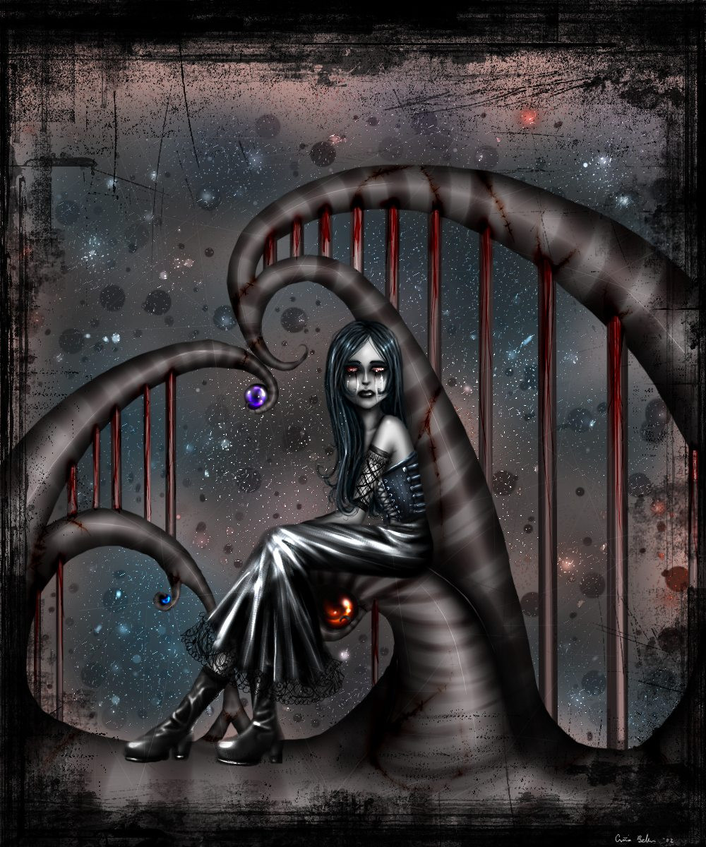
 asunder — Save the Tears v2

Published: 2002-07-25 01:15:22 +0000 UTC; Views: 7296; Favourites: 146; Downloads: 697
Redirect to original
Description
this is another version.. i took in some suggestions and i made a few gaps in the tear/blood whatever.. and i changed the bg.. don't know if it helps any or nothere's the other version - [link]
Related content


Comments: 89

Asunder!!!! You yust got another fav I love the pic.
👍: 0 ⏩: 0


nice work...i like the brushe work alot too..keep it up
👍: 0 ⏩: 0


great great great
i like both, they look different. maybe add a shadow from the little girl on the wall
👍: 0 ⏩: 0

I like the first more. The darker background pulled the two figures together.
👍: 0 ⏩: 0


I definatly prefer this version. The other one was good - The background was very nice but a little too complicated for the foreground maybe. This image is more focused on the 'main characters' and better emphasised IMO.
-Luci
👍: 0 ⏩: 0

i haven't seen the first one but I like this one a lot.
I like the hair and the way you did the hair, it's very smooth.
its dark with a slight comical twist to it.
👍: 0 ⏩: 0

Wonderful work... The imagery and metaphoric feel to this is stunning... Not my usual style, but I am oddly drawn to this.
👍: 0 ⏩: 0

Crazy. Very imaginative.
Reminds me of Tim Burton.
+ fav
👍: 0 ⏩: 0

awesome (sorry im way to fuckin tired to try to compliment you any further, i'd prolly end up rambling lol.. +fav tho!)
👍: 0 ⏩: 0

both are great, can't choose...
ok i lean towards this one more
again!
👍: 0 ⏩: 0

Wow, that's amazing. Kinda strange looking, but extremely awesome.
👍: 0 ⏩: 0

yep, it's better this way, you kan see klearer what it is..
👍: 0 ⏩: 0

This to me, looks like is represents when men get violent and drunk and tend to bash there women up. Not good!.Very symbolic..
👍: 0 ⏩: 0

yep I think this is better than the first version.
:Sad Angel:
👍: 0 ⏩: 0


well the background of the previous version was better and the work on the blood is making it a bit realistic....good job
👍: 0 ⏩: 0

I like this one the best. The other background was nice but detracted too much from the character catching the "tears" I think. I think this version also allowed the face to stand out more and lets the eye flow to the hair, which I didn't even notice it was before! Anyway, it's beautiful.
👍: 0 ⏩: 0

infinitly better!! I love the smoothness of flesh and the clever use of negative space for the hair. Really wonderful emotive work, i love it!!
👍: 0 ⏩: 0

i love this so much. changing the bg helped a lot. the girl at the bottom really stands out. wow...yeah i really love this. this is probably my fav of all my favs. yep.
👍: 0 ⏩: 0


~ lovely, lovely work. animated, poignant and near-sublime. (if i you would allow me a single cavea,t it would be that the girl holding the pail is a tad two-dimensional - it would be cool to see a distanced drop shadow projecting onto the wall to give her more depth...) great work.
👍: 0 ⏩: 0


I definately (out of all three) like this version the best! You can see everything and before I couldn't even tell that ALL the black w/the stars was her hair. Now I know!
I
it!
👍: 0 ⏩: 0

The emotion this pulls together is astounding. It mimics a lot of what I've been feeling lately. +fav. I couldn't think of one thing negative to say about it even if I tried for 5 hours.
👍: 0 ⏩: 0

Amazing, +fav. I would give criticism but i can't think of any.
👍: 0 ⏩: 0

i like this version. your first version was nice, but i have to agree that this one's a lot better--more attention to detail, and the colours used seem a bit more vivid for some reason. hrm.
👍: 0 ⏩: 0

snagged it as soon as i saw it. its perfect, dont think i wanna see the other version, but, ok..i have to. oh yeah,
👍: 0 ⏩: 0


Either way, this is still a magnificent piece. +FAVS again.
👍: 0 ⏩: 0

yeah great as usual, you are ownage man keep it up
👍: 0 ⏩: 0

I like this version a lot better. It's easier to see the detail. I really like the way the hair frames it all.
👍: 0 ⏩: 0
<= Prev |