HOME | DD
 Atagamay — Serums and Isolation

Published: 2008-12-05 22:29:12 +0000 UTC; Views: 422; Favourites: 6; Downloads: 27
Redirect to original
Description
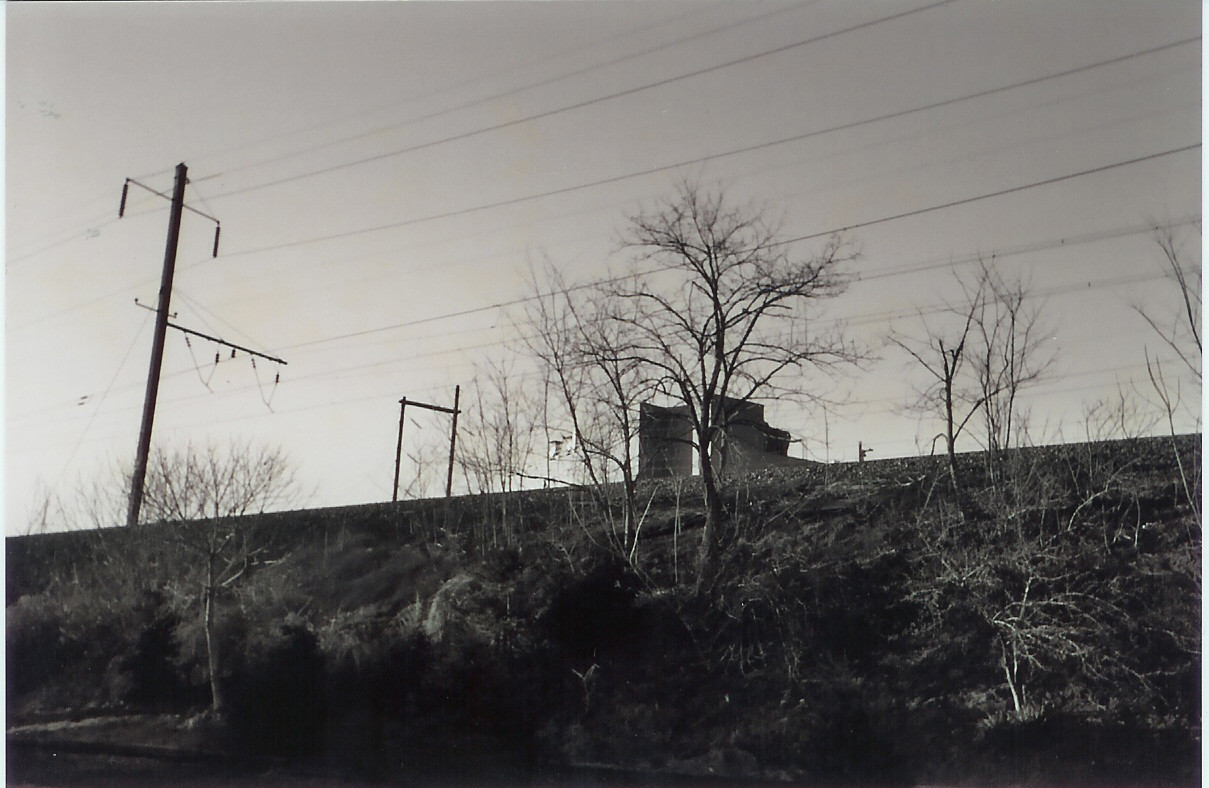
Victor from the Trauma Center series, because he's awesome and any excuse to draw a laboratory is a good one. At first, I thought he was just sort of hunched over his work all tired and melancholy-like, but today I realized... That he might actually have fallen asleep at the lab table. XD Yeah, I know very little about my own drawings, even as I am drawing them. Anyway, falling asleep at a lab table. I've come close to doing that before. I used to work in a lab, did you know that? But I digress...I didn't paint and ink this one for a while after I sketched it, because I didn't have time and then lost my watercolor tablet for a bit.
") This is another one where I painted the whole page first to set the lighting. This time, I used a light greyish blue, because nothing speaks of science and sterility better than cool, low-contrast lighting.
This is another one where I painted the whole page first to set the lighting. This time, I used a light greyish blue, because nothing speaks of science and sterility better than cool, low-contrast lighting.Watercolors over pencil sketched, inked with a fountain pen.
Related content


Comments: 4

Here from LJ... and to me,it looks like Victor's resisting the urge to grab that syringe in front of him and go stab Chase with it. But that'sjust me.
 (Wink)")
👍: 0 ⏩: 1

LOL!
I love how everyone sees his mood as a little different in this.
👍: 0 ⏩: 0

Yup, that's Victor all right. XD Kind of looks like he's trying to avert his attention from the viewer, like he's annoyed about being stared at while he's working. That's how I interpret his pose. I like how most of the picture is the lab, with Victor off to the side and in the background. I don't know, I guess that adds to the "isolated" theme. I think it would look even better if the outlines weren't so wavy. I feel like straight, solid lines would make it more appealing. Also on the signs, if there were more letter-like shapes (I don't have the heart to ask you to actually write a bunch of tiny text in there. I rarely do it myself). But then again, maybe it works this way, since it draws attention away from the signs and back on to our nice solidly-shaped Victor.
The minimal use of red is great against all the dull blues, too, I think. It's like, the picture is nearly cool monochromatic (I know it's not really, but it gives that impression), but then you have these spots of warm red accent. I guess what I'm saying is the color composition is nicely done.
I have this habit of saying a lot in my comments, and I apologize for that. XD
👍: 0 ⏩: 1
I like long comments! Yours is just fine! And I like how you interpreted his pose. Now I see it that way, too!
Yeah, my outlines are kind of wavy, and I know that might put some people off, but I've always had trouble with drawing perfect lines without a ruler, so I just kind of gave in and made it part of my style. And as for the squiggly letters, just as you don't have the heart to ask people to write it, I don't have the heart to put it there for people to squint at. And like you said, the overall wobbly look makes the sharper outlines of the character stand out, and that's kind of what I go for. I'm sort of a perfectionist (but not about realism) when drawing characters, but my backgrounds are sort of wobbly, but detailed. But yeah, some of the lines in this turned out too wavy, even for me, but I'm still satisfied with how it turned out as a whole.
And thanks! I was worried that the bright colors might clash, but you're right, I think the word for this is "pop" more than "clash." And I've been told that another image of mine bordered on monochromatic when it wasn't, and that was another image with strong red accents. (It's my Featured Deviation right now, if you'd want to have a look.)
I said a lot in my comment too, but I'm glad you liked the picture. ^^
👍: 0 ⏩: 0