HOME | DD
 AtarAtis — Picture Perfect

Published: 2008-03-21 22:27:55 +0000 UTC; Views: 1869; Favourites: 35; Downloads: 51
Redirect to original
Description
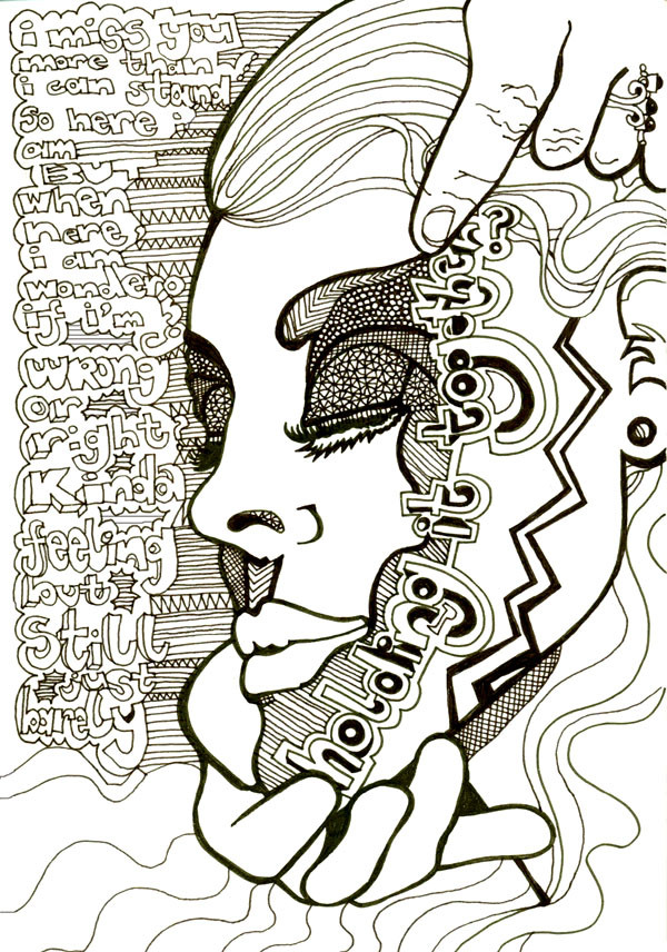
Trying to make something different and slightly experimental.Have been wanting to make use of words for a while now and seeing as I decided to submit this for the "Art for the Sake of Art" (once got to be the first time) contest I ended up making my own ink from an art tablet my mom brought back from China at some point. Turns out it takes a bit of patience to get nice black ink but it is very beautiful if you do!
This picture partially evolved form me browsing stockart to find something inspiring. I got a little frustrated with all the perfect faces. Not that there is anything wrong with that, but I was looking for something odd, strange. I'll have to look again. However this is the resulting thought process and image:
Beauty aiming for perfection but losing personality in the process.
Hope I got the thought across!
Found an interesting piece that you might like if you have interest in this concept: Picture Perfect by Mariedark
*Le Visage Club has my permission to display this deviation in their members gallery.
Related content


Comments: 44

This is really great! I love having so many things to focus on at once, and having the piece really make me think about what the artist intended and what I get out of it. Really amazing work!
👍: 0 ⏩: 1

Thank you for your comment! I enjoy making things with many focal points, think it would be nice to make this one on a bigger scale someday, or something similar, this is A4 and I think size would give it more space and detail.
And it is the best compliment that it made you think!
👍: 0 ⏩: 0


Thankyou very much! Also for the 
👍: 0 ⏩: 0

I like this one ... very nice, simple but look strong with the color ... you got talented
👍: 0 ⏩: 0

Well thankyou! also for the
👍: 0 ⏩: 0


I don't think I can say anything that hasn't been said already, but this is very interesting, very creative. I live the contrast of writing and picture, color and white, thick and thin lines. Very cool
👍: 0 ⏩: 1
thankoyu! I'm really glad you do! It was a fun and different thing to make!
👍: 0 ⏩: 0
I don't think I can say anything that hasn't been said already, but this is very interesting, very creative. I live the contrast of writing and picture, color and white, thick and thin lines. Very cool
👍: 0 ⏩: 0


Yes, Vogue  (Smile)")
👍: 0 ⏩: 1
great! I'm glad there is sense in this piece after all.. and thanks for reading!
👍: 0 ⏩: 1


Meike, this is really awesome! You always come up with such creative pieces and this one is no exception. The colors you used in this one work so well and enhances the composition. really cool stuff!
👍: 0 ⏩: 1
You flatter me! But I'm glad we can admire each others work so much
*hugz*
👍: 0 ⏩: 0

I like it ")

👍: 0 ⏩: 1
Thanks! I think it is more of a combination of the fact that I used to have conecepts but wasn't very good at drawing them, and drawing a picture, where now I can find all the things I need to draw the picture that supports the concept.. if that makes sense?? But yeah! I'm getting better at something!
👍: 0 ⏩: 0

Dit is echt heel creatief en daardoor heel attractief. Het afwisselende kleur-, zwart/wit gebruik en de hoofdletters geven een ontzettend apart effect, waardoor je niet wet waar je je ogen op moet focussen en je vanzelf naar het geheel kijkt. Heel mooi gedaan!
👍: 0 ⏩: 1
👍: 0 ⏩: 1
Ohh, geen dank! Ik weet van mezelf dat ik het fijn vind als iemand duidelijk omschrijft wat hij/zij (niet) goed vindt aan mijn werk, dus dan is het wel zo handig om hetzelfde ook bij anderen te doen. Daar plaats je je werk ook voor, toch? Om tips en reacties te krijgen zodat je je kunt verbeteren! (En stiekem ook een beetje om te horen da je iets goed hebt gedaan, lol. ")
👍: 0 ⏩: 1
Heel mooi verwoord en blij dat we dezelfde deviant (levens) overtuiging hebben! Als je zelf wat nuttigs (comment) wil begint dat bij jezelf! En als iets lukt is het ook fijn om te horen. Best raar trouwens om hier nederlands te typen!
👍: 0 ⏩: 1
Ja inderdaad, ik ben het ook niet gewend om hier Nederlands te typen. Maar ach, afwisseling is goed voor de mens.
👍: 0 ⏩: 0

Great idea. The idea of perfection is so incredibly skewed in the westernworld and subjectively (for me) it gets to a point where what the masses would call faultless holds a certain level of banality that just seems off. Many of us tend to latch on to a saddened perspective of beauty and perfection in this at times material world and it is nicely challenged in your piece. "keeping up with fasion becomes more about your income..." nice, I wish I could read all of the writing in the background, which by the way holds a (ironically so) an awesome perfection to it, all of those capital letters so impeccably placed
👍: 0 ⏩: 1
Your response made my day!!!! and the text in the back always follows up on the line after it.. And it is not entirely written well. I got distracted and started swirving the last couple of lines. (too lazy to measure it out) That is why the dots; to fill up the randomly created space!
Keeping up with fashion depending on one's income has been quite the trend throughout history! Traces of this can be clearly seen in Africa where you should be fat (or at least the man) if you are rich to show that you can afford the food! It is very clearly seen in the western "blonde" which 1 seemed to be cool to do for a while and 2 was applauded for keeping up with your roots and whatnot... blond streaks (and a tan) would indicate that you had enough time/money to laze about in the sun and a white skin (in earlier days and very much so in asian countries) that you could pay people to work out in the field for you! I could go on and on.. but it is a never endinginteresting subject
Thankyou for reading!!!!!! and going along in the thoughtprocess!
👍: 0 ⏩: 1
Strange world, its all materialism, and one day a sense of spirituality and well ordered beauty will transcend it. It has to
👍: 0 ⏩: 1
Amen to that! And I think it already is.. slowly but surely!
👍: 0 ⏩: 0

'beauty aiming for perfection but losing personality in the process'
very interesting piece, well done
I have often thought of photographing as many weird or odd faces as I could make, practicing in the mirror, but not being much of a photographer, and not even having a working camera, I have never gotten around to it.
👍: 0 ⏩: 1
let me know if you do! I ofund some on devart now but they are hard to find
👍: 0 ⏩: 0

I've finally logged in has I just had to leave a comment on this painting Meike it's fantastic

👍: 0 ⏩: 1
Drawing mostly steph
👍: 0 ⏩: 0

Way too much! haha especially with all the time I spent looking at it thinking up ways to resolve my misery on being stuck and not being able ot work on it when I wanted to because of waterpolo practice! But I finished it!
👍: 0 ⏩: 0
