HOME | DD
 AtixVector — MY deviantART LOGOTYPE
Published: 2008-10-04 02:03:03 +0000 UTC; Views: 36603; Favourites: 440; Downloads: 2778
Redirect to original
Description
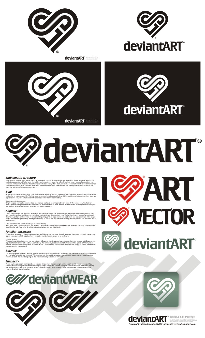
I LOVE DA V1.0::::::::::A C T U A L I Z A C I O N:::::::::
Si quieren ver cómo quedaría este logotipo en el header de DA, veanlo en este video, cortesía de `Norke [link]
I LOVE DA V 2.0 [link]
My deviantART Logotype III [link]
Related content


Comments: 359

good work!...
i agree with
fediafedia and jun1art!
👍: 0 ⏩: 0

bit hard to read to me. looks like it says SA to me.
👍: 0 ⏩: 0


It's a nice idea, but I doubt that many deviatins or the staff would ever want a HEART as a logo...
👍: 0 ⏩: 0

Damn... after seeing this, I don't think I'm going to try. You win. Hands down.
👍: 0 ⏩: 0

 (Smile)")

Great concept, and very well executed, But i dont see that it 'fits' dA.
Good work though
👍: 0 ⏩: 0

Beautiful the Idea and excellent for the execution.
But I couldn't find so "sweet" the shape of the singles letters because of a retrò taste that doesn't represent my personal idea of DA (dynamic, very cool, young, tough).
And finally, I find the closing of the A letter a bit forced (but may be required) to maintain the heart shape but not in harmony with the letter.
👍: 0 ⏩: 0


You like this just because other entries are crap? xD
👍: 0 ⏩: 1

la verdad que es el que más me gusta de todos los que he visto, a ver si hay suerte y ganas
 (Wink)")
👍: 0 ⏩: 1
Pues, a ver si hay suerte...gracias
👍: 0 ⏩: 0

")

I'll tell you this...
I definately see you as the winner...
👍: 0 ⏩: 1

Reminds me of emerates airlines...
am i the only one?
")
👍: 0 ⏩: 1
Yeah
The heart logo is cool tho
👍: 0 ⏩: 0

nice but the heart shape is a little too subjective...
👍: 0 ⏩: 0


Simplest things are most difficult
👍: 0 ⏩: 0

Very stylish and awesome, albeit somehow I don't see this really fitting the dA theme. >_<
👍: 0 ⏩: 0

awesome idea, just don't like to much the "A"
but nice job!
👍: 0 ⏩: 1

I entered a logo for the contest as well. lol I'm gonna lose xD (i don't mind) This is really creative though. Very open to use (if that makes sense) and it doesn't look like all the others (i dunno a lot of them were well done but seemed like the original one you know?) good work
👍: 0 ⏩: 1
No one knows who will be the winner (we don't even know if there will be a winner). But at least we tried. Thanks for your comment
👍: 0 ⏩: 1
Oh true enough, one reason why I don't mind so much 
👍: 0 ⏩: 0

I really don't like this one as new logo, but you got d and A together nicely.
👍: 0 ⏩: 1

It's obvious that you are really good at logo design, but I don't like it at all.
I really do not like a heart as a logo; looks kinda childish to me. I am proud to be a deviant, but I wouldn't end up in spreading hearts all over the world.
Your gallery is great though ;]
👍: 0 ⏩: 1
So your problem is with love and hearts and stuff. That's ok. Anyway,I think the shape (in this case a heart-shape) is not enough for the logo looks effeminate or childish. Color plays an important role too. (I hope you understand, my english is not good).
Thanks for watch my gallery.
👍: 0 ⏩: 0

Really nice concept although the idea of representing Da as a heart seems a bit too cheesy and feminine
👍: 0 ⏩: 0

I think you did a great job man... i love it.
👍: 0 ⏩: 0

it is a briliant idea..making dA logo as heart-shaped
i love how you excecute it too..this is definitely a good logo
and the typeface syncronized well with the logo..
yeah..i must admit this is best logo so far
keep up the good work !! <3
👍: 0 ⏩: 1

I don't really like it to be honest, it's too complex, too heavy, too much going on.
how does it look on 50x50px ?
👍: 0 ⏩: 1

Clever logo, brilliant execution, and great presentation!
You're logo is so cool that it didn't make me want to forfeit the contest... Instead it inspired me to improve my own logo designs. So thank you. Thank you for being awesome and making such a cool and innovative design!
👍: 0 ⏩: 1
Thank you very much for the support. It's good to know that my work inspires others in DA.
👍: 0 ⏩: 0

I hope you're one of the judges... xD
👍: 0 ⏩: 0

I like this logo, and I like the new version too.
For the people who're saying that know one would know what it means, no matter how you go about, using the letters "dA" is not going to help someone know.
Most logo's don't give people ANY idea of what the think is about (Subway, Telus, Shaw, Mac (I mean an apple for a computer? Lol) anything really) so don't worry too much about that.
👍: 0 ⏩: 1
| Next =>