HOME | DD
 AtixVector — MY deviantART LOGOTYPE
Published: 2008-10-04 02:03:03 +0000 UTC; Views: 36603; Favourites: 440; Downloads: 2778
Redirect to original
Description
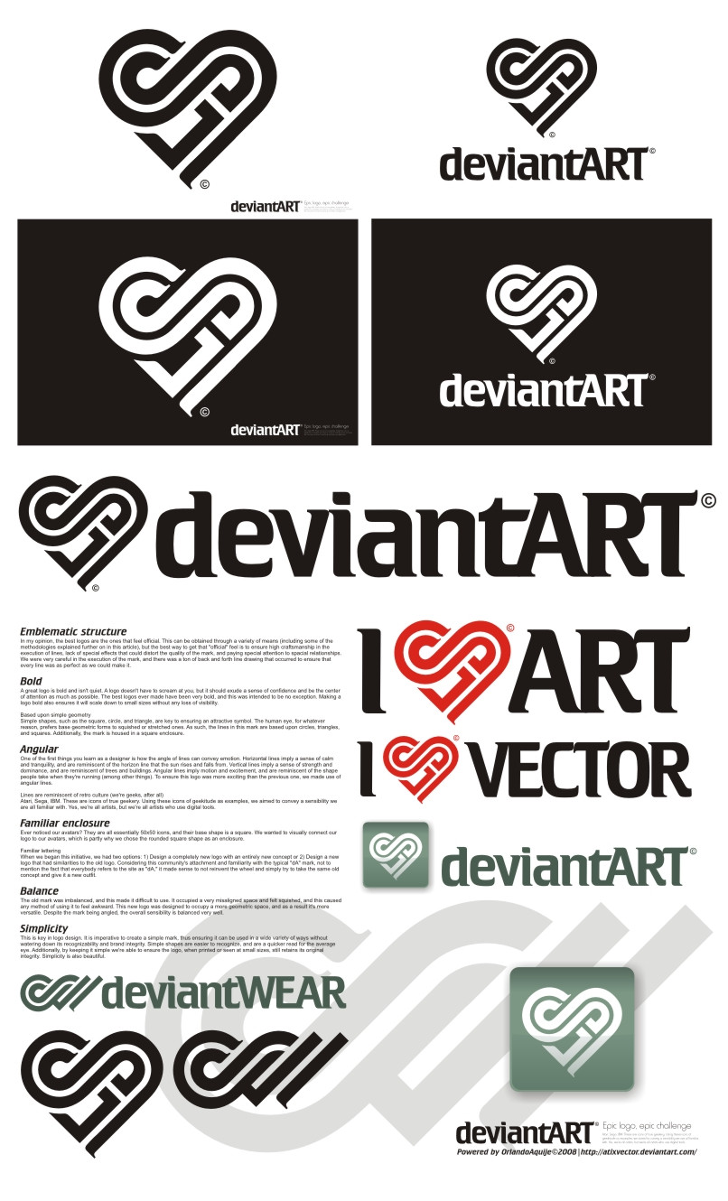
I LOVE DA V1.0::::::::::A C T U A L I Z A C I O N:::::::::
Si quieren ver cómo quedaría este logotipo en el header de DA, veanlo en este video, cortesía de `Norke [link]
I LOVE DA V 2.0 [link]
My deviantART Logotype III [link]
Related content


Comments: 359

")


Awesome logo! Great typeface! Superb concept!
Hope you win dude! This really gives a total different feel to dA!
Good luck!


👍: 0 ⏩: 1
 (Smile)")

reminds me of cpluv a little, but other than that it's a really nice and clean design
👍: 0 ⏩: 1

Yes, other users also reminded computerlove. But the heart of DA gives more love...xD
👍: 0 ⏩: 1


Nice idea, but, it's been used before (:
At least.. In Denmark it has.
This is the homepage for an organization for breast cancer: [link]
And here a picture of the logo itself: [link]
👍: 0 ⏩: 2

That looks nothing like his logo, lol.
👍: 0 ⏩: 1
I'm just saying that it's the same IDEA.
👍: 0 ⏩: 1
Not really. I think those look more like boobs.
👍: 0 ⏩: 1
And that's what it's supposed to look like since it's an organisation for breast cancer.
But all I was saying is that the idea with the lines and such are alike.

👍: 0 ⏩: 1
So hearts look like boobs now?
LOL xD
👍: 0 ⏩: 1
I am not saying that. At all.
I just said that what I posted a link to was for breast cancer, and that's why it looks like a pair of breasts.
All I was saying to begin with, was that the idea was the same, with the lines and the "top of the heart"-ish. That's all.
👍: 0 ⏩: 0
Just wanted you to know.  (Wink)")

👍: 0 ⏩: 1
Ok, thanks. However, the logo does not evoke anything like cancer. Unless you know about that organization for breast cancer.
👍: 0 ⏩: 1
I know (: Just found it funny. ;D
👍: 0 ⏩: 0


Great, one of the best I've seen so far.
👍: 0 ⏩: 1

")

Can't see any DA... Can't see any relation with Deviant...
You must try a completely different style...
👍: 0 ⏩: 2

I disagree. I see a D & an A... I also see an infinity symbol (long live DA!), and the most obvious heart. I think it's very clever. That goes for the DA Wear as well!. I think I'd like to see a crisp san serif version. Can you whip that out too?
👍: 0 ⏩: 1
It is not a matter if you can see or not. Just put this logo anywhere on the world and ask ppl what it writes on it. And noone will say a DA (that does not know this logo).
It just looks like a life insurance company logo
👍: 0 ⏩: 0

")


what letters make up that heart symbol?
i can see an S...
👍: 0 ⏩: 1


<= Prev | | Next =>