HOME | DD
 attackvector — attack vector new identity

Published: 2009-01-24 05:06:30 +0000 UTC; Views: 1319; Favourites: 6; Downloads: 22
Redirect to original
Description
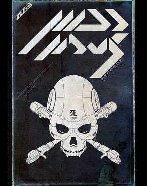
Exploring a fresh look for myself in the new year. It felt good to get back to some simpler art... I forgot how much fun iconography and fontography is.Related content
Comments: 4

I like the Style . But why Pink ? I'd love to see a series of different color variants for this.
👍: 0 ⏩: 1

Heh, a good observation!
The light pastel color palette seemed like an interesting dichotomy to the masculine nature of the logoform.
I did make a few variations on this logo, but they are mostly for high contrast B&W printing. But now you've got me thinking about further variations and palettes. This is worth exploring
👍: 0 ⏩: 0
