HOME | DD
 awesomesakura — Sunset

Published: 2010-02-04 02:21:56 +0000 UTC; Views: 3513; Favourites: 89; Downloads: 31
Redirect to original
Description
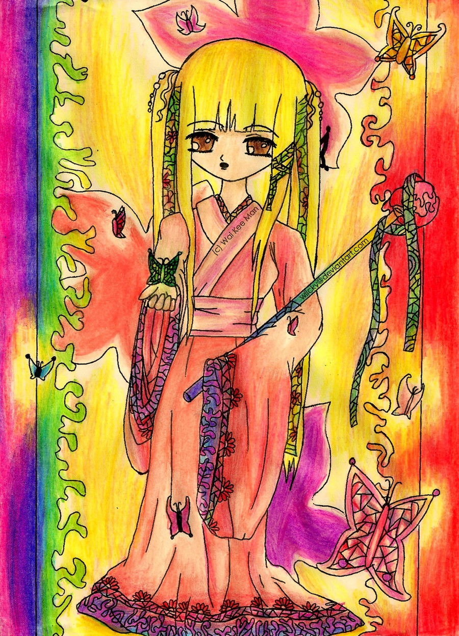
This drawing is dedicated to my great friend !!!! She was my first friend on DA. We met on Asdastory, an online game, while questing in Coc... I think that stands for Castle of Chess. Fun times~~~ I hope you really really really like it!!! I worked very hard. I'm so happy of how this drawing turned out.She asked me to draw a fanart of Tohru Honda from Fruits Basket. I know Tohru doesn't look like Tohru because... well... she's drawn on my style. Although you can see some features that resemble her.
[Edit]
Thank you for the constructive criticism people ^-^! However, they are starting to contradict each other (the feedback) so that's why I took off the questions. = )
Related content


Comments: 148


Really splendid work we got here. Dress is stunning: colors blend well, details are amazing and I like pattern on black part.
You did well on drawing wings, I like your choice of color. Background is very simple and therefore fits character well.
As for critique I can say, her waist is bit too thin, eyes are too big and shape of head is bit weird.
👍: 0 ⏩: 0


")

Congrats on the 1000+ deviant kiriban~!! ^v^
👍: 0 ⏩: 0

I think you did the wrinkles justice, but if you're going for a more pleated look I suggest using straighter, stiffer lines? I also think that more shadows can be added if you used brown to darken certain areas, for example the bottom of her sleeves. A reddish-brown would be fine. The hands look fine, though I think her left hand should droop a bit more for a more natural pose.
However, I like the black part of the dress-very nice.
👍: 0 ⏩: 0

I love your style  (Smile)")
Great ideas and nice coloring!
👍: 0 ⏩: 0

really nice! You've put a lot of texture and detail into it, which makes it stand out
x
👍: 0 ⏩: 0

Wow, I'm blown away by this XD Its absolutely stunning, I never have the courage to do anything like this because Im so scared I'll mess it up half way through so you get a big thumbs up for being brave! XD I cant see anything wrong with this piece, her hands look fine, and the ruffles look good XD
The little bits of white under her eyes, is she crying? It makes her look rather sad ;<
I love all the inked details weaving in and out of her wings too, and the background looks really good, the lighting looks good too.
Overall a really stunning piece! Congratulations
")
👍: 0 ⏩: 0

:icongivemefeedback:
I must say, this is very interesting to look at. It has so many colors and so many details. But I do suggest to go for more dramatic shadings, as in don't stay inside the tone color, experiment. In the red areas, I suggest you can add purple or brown to add more depth into it for example. you should mostly do this on the wings, since they do get lost with the sunset.
However, don't feel bad, because you do have wonderful things in this piece. Like the folds, I must say they look amazing and they have lovely patterns, I can tell you are willing to learn and improve. So I wish you the best.
👍: 0 ⏩: 0


first of all she really cute ^^ and the details you've made really lovely C:


overall this's very lovely drawing ^^ i love the amount of details you've made~ i hope you can understand my bad english 

👍: 0 ⏩: 1

oh thank you so much for the feedback (sorry to be answering this late). I will do my best to take your advice ^^ I'm also very glad that you thought it was a cute drawing

👍: 0 ⏩: 0

A critique for you and your artwork "A Gaze Upon Darkness"...
1. I don't see what your character is gazing at because I don't see darkness.
I think if you draw a figure under this title, both her gaze and the darkness would be immediately identifiable. She's looking at something, but I can't say what.
2. You ask about "light source."
I must admit I don't see any particular light source.
I do see the orange and its shades behing your character, but don't see a light source ON your character.
Perhaps an addition of more shading at the back of wherever the light source is from, even if it's from the oranges and the background.
Then the girl would have shades here and there along the front of her (don't you think?) and there would be shading.
Brightness from a light source, shading behind a light source.
3. I admit I first noticed the girl's apparent lack of a torso.
She doesn't only have a thin waist, she appears to have no ribcage and very thin arms. I can't say anything about anything else because of her voluminous (and rather pretty) blouse and skirt.
4. I like the streamers of dark colors here and there in the compostition, though they still don't add to a gaze into darkness. They're well-done.
Her clothes and -is it a parasol? a large fan?- she carries are done well but with no particular shading I notice.
5. The sunset you want feedback on may be better served if it's more abrupt.
The glow of a sunset (especially if a character is soon gazing into darkness) could be improved if you decide -and you're the artist, it's ultimately up to you- to have just a peek of the sun right at a horizon line -and have its glow take up much less room. That way the sky can be shaded from an 'only-almost' light to nearly-night.
7. The girl's hands could use some pratice ...your own artistic eye is correct.
Practice drawing only hands for a while. They're tough to draw.
Suggest you practice drawing them in several different positions.
Then when you want a character to hold something, you'll know what a hand looks like holding something. The same is true for shows of tension, love, despair and any emotion often expressed primarily by hands.
You've done a good job.
What impresses me is you also ask for feedback on many things not seen here.
Though a "scan" may leave a picture lacking all you want to show... you still know enough about art to know what the possible weaknesses are here.
You're brave.
By being brave like this your art will only continue to improve.
Thank you for contributing your artwork to
👍: 0 ⏩: 1
Please excuse the typos and incomplete sentences. Not acceptable but seen too late. Sorry!
👍: 0 ⏩: 0

Whoa. Lemme guess the wings took u a loooooonnnngggg time no? XD. I luv it! say it lik er...mr Crump? XD.
👍: 0 ⏩: 0

I can't find any light source here. I do see the yellow highlights on her skirt, but there are no shadows. So it's really difficult to judge that d: Maybe you should concentrate on pictures with more apparent light sources?
It looks like a red sky. I think the sunset-feel would come out better if you'd show some of the sun in the background. It looks like you tried, but make it even stronger than this. And the black on the upper edge isn't a very good idea either. Make it purple, or dark blue. Black is in general a forbidden color to use. Rather mix and blend things to make them look black! Everything black should have a blue, purple, green or even red basic color which you'd later build on with black. But try avoiding this as far as you can!
Secondly, no matter what you draw, YOU NEED ANATOMY. You need to learn how the human body works to be able to exaggerate the proportions to your own advantage. Otherwise, it will be clearly visible that you don't know what you're doing.
There isn't much of her body visible, but I think that if you wanted to draw a child you did good. (Big head, big eyes.) Her torso is questionable though. Where is the ribcage?
For the hands. (I have nothing to complain about with your wrinkles, from now on, they'll only get better once you find the understanding for them.) Study them. Draw them in simple shapes, a box for the palm, a ball for the wrist, many small pipes for each part of the finger, they should end by each joint.
No matter what I say, I come back to the fact that you should study anatomy, and use simple shapes to draw the main position of the body out before adding ANYTHING else. If you didn't know/notice, the more you know about something, the better you draw it. Live by this simple rule, and learn. Learn about everything you want to draw!
Finally you need some praise too! You did very well with this picture, and unlike most people, you didn't make the arms too short (: And the wings and the dress are very beautiful. Just keep working! If you want to, you'll get somewhere for sure!
👍: 0 ⏩: 1

👍: 0 ⏩: 1
Good to hear (: I'm only glad to help
 (Wink) - ;)")
👍: 0 ⏩: 0

I think it looks fine, the colour scheme is quite stunning. I like how each of the colours are separate and ... different than the rest, but they all relate quite beautifully.
Although I liked the colours of the background, I didn't realize it was a sunset until you said so. To make it more obvious, I think that you should darken the 'land' part of the background. Make it darker than the sky.
I think the worst thing about this is her eyes. Not going to lie, they are way too big.
Good work!
👍: 0 ⏩: 1
Thank you very much to take the time to give me feedback!! You wrote so much and you gave me valuable criticism ^^ I'll try to improve in everything I can

👍: 0 ⏩: 1


Woah!!  - :O")
I love this picture!!!


👍: 0 ⏩: 1
Thank you T___T <~~~ lol I'm being using that emoticon too many times this week and now I try to find any situation that will allow me to use it hahaha
👍: 0 ⏩: 1
This emoticon is sooo lovely!! 
👍: 0 ⏩: 1
hahaha I know ^^ Yay for cute emoticons 
👍: 0 ⏩: 0

Hands: The shape of your hands are really very good, the left one is a tad smaller though. Getting things like that even is tricky- you'll just have to practice.
Wrinkles: I love the wrinkles in the black fabric, the ones on the lighter pink I'm assuming are suppose to be kind of those big bunches of fabrics that allot of older big dresses like that had- in which case they look pretty awesome. I would just say make sure you know where your shadows are, and combine hard edges with soft edges(shadows) to make a great wrinkle :3 That's something else that will just take practice.( I need to practice clothing myself >,<) I also see your character is wearing gloves, as you get better and want more detail, you can add small wrinkles in the gloves. Just don't over do it. Or do over do it! It just depends on what effect you want.
Over all great job.
👍: 0 ⏩: 1
Thank you very much for suggesting great ideas and for the feedback! I had completely overlooked small details like adding wrinkles to the gloves O___O That was a fantastic observation!! I truly appreciate you pointing small things like that!!
👍: 0 ⏩: 0

THIS IS SO PRETTY *____* OMGGGGG 
👍: 0 ⏩: 1
Y-y-y-you said that you like it? O___O OMG I SHOULD BE THE ONE FAINTING
👍: 0 ⏩: 1
O______O
Of course I like it....IT'S SO BEAUTIFUL ;____; *luffs on pic* The wings, the dress, OMGGGG ;_; 
👍: 0 ⏩: 1
TT___TT awwww thank you!!! You have one of the greatest anime styles I've ever seen
👍: 0 ⏩: 0

I think the overall image is astounding. Her hands look beautiful and delicate. The only part that seems a tiny bit off is the white under her eyes. They just seem to distract from the face.
👍: 0 ⏩: 1
oh thank you thank you for the feeback TT_TT oh yes yes I think that I added too much white under the eye too
👍: 0 ⏩: 0

how do you know all of my name? O____O I'm so scared... *runs to hide under bed*

👍: 0 ⏩: 0

I think the colours are good, and I really love the details with the black, it contrasts nicely. Allthough your image is detail heavy, I don't think it detracts from it in any way. On the topic of anatomy, even though you are using anime like style, I don't think she is too long and thin, however that her eyes are overly large. I know it is common in anime, but I still think it is a bit too large, since you like the long body type, the head being so large seems a bit baloon like. I think I'm nitpicking though. Another thing I think you could have done better is the placement of the wings, they seem like they are next to eachother and not so much attatched to the back. allthoug hchanging this now would be rather difficult, but you can think more about it next time you draw wings, the composition seems a bit heavy on the right side.
👍: 0 ⏩: 1
oh thanks for giving me feedback~ I will truly try to follow up your recommendations so that I improve my skills. Your help is much appreciated. You deserve a rose! <~~ this goes along valentine's day XD
👍: 0 ⏩: 0
thank you thank you!!
👍: 0 ⏩: 1

Most welcome!
Ari chan
👍: 0 ⏩: 0

HOLY POOP THIS IS AMAZING. O O
The attention to detail really shows and makes the piece. Everything flows so very well~
👍: 0 ⏩: 1
Thank youuuuuuuuuuuuu I spent very long adding all the details = = My hands were in pain D: But I'm very happy of how it looks ^^
👍: 0 ⏩: 1
Burnishing causes all sorts of hand cramps. = =
👍: 0 ⏩: 1

This picture's amazing!
I love it so much!
The wings are real enough
To reach out and touch!
The picture's got darkness
Yet the girl's just so sweet,
I must admit this picture
Is an amazing feat!
👍: 0 ⏩: 1
awwwwwwwwwwwwwwwwwww you comment just made me soooo happy TT___TT You just made my day better
👍: 0 ⏩: 1
I'm glad I could help
To brighten your day
I simply realize
If I have something to say
I can say it in rhyme
And people will grin
They think poems are sweet
So my comments are win!
(That was a joke
I just wanted to tell
That your art is amazing
You do things so well!)

👍: 0 ⏩: 1
awwwwwwwwwwwww thanks for the rhythming looking poem XD that was very interesting to see as many people don't comment like that O: yes yes ^^ quite unique!
👍: 0 ⏩: 0

Her hands look fine by me, maybe they should have been slightly bigger.. and her head slightly less round.
She does not appear to have a chin so maybe focus on the shape of a head for your next piece!
The sunset does really look like a sunset and I have to compliment you on her wings. Those are really well done!
Anatoy is hard, but it can make such a difference in how your work looks when your done, so keep practising on it.
The wrinkles is the pink above the black in the dress is fairly nicely done.
The black is a bit less. I think the fabric you wanted for the black was silk, so go find on internet black silk dresses and see how the light reflects on it.
Goodluck!
👍: 0 ⏩: 1
| Next =>