HOME | DD
 awesomesakura — Sunset

Published: 2010-02-04 02:21:56 +0000 UTC; Views: 3513; Favourites: 89; Downloads: 31
Redirect to original
Description
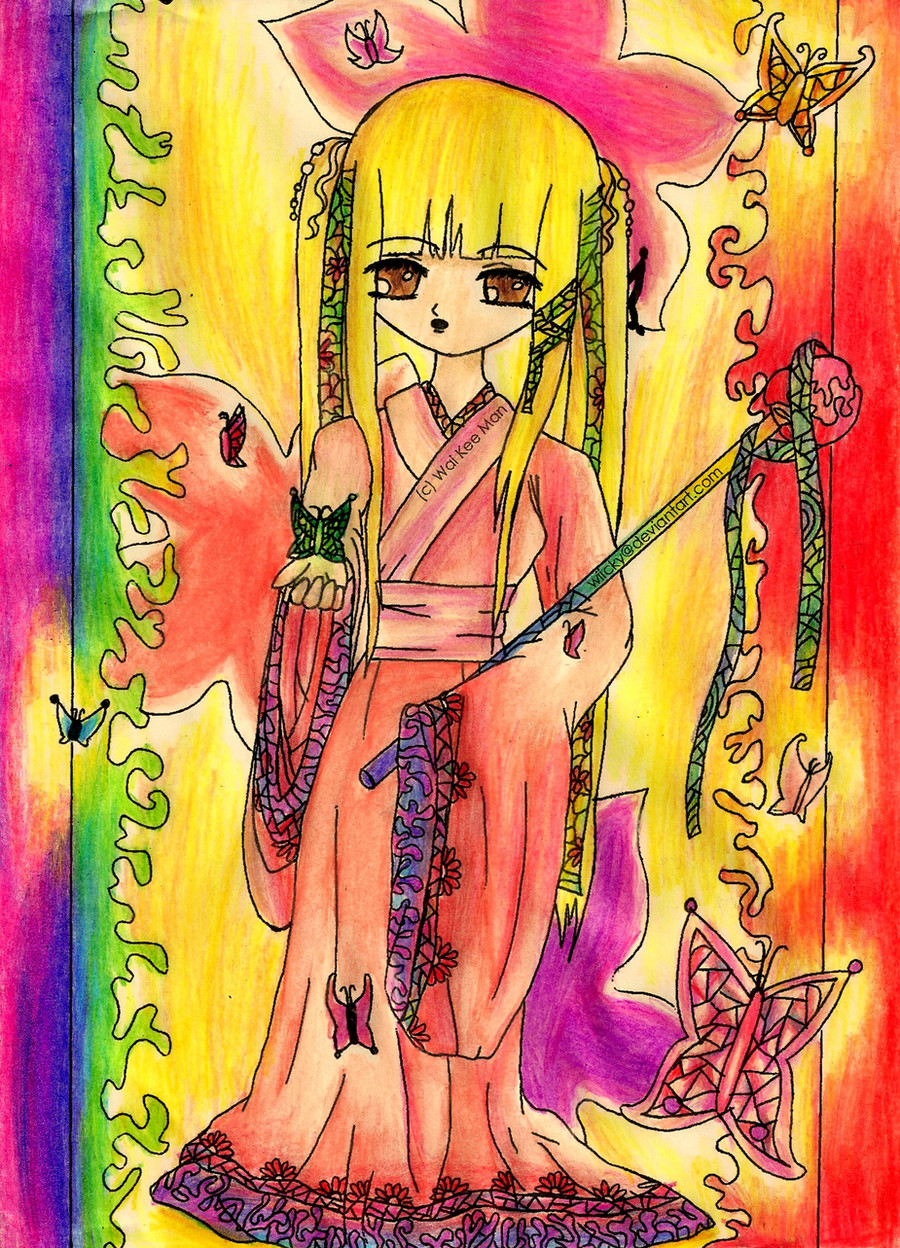
This drawing is dedicated to my great friend !!!! She was my first friend on DA. We met on Asdastory, an online game, while questing in Coc... I think that stands for Castle of Chess. Fun times~~~ I hope you really really really like it!!! I worked very hard. I'm so happy of how this drawing turned out.She asked me to draw a fanart of Tohru Honda from Fruits Basket. I know Tohru doesn't look like Tohru because... well... she's drawn on my style. Although you can see some features that resemble her.
[Edit]
Thank you for the constructive criticism people ^-^! However, they are starting to contradict each other (the feedback) so that's why I took off the questions. = )
Related content


Comments: 148

Oh thank you for the feedback~~ Very much appreciated ^^ I'll try to improve more and more with the hands because I find that very hard @.@ ohhh thanks for recommending the black silk yes yes that's a very useful tip.
👍: 0 ⏩: 0

THIS IS AMAZINGGGGGGGGGG!!
there is so much i could say about this D: but i'll have to cut it down im afraid!
i love the colours first of all~ there so bright and vivid!
the details in the dress - WOW! i love all the different textures and patterns that you've captured
the background has a completely different tone to it, which makes the character pop right out at you!
the wings are just jaw dropping!! i love how the black is so bold against the red as they wind together
this is so incredible!! if i had drawn this (in my dreams!!) i would be so incredibly proud of myself! CXX
👍: 0 ⏩: 1
THANK YOUUUUUUUUUUUUUUUUUUUUUUUUUUUUUUUU *gives you many roses* Hey! I just remembered today is Valentine's day XD
👍: 0 ⏩: 1
your so so so welcome!!
CX
👍: 0 ⏩: 0

This picture is lovely and the colors pop and grasp you. Yes, the shading was done corectly on the dress and character, though the background shows a different direction of light. That is okay since sunsets do tend now to show the direction of light, due to all the different colors.
For the character it can reflect the anime style while still being your own. There are some styles of anime that do use more of a slinder body type. So I would just to mess around and see what styles tha you like the most.
The clouthing does have of alot of folds in it, but larger puffydress do tend to have the alot of folds. The color difference in the folds does add a very nice affect to this picture, which I really like.
The hands are in proportion to the character itself, which is nice. I also like the gloves the match the lace on the dress. The right hand the is holding the staff is good, but I would like to see it have more of a grasping effect..BUT since the staf in leaning it does work! ^-^
The only thing I would work on are the eyes. I find that they do fit the anime style of the character, but take away from the lovly coloring. Personly I would just do a thinner outline for the eye.
Overall this picture is awesome! ^o^
~Ann
👍: 0 ⏩: 1
Oh thanks for clarifying that 


👍: 0 ⏩: 1
Fanart is pretty hard to draw, since you aren't drawing in your own style. Sometimes my favorite fanart pictures aren't in the same style as the anime itself though. It is my pleasure! Yeah.. I tend to run on while typing! ^O^ Your picture really is awesome! ^-^
~Ann
👍: 0 ⏩: 0

Wow, I think the colors are great! For the wrinkles, they're preety good, however, you should put more shading in the wrinkles to make them look more natural (try blending colors with your finger)
As for the anatomy, I know what you're talking about wen it comes to style. The only opinion I have would be that the head is just to awkwardly shaped and wide for me. I think a few people would agree. Just work on thta a bit.
Don't worry, the hands are looking good, they could always be better, but what they hey, hands are the most difficult part of the body to draw.
Keep it up! : )
👍: 0 ⏩: 1
Thanks for the feeback. Oh great recommendation of shading the black wrinkles! I didn't think of that. Very useful to know for the next time!
Yes yes the watercolor expanded a bit too much when I was doing the head and it got bigger XD I really need to control the brush better @_@"
Yes... the hands are very hard ^__^ but I'll do my best for next time! Thanks for the encouragement!!! *gives you roses for valentine's day*
👍: 0 ⏩: 1


I think the hands look absolutely fantabulous. *-* The wings, and the designs around it, do too. And the folds of the clothes? AMAZINGPLZ.
The only thing that bugs me is the hair. I don't know if that was the style you were aiming for, but it looks a little.... kelpy? ._.'
Anywho, ignoring the hair, this would be a 9/10 on my scale. :3
👍: 0 ⏩: 1
HAHAHAH lol fantabulous??? I like the combination of the word *makes cat face >w<*
kelpy? *goes to dictionary.com*
definition: A malevolent water spirit of Scottish legend, usually having the shape of a horse and rejoicing in or causing drownings.
I like how that sounds 

👍: 0 ⏩: 1
That looks painful X.x I don't know if I would ever survive if someone were to hug me like that x.X I prefer this one ~~~> Not because I'm a girl... well just because it's.. well... cute = =
👍: 0 ⏩: 1

the dress is beautiful and the colors also!
👍: 0 ⏩: 1
Thank you very much <~~~ *wants to learn how to do that dance in real life* >.> Looks hard... <.<
👍: 0 ⏩: 1

I like this
I like how the colors go well together, and I like the folds on the dress. O: The dress looks so awesome.
The background is really well done. <3 SUPERB!
The hands, though, kinda pop out because they're outlined with black, while most parts of the dress aren't [outlined with black, I mean]. If that was what you were going for though, it's fine, I guess xD Maybe it's just not in my style to be inconsistent with outlining. I think you should outline the ribbons on the dress though... and the contours of her face... o:
I love the entire thing though!  - :D")

👍: 0 ⏩: 1
awwwwwwwwwwwwwwwwwwww than you for the feeback ^^ There's just so much room to improve on XD *gives you roses* :
👍: 0 ⏩: 1
YAY ROSES! XDDD
:'D
You're really great though! Keep practicing and you'll be really better in no time!
👍: 0 ⏩: 1

yes yes I'll keep on practicing!!
👍: 0 ⏩: 0

8DD This is just lovely!
So beautiful and detailed, simply lovelllyyyy~~
👍: 0 ⏩: 1
Thank you!!!!!!!!!!!!!!!!!! *bows* *gives you flowers* and an emote in between
👍: 0 ⏩: 1
8DD Yay flowers~
You're very welcooooommmmeeeeeee~!!!!!!!!!!!!!
👍: 0 ⏩: 0

I spy a pretty frilly dress!! 8D lol awesome shading as always! I absolutely love the sunset...I envy you T3T and more importantly...YOU'RE ALIVE!
👍: 0 ⏩: 1
hahhahaah yes yes a dress this time ^^ thank you thank you~~ I KNOW! I'M ALIVE ... barely alive >.> just finished final exmas = =
👍: 0 ⏩: 1
ooh...hope you did well on your exams!

👍: 0 ⏩: 1
yes yes~~ I did fine on them ^^ so happy ~~ yay!! *plays ode to the joy on her tenor sax*
👍: 0 ⏩: 0


👍: 0 ⏩: 1

The colours of the backgrund are great, the shading is very nice and it definitely looks like a sunset. The colours blend into each other, though, she doesn't really stand out from the background (at least her wings don't), maybe give her darker colours or add a lightsource to the side.
The eyes are a bit big for my taste, even for a manga character.
The details one her clothes and wings are amazing, I like the gloves in particular and the pose of her hands.
👍: 0 ⏩: 1
Yay!!! I'm glad it looks like a sunset!! 
👍: 0 ⏩: 1

hello(:
i'm =Sepulchral-Roses , and i happened upon your piece from #GimmeFeedback .
first, i'd like to say that the detail in this piece is phenomenal. everything from her wings to her dress exudes detail and care. great job. the hair, hands, wings, and sky are absolutely lovely; i know how hard those things can be to do.
shading - you have positioned the character in front of the light source, not behind. as such, there should be highlights of bright orangeish colors around the edges of the character, particularly closer to the center. this would also throw her into darkness, something which you obviously don't want to do. to compensate, a slight glow [soft light source from below, maybe] can be added.
sunset - i love how you've drawn it, and it does give off that late evening or early morning feel. gradient is nice, but try darkening more as you go up. steeper gradient. in addition, there should be an unusually bright area where the sun should be, [presumably hidden by the character]...but there should be a bright aura behind regardless. [more so than it is now]
finally, the main reason that the above are points of contention boils down to this: colors. individually, each aspect looks fine. together, it's all a mishmash of red, orange, red, red details. it's too much of the same all at once, but it's broken up into little bits by all the detail. at this point, it may be a little late to try to change the colors, but keep that in mind for the future (:
good luck,
=Sepulchral-Roses
👍: 0 ⏩: 1
Thank you very much for taking the time to write as much as you did! *takes notepad out and starts taking notes* Oh yes! I also thought the same for the combinations of colors
👍: 0 ⏩: 1
you're very welcome, hun. glad to help (:
i know what you mean - the few times i do draw things, they always look a lot better in my head than on paper. but that's okay, it's room for improvement - figure out why it didn't come out the way you wanted (:
👍: 0 ⏩: 1
Oh thank you o(_ _)o
👍: 0 ⏩: 0

I love this picture. The texture is blended, the colors match the picture and balance well, and the angle of the person is correct just the way it is(if that is your style of art). The only thing you missed, in my opinion, is a little more light on the halo. It is an amazing picture.
👍: 0 ⏩: 1
Why thank you !! Thanks for the feeback~~~ OHHH the glow of hte halo!!!! I completely forgot about that!!! *facepalms* Good point!!! Thanks for reminding me @_@"
👍: 0 ⏩: 0

I just realized, instead of making Tohru darker you could make the background darker, like it's late sunset.
👍: 0 ⏩: 1
oh yes yes! good idea ^^ I'll keep it on mind
👍: 0 ⏩: 0

There is a phenomenal amount of detail in this piece. However, the shading is more of basic shading instead of a real light source. I know, the detail definitely takes up a lot of time, but for making the shading more viewable, it helps to pick the light direction, and base your shading around that. It helps to look up light source or shading practices done b others for good reference on how the light falls certain ways. It almost seems like a sunrise to me for some reason. I don't know why, however. The hand positions look fine, but if anything, I would make them a little bigger.
👍: 0 ⏩: 1
hahaha I googled sunrise and sunset and they almost look the same at one point O.o I was confused by that = = Thanks for giving me feedback on the direction of the light and shading
👍: 0 ⏩: 1
Yeah, I figured they probably did. I didn't mean to confuse you there, I just see things differently sometimes! (Smile) - :)")
👍: 0 ⏩: 1
Yes yes ^^ I see things differently sometimes too~~ *high five* 
👍: 0 ⏩: 1
| Next =>