HOME | DD
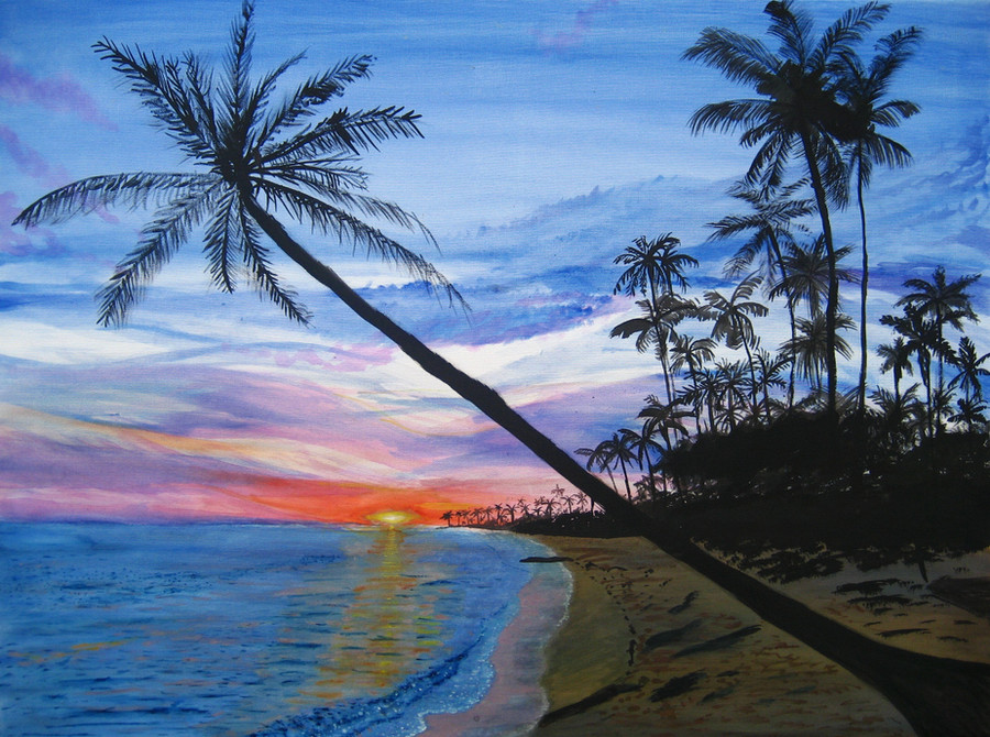
 azeemb — Paradise
by-nc-sa
azeemb — Paradise
by-nc-sa
Published: 2011-11-26 13:16:15 +0000 UTC; Views: 915; Favourites: 24; Downloads: 18
Redirect to original
Description
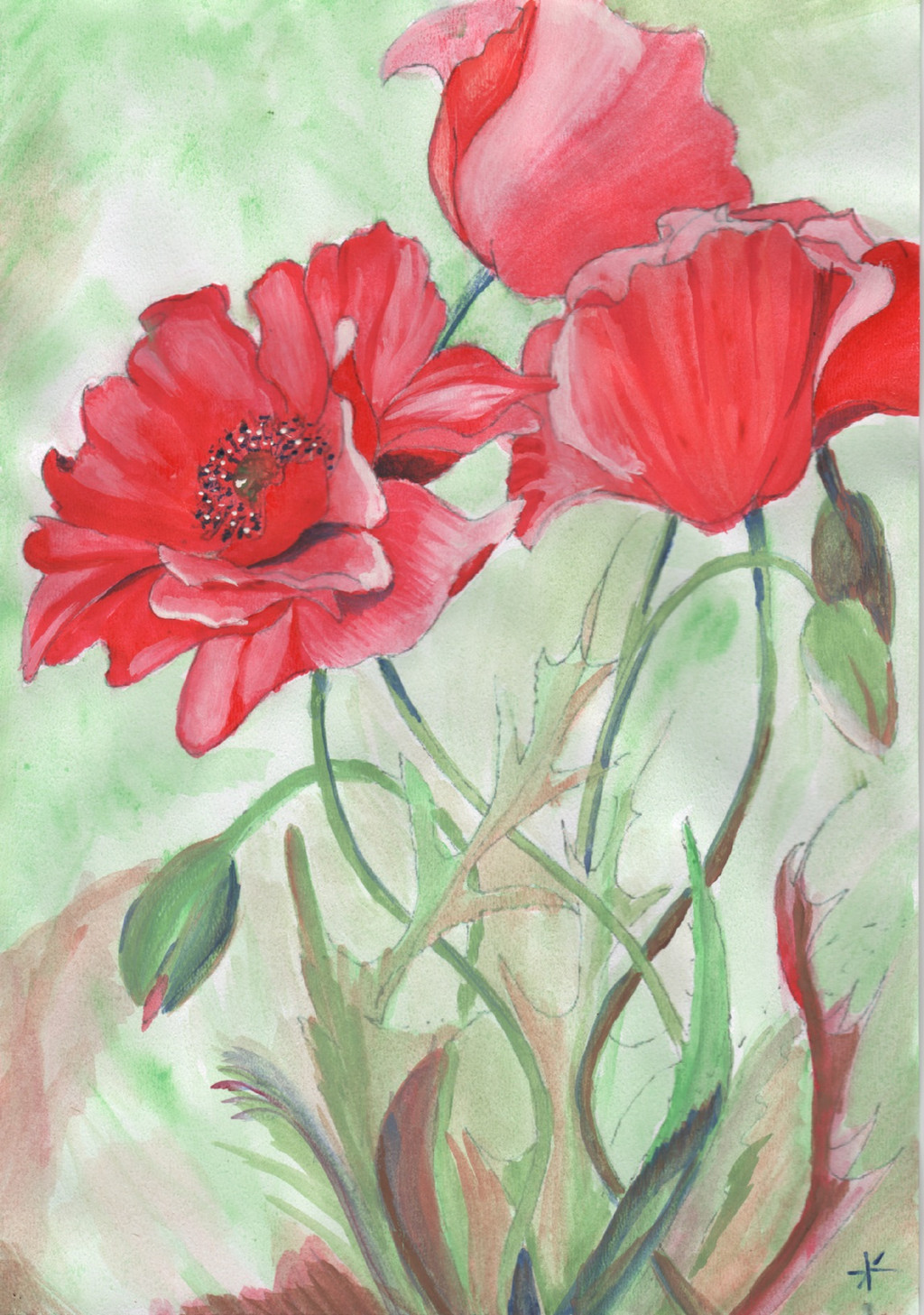
Watercolour Painting of a photo, I found here on deviant art.I did this painting a long time ago and just finished it off a little
I believe its the Maldives, i'll link to source once I've found it.
Source [link]
You can see in my painting gallery when it was painted in relation to my other works [link]
My notes
~~~~~~~
Finally got this up (:
didn't quite get the sun right was going for [link]
Related content


Comments: 32


thanks, i'm working on another one at the moment, which has a similar sky

👍: 0 ⏩: 0


Paradise! I love the beach! Keep up the awesome artwork!
👍: 0 ⏩: 1
 (Smile)")


i suck at land scapes, this is very well done
👍: 0 ⏩: 1
thanks
I'll probably try some again in the future.
P.s Have you ever seen work by Bob Ross?
👍: 0 ⏩: 1
yes! Bob Ross is crrrazy!
👍: 0 ⏩: 1
yep, but he makes landscapes look easy
👍: 0 ⏩: 0


I'm glad you like my paintings and thanks for the llama

👍: 0 ⏩: 1


MashaAllah you nailed it! Amazing details and colors!
👍: 0 ⏩: 1


You've really got the tones down right for most of the picture! Since the sky is that of sunset/sunrise, it would make sense that the sand is darker as well (just something I noticed because I've been wanting to improve my own colour tones 
I think the warm colours could be expanded a bit more because right now those colours are very concentrated near the bottom and some parts of the sky seem to suddenly change into a different colour. Maybe a brighter yellow could also be used since it's kind of a mustard colour right now and doesn't seem to blend well with the orange (though I don't know if it's because colour was lost through scanning/photographing).
Well, that's my input for this piece, so well done!

👍: 0 ⏩: 1
Thank you for the critique. You have highlighted many things which I will take in to account in my future work. p.s I messed the sun up  (Wink)")
👍: 0 ⏩: 1

")

Impressive colours and detail, the effect is baffling. Fantastically done! Thank you for sharing!


👍: 0 ⏩: 1
The first thing I thought I would need is purple but there isn't that much there, its mostly blue paint
👍: 0 ⏩: 1
*nods* that is what the effort to create art can do for you, it heightens the senses.
👍: 0 ⏩: 0