HOME | DD
 bahndotcom — Zero 3 Redux, Take 2
Published: 2006-06-24 07:56:00 +0000 UTC; Views: 235; Favourites: 2; Downloads: 21
Redirect to original
Description
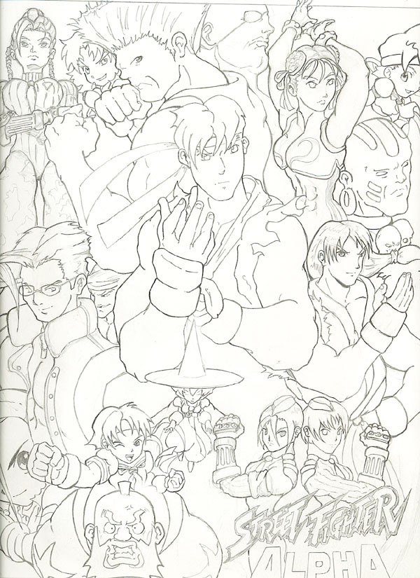
Almost perfect... (almost).Here's the second version of the Alpha group pic. As discussed before, my objective was to feature characters that weren't in the previous Zero 3 pic. The pic ended up becoming more of a Street Fighter Alpha Anthology pic -- which is why you see some of the Chibi SF characters from Pocket Fighter.
I'm mostly satisfied with this pic, but Ken didn't turn out quite as I expected and his imperfections weren't realize until after I had already finalized the linework. And I stuck Adon in there and it just looks "tacked on". What was I thinking?!?! Oh and to make things even worse -- the picture was drawn on 11x17 paper, but the scanner isn't large enough to capture the entire potrait... resulting in unwanted clipping. -_-
Grrrr... I'm not going to color this pic because such flaws can't be overlooked. Yes -- I'll be taking another go at this project; I'll closely analyze who I intend to keep around and then go from there. (Practice makes perfect, no?)
Comments are naturally welcome of course.
Related content


Comments: 7

...poor adon. will this make his self-esteem sink?
naah

👍: 0 ⏩: 0

yay! you're workin on this one! i think it looks awesome n_n you are soooo great with lineart *bows* perfect poster image. i really hope it ends up in colour.
👍: 0 ⏩: 0

I think is came out nicely! Adon... is that the one with the eye patch? I agree, and improvement from the first.
I guess if you really plan on doing another one, that's fine. Yeah, tighten it a little more towards the bottom. The top half is really full, but there is empty space on the bottom.
Otherwise, I see little flaw in this, proportions look right, poses are nice, an excellent piece!
")
👍: 0 ⏩: 1

Adon is the small character I snuck in between Charlie (character with glasses) and Ryu. As for composition -- I'm probably going to move Ryu a bit further down or so that way I don't need to feature so many characters on the bottom or what not. Definitely plan on doing another pic and reflecting upon the aspects I like against those I don't.
Hero: Corey Lewis eh? Never heard of him, but I appreciate the compliment.
👍: 0 ⏩: 0

Now I know whose style you remind me of! Corey Lewis - he's doing the Udon comic Rival Schools right now.
👍: 0 ⏩: 0

wow, thats alot of characters. This is definetly an improvement over the first one.

👍: 0 ⏩: 1
thx - the next version will be somewhat tighter. and that one, I plan to color.
 (Smile)")
👍: 0 ⏩: 0