HOME | DD
 balnibarbi — Princess of Fortune's Roulette

Published: 2011-11-06 05:17:23 +0000 UTC; Views: 830; Favourites: 32; Downloads: 0
Redirect to original
Description
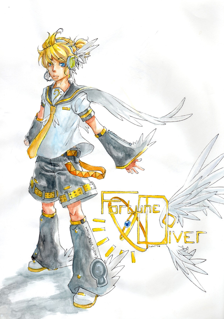
I made a Hero for a Tiger and Bunny contest. (I think I missed the deadline though)You can see the card here: [link]
I got really good at drawing logos. I memorized the ones for Hyatt and Shiseido...
I wanted to stick the Coca-Cola logo on her somewhere just to be an asshole.
Related content


Comments: 11

i love the fact that you gave her the frilled collar, gives her a really Vegas showgirl kinda feel. 
And her face's got the goods. Like, I can hear the cheesy catchphrase now-- "Your luck's just run out!" or something.
👍: 0 ⏩: 1

Definitely! I didn't want to put the actual card symbols on her outfit, since in the show Kriem has that. But it worked out. Thanks so much! And yeah, that would be the best catchphrase, ahaha!
👍: 0 ⏩: 0

She's cute
My OC is sponsored by Coca-Cola :3 Though I haven't submitted him, he's supposed to rival Blue Rose (if you can get the joke xD)
👍: 0 ⏩: 1
Yeah, that was the intention I had, haha. But I figured that would be a bit too cliched.
👍: 0 ⏩: 1
Aw, some cliches are nice :3
👍: 0 ⏩: 0


Ooooooh holy crap Balni, your complete colored illustrations always just blow my mind, augh~ * A *
What a crazy-awesome design, and such awesome shading on top of that, augh! I love the colorscheme here--you used such basic colors but did so much with them, augh!

👍: 0 ⏩: 0


I rerally hope you made it in time(and that you win)
👍: 0 ⏩: 0

Love her! 
👍: 0 ⏩: 0

Ooh. This looks really cool. I dunno if you did it on purpose or not, but seeing the strokes (look like markers?) adds a lot of movement to the whole thing. It has a very cute, playful attitude!
👍: 0 ⏩: 0