HOME | DD
 bashcorpo — Slippery Surface

Published: 2005-01-23 20:25:13 +0000 UTC; Views: 25637; Favourites: 412; Downloads: 1606
Redirect to original
Description
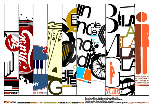
A little typo-art about the unpleasant surprise of frosty weather!")
'Surface.. zero degrees celcius. Parking Lot.. slippery asphalt under the electric lights of the frozen winter's night...'
- that's poetry for ya'...!

Related content


Comments: 181


Love the colours used and the type flows together very well, nice job. Fav.
👍: 0 ⏩: 0


 (Smile)")


wow thats really cool! this is so much more interesting than school poetry > why cant it be like this? haha
👍: 0 ⏩: 0

Haha! This is ab-so-lute-ly kickass XD;. Instant fave~!
👍: 0 ⏩: 0


that's so cool!! wow, I didn't think I'd ever see concrete poetry out of 7th grade - this is soo much coooler
👍: 0 ⏩: 0


Woow, this is wonderful <3 I live for typography X)
👍: 0 ⏩: 0

 (Wink)")


Diggin' the humor in this, and the play with type.
Words echo message.
The way you arranged them. It really communicates the idea well. Makes me feel like I'm slipping...
: ]
👍: 0 ⏩: 0


can i ask u something. what is the name of that font???
👍: 0 ⏩: 1

if you tell me that you were actually inspired by your personal experience in falling on the ice when getting off your car in a parking lot I'll create a small (digital) altar for you in my gallery
👍: 0 ⏩: 0


Featured in this weeks Typographic and Graphic Design Features: [link]
+fav! Excellent work!
👍: 0 ⏩: 0

fun stuff 
👍: 0 ⏩: 0
")

Oh, you're from around the Dubai area? 'Cause a friend told me about a year ago he had seen it too... The story is a company stole this plus other works from users here on DeviantART to use them on official school notebooks and various similar print works.
Would you maybe be able to take a picture of it or scan it somehow? Especially if you see any contact info or company names of the distributors.
Thanks a bunch in advance and even more for your sweet comment! It means a lot

👍: 0 ⏩: 1

wooow i did not know that
THOSE BASTARDS !!!!
absoloutly i'll take a pic of it
i knoooowww there are more designs of the same company
it says its made in u.a.e
but i'm from Qatar :S
i'll take a pic now & send it
👍: 0 ⏩: 1
thank youuu a billion!! just send it to my bashcorpo@sol.dk when you can.. you're the best!
👍: 0 ⏩: 1
i'll upload it to my scraps it'll be faster
👍: 0 ⏩: 2
Okis yay, I see it.. thank you again so much! I'll try move on with the info you've given me, and then hope I'll be able to get in contact with these people.
You've been at great biiig help here, and I will of course make you any graphics / photos you'd like.. just make a wish and I'll do my best to fulfill it

👍: 0 ⏩: 1
omg your so awesome .. not at all man i did'nt do it to get something in return .. hope u get in contact with them .. thank u so much
👍: 0 ⏩: 0
its there .. go check it out .. i also took a pic of another notebook .. & all the logos i found
👍: 0 ⏩: 0


Ya know, thinking about this, the only thing I’d actually suggest could use some improvement is the circular gradient in the background. It’s banding pretty badly. If you were to take that into Photoshop and add a touch of monochromatic noise (like 3-5%, say) that might fix it.
👍: 0 ⏩: 1
hey stephen, the reason for the bad gradient you mentioned was due to my old crappy monitor that just darkened it all up so i couldn't see, but i've got hold on a new monitor in the meantime and it made the problem very clearly indeed, so thanks a bunch for the tip i'm just sorry it took ages for me to correct and reply to..
but instead of blurring up the bands (which didn't at all look as planned) i've decided to just remove the gradient completely and make the background clean. i hope that'll work out too, and thanks again ^^
👍: 0 ⏩: 0
thank you so much for you favs, watch and comment! i'm mighty glad u like my works
👍: 0 ⏩: 1
You’ve got some great stuff in your gallery. I’ll be back to fav more of it when I get the time.
👍: 0 ⏩: 0

ehehe thanks a bunch! glad you like it
👍: 0 ⏩: 1
| Next =>