HOME | DD
 beanhugger — Tea Date in the Courtyard

Published: 2007-08-03 03:52:47 +0000 UTC; Views: 2533; Favourites: 50; Downloads: 50
Redirect to original
Description
Wow.
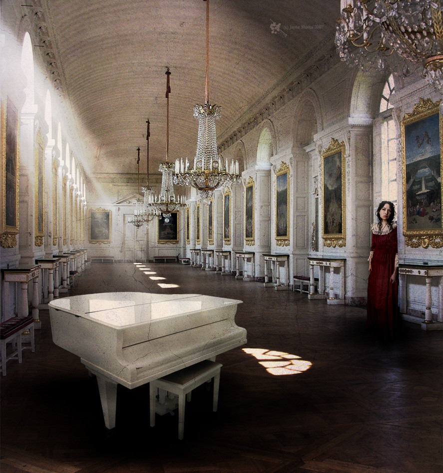
Jeff and I just spent a good 15 minutes discussing how this piece should be arranged, based on our very different personal opinions. (Mine being the dominant one of course, since I put in all the time to create the piece!) I recognize that the subject is dressed in a Victorian-esque outfit, and that the general feel of the piece is vintage, so it would be natural to make this a portrait; however, I love negative space and didn't want her to feel too cropped. (After all, her feet are already missing- I'm just no good at painting in what isn't there to begin with.) On the other hand, Jeff felt that all the negative space was unnecessary and that because of her manner of dress the piece should be cropped as more of a portrait. I experimented with cropping it his way, and then flipped back and forth to see what I liked better- I personally think this is the better layout. His way looked very nice too.
If anyone else has any opinions on the matter, feel free to say so!
 (Smile)") Otherwise, please just enjoy.
Otherwise, please just enjoy.STOCK
Girl- 2 separate pictures from ~THT-stock
Companion- Dog & Jeans from sxc.hu
Chair- ~puddlzstock
Background- combination of ^radioPooh , ~Tracie76Stock and Misty morning from sxc.hu
Texture- =muted-pain
Brushes- ~Trisste-stock
Related content


Comments: 27

OMG, she is SO creepy! 
👍: 0 ⏩: 1


👍: 0 ⏩: 0


👍: 0 ⏩: 0

Hello!
Congratulations, this work has been featured at "Visual Senses" article: [link]
Please, do not comment here, but only under the news article.
Thank you and wish you more fantastic works!


👍: 0 ⏩: 0

Blah blah blah, fine, I'm wrong.
I was worried it wouldn't be balanced like this, but the fact that it's brighter on the right balances it for me. Looks good.
Thanks for asking for my opinion even though you rejected it anyway.
👍: 0 ⏩: 1
Haha, Jeff- right now you're making fun of me from across the room for denying that I "rejected" your opinion, but I swear I didn't! I just like this way more.

👍: 0 ⏩: 0

Very nicely done -- and I like the use of the negative space, too. You've incorporated a lovely surreal/dreamy quality that really makes the picture.

👍: 0 ⏩: 1


👍: 0 ⏩: 0


but it's photomanipulation not photography
there's a section for Conceptual in the Photomanipulation category too

👍: 0 ⏩: 1
👍: 0 ⏩: 0

I think the negative space option is better indeed 
The combination between the vintage model and the negative space works great in my opinion and it gives the piece a very eerie surreal atmosphere
👍: 0 ⏩: 1
Thank you very much for your opinion! I feel I made the right choice with it, but if I ever change my mind at least I know that I can edit it easily.
👍: 0 ⏩: 1
I always appreciate experimenting madness, I think it's vital to find your own style , and to always bring something fresh and new to it once you find it!  (Wink)")
👍: 0 ⏩: 1
Well, that's a good goal to have! I'm trying my hardest.
👍: 0 ⏩: 0

Nice combination of stock, and I think the composition is fine like this. Nice colours, and a good feel. Why is this in photography when your other work is in photomanip though?
👍: 0 ⏩: 1
Uh oh! I put it in the wrong category! 
👍: 0 ⏩: 1
")

Thank you very much!
👍: 0 ⏩: 0

Negative space is brilliant! I'm glad you didn't crop
👍: 0 ⏩: 1
")
👍: 0 ⏩: 0