HOME | DD
 bearcavestudios — Concept - Plains of Jaalin map
Published: 2006-10-03 13:01:33 +0000 UTC; Views: 2507; Favourites: 32; Downloads: 8
Redirect to original
Description
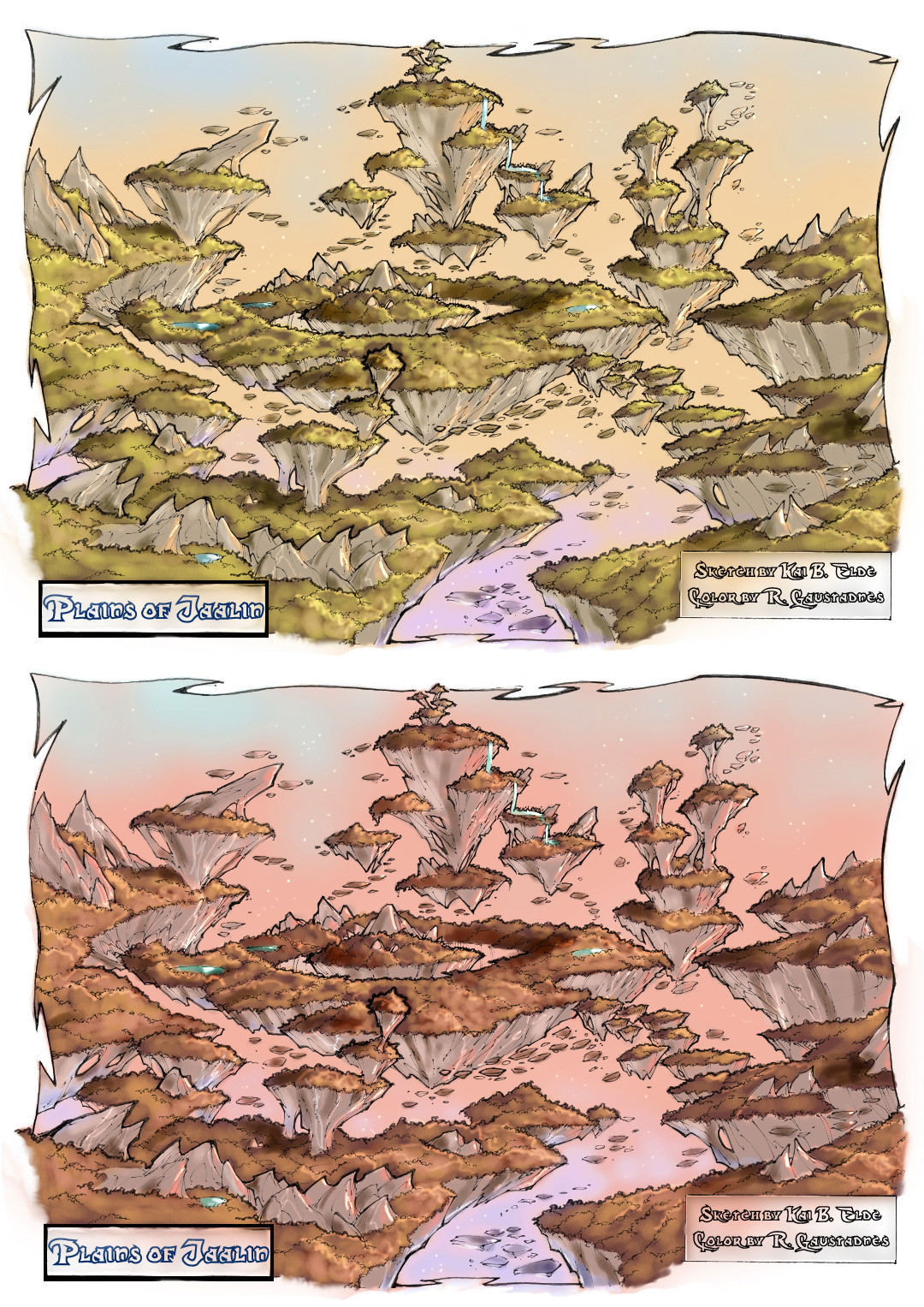
Sketch by the talented Kai Bjørnar EldeColor by Raymond Gaustadnes aka Shockbolt
Concept colored sketch of the Plains of Jaalin. This is the "playground of Boriak, Alaric, Timi etc.
Came up with several color themes, this is the two "best" of the 1,5 hour speed coloring I did this morning.
Let me know which one You think is the best of the two
Divided sketch into two layers, color on the topmost layer, 1.5 hours total
PS6 and tablet ( You just wait til You get Your hands on one Yourself Elde )
Related content


Comments: 33

Interesting! I see you guys doing a hudge project like we are ")
Maybe we can support eachother, huh?
👍: 0 ⏩: 1
I ment big project
 (Wink)")
👍: 0 ⏩: 1

ahh OK, yea I stopped by your page - its a HUGE project!! Looks great..
👍: 0 ⏩: 1
Sorry for my mistake in ENG - huge word .. sorry onece again for this mistake ...
So, what you say for a little supporting here at DA eachother?
👍: 0 ⏩: 1
What exactly are you thinking??
👍: 0 ⏩: 1
Maybe some support in journals?
👍: 0 ⏩: 1
I guess we could do that.. Any spesific thing you want me to write.. NOT TO LONG!!!
👍: 0 ⏩: 1
you may add something like that:
Mystery of Albesila – that’s right! I guess that a lot of us already know that title, or if not – than must had heart about it. Ambitious noncommercial movie production with extremely creative team! Just take a look at this -
👍: 0 ⏩: 0


very nice detail and nice coLOurs u used there...FAAAAAAAAAAVEEEEEEEEEE
👍: 0 ⏩: 1

that would make a good game level.. for fighting too
👍: 0 ⏩: 1

This looks a lot better colored! Much less confused!
Unless there is some specific reason to have a red atmosphere, i prefer the first one with the green tones!
But the red one looks great! Very surrel!
👍: 0 ⏩: 1
THANKS, yea we also think it looks much better like this
👍: 0 ⏩: 0

there ya go! now that looks good. the color is good, that's to Shock, but you did the concept and now it's there. Awesome!
👍: 0 ⏩: 1

Love it!
Both are good, but I prefer the first one.
👍: 0 ⏩: 1


Nice job! As for the coloring, I guess I prefer the bottom version.
👍: 0 ⏩: 1

looks amazing dude excellent work!!!  (Smile)")
")
👍: 0 ⏩: 1

Is the world supposed to have a particular glow to it? The two maps look like a difference in day and sunset, otherwise. If the world naturally has a red glow, stick with the bottom image. If it doesn't have a red glow, the top is the best (really shows the green).
👍: 0 ⏩: 0

i really like the second one, the red one, really seems more surreal and fit for the characters
id also like to add that - adding color really makes the sketch more understandable lol, with the sketch it seemed like a rocky asteroid field or something
haha <3 ur art
👍: 0 ⏩: 0

Enda bedre. Men synes det er litt mye trær, kunne vert mere "dill".
Ok jeg vet jo ikke helt hva det er kart til men.
👍: 0 ⏩: 1
som sagt er det en test.. stay tuned
👍: 0 ⏩: 0
