HOME | DD
 BeautifulEscapsim — The Next Day
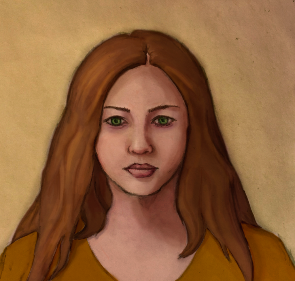
#emotional #portrait #resolute #sadness #subtle #woman #womanportrait #determination #lost #sunlight
Published: 2018-05-10 21:01:22 +0000 UTC; Views: 604; Favourites: 17; Downloads: 0
Redirect to original
Description
The next day doesn't seem to make any difference.Digital painting from a sketch that I did. I had intended the sketch to be for drawing practice for a variety of lighting situations, but I think it's better as a piece on its own. It's subtle, but I hope, emotionally complex. Constructive feedback is more than welcome on this piece, and thanks to everyone who commented!
Now it's part of a series of oil-inspired digital portraits , which I am currently accepting commissions on .
Referenced from a stock photo from kirilee
(see the process here )
Related content


Comments: 26
 (Smile)")

I appreciate that, I thought a lot about how I wanted them to look
👍: 0 ⏩: 0

You are welcome my kind friend!
👍: 0 ⏩: 0

Hi I am Robert from project comment,
I will attempt to give you a very detailed and constructive critique on the concepts behind creating this piece, as I see you would like to progress to a higher degree in design and digital media, good luck with your ambitions.
I must say you have the skin tone and transitions in hue working well. I see this piece started from a sketch, What will boost the realism is high contrast dark to light, subtle highlights in the light facing cheek the nose and forehead. a high intensity highlight across the lower lip to give some depth, a less intense edge to upper lip,
Always consider facial features as having three dimensional form, we can only recreate 2D in digital, but the brain is able recollect the other dimension, It needs some effective 2D markers, in the form of highlights and shade, for best visual impact to the viewer.
When using a construction sketch as a basis, place it on another layer. Try to tone them down or hide them in the final gathering this will also boost realism. The hard lines between surfaces; cloth to skin should be coherent created in such away that it too has a shade or highlight giving a 3D look to this layering.
Regarding the hair ,what I find works well for hair is a flat base colour then strategically placed highlights not too intense, gradually shifting intensity to create the fading effect for the rest of the hair in clumps or use pressure sensitive tablet . best to do hair highlights on another layer, so as to control the intensity. it is most important to know where the light is coming from. direction, angle, hue and intensity. There is scattered light which still reaches shaded areas at a much lower intensity. I see you have some understanding of this but you need more contrast to be confident and definite about the available light characteristics.
The proportions a good,however try to choose subjects with a slightly turned face, this will help you understand the asymmetric nature of a symmetrical object when rotated, as this will give an even morel realistic outcome in the whole piece.
Once again, good luck with your art ambitions.
Robert
👍: 0 ⏩: 1
Hi Robert,
Thank you so much for your very detailed critique! I would have thanked you sooner, but I was traveling and wanted to make sure I could give your comment full attention. Among other things, you are particularly correct that a straight-on face and shoulders almost always has less appeal than a slightly turned pose.
Again, thank you for your thoughts!
👍: 0 ⏩: 1
You're welcome Beautiful,
If you would like a second eye over your work, just send me a note, I'm only too glad to help.
Robert
👍: 0 ⏩: 0

Once more, thank you!
👍: 0 ⏩: 0

Good Evening! I am from: , and I am here to help you with whatever I can regarding your artwork.
First thing I want to say is, I love how you shaded the skin; it really brings the viewers eye in along with the beautiful green of her eyes. Very nicely done! I also really like how you did the lips, not too much detail, but enough to know that they are what they are. Again, very well done in my opinion!
I only really have three edits for this, so let me tell you what I think. To begin with, I really think you should put a little more detail in her hair. With such a pretty, well-detailed face, I think she needs some hair to compliment it. I don't think a ton of detail needs to be put into the hair as to make it too distracting, but just enough so it looks more realistic.
The second thing is that I think her shirt could use a little more shading. Again, not too much, but just enough to make it look more realistic.
Lastly, her eyes could use a little light. Though your figure is quite pretty, she seems kind of lifeless. A simple highlight or two in her eyes will fix that, I'm sure!
Overall, this piece is very pretty, I just love the shading of the skin! Please continue down your artistic path, and I'll see you later! Bye!
👍: 0 ⏩: 1
Hi, I really appreciate the time you put into this critique! I will definitely consider more detail on this and other works for the shirt and hair. The slight lifelessness/lack of highlight in the eyes is deliberate, though- she’s meant to seem somewhat devoid and even sad. Thanks so much again for the time and thoughtfulness. ^_^
👍: 0 ⏩: 1
Aww, you're very welcome! I'm glad I could help!
As for the highlights, I suppose if you're going for an expression of devoid and sadness, the highlights in the eyes could be avoided. I guess since I see a lot of artist add highlights in the eyes of their figures, I thought it was a must...I could very well be wrong.
👍: 0 ⏩: 1
Yeah, absolutely!
I think the thing about art is, nothing is a "must" – differences are where style comes in, after all but it was a good mention, because if I had just forgotten it, I probably would have felt it improved the piece enormously
👍: 0 ⏩: 1

Nice work, i think she is little to wide in the shoulders. i really like her face tho, and those green eyes ...mysterious
👍: 0 ⏩: 1
Thank you! And I appreciate the feedback. Shoulders are always a little weird… I did use the 3 heads=shoulders rule of thumb, but they might be a smidge wide
👍: 0 ⏩: 0

It's a bit dark but that's all the critique I can make. The face is balanced and the overall is lovely!
👍: 0 ⏩: 1
As always, I appreciate the feedback! One point of clarification, dark as in not enough brights, or dark as in not enough contrast? Thanks for the other compliments
👍: 0 ⏩: 1
I'd say... both? I mean, when you'll add light you'll also add contrast. For instance if you lighten the background, this will increase the contrast between character and background ^^
👍: 0 ⏩: 1
I think I gotcha. Not lighten the whole image, but increase the areas of brightness. You were right, it helped the composition a lot! Brightening the background really made her stand out, too. I also went ahead and threw in a few darker shadows to make the light feel more directional.
Thanks again for the feedback!
👍: 0 ⏩: 1
Better indeed! Well done!
👍: 0 ⏩: 0

