HOME | DD
 BigJimmyC — Mumashii Toki
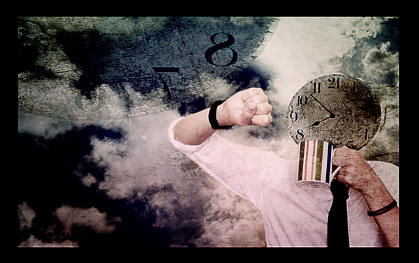
#clock #coffee #time
Published: 2007-12-01 19:30:21 +0000 UTC; Views: 1268; Favourites: 20; Downloads: 16
Redirect to original
Description
"空しい時間/Empty Time"Originally I intended this to be a scrap for the fact that it's such an unoriginal idea. I'm almost 100% sure I've seen a guy with a clock head looking at his own wrist watch.
I'm also semi-dissatisfied with the piece itself. Don't get me wrong, I do enjoy it but probably only because I've slaved over this piece for a long time (along with two others). I may retake the photos in it because I'm unhappy with the angle, it's too flat and boring.
My biggest insperation on this piece was probably *BaddogLtd . I think when I was working on this I had him in mind and wanted to do something like him but make it more pop.
Pre-Critique: *BaddogLtd , ~VonDerV
Related content


Comments: 28


really deep colours. love this piece. should be hung up in a gallery.
👍: 0 ⏩: 0

interesting piece. i dunno, i quite like it. especially all the grungyness
 (Smile)")
👍: 0 ⏩: 0

Well I can't recall seeing it before but I agree with you, it has very probably been done. What I would do here, if just changing this picture, would be to change the angle of the 'face' to be facing the wristwatch a little more, since he doesn't have eyes. I love the fact that you take the pictures yourself!
What language is the title?
👍: 0 ⏩: 1

Thank you! I agree. The perspective of the clock was really hard. I did try and fix it but I rushed through it and did a poor job.
The title is Japanese. I usually use Japanese titles for concepts that arent natural to me but this time I used a Japanese title for the look and the play on words. It's far more easier to play with words in Japanese than it is in English.
And thank you for leaving me such a great comment. It makes me feel better when people point out negative and good points of my pieces.
👍: 0 ⏩: 1
I take it you speak fluent Japanese then?
It's weird, I prefer to use english because I think that the words have more meanings than in the Swedish language. Are we straying away from our native languages for a specific reason?
👍: 0 ⏩: 1
I’m not fluent but I speak enough to get by sometimes.
To me, language is a tool to add to my pieces (especially in the form of a title). If A subject or topic is different to my usual nature or not something that's not understood, I'll try and carry that over to the view just the same. So by them looking at this strange title they too will as urked as I was by the idea. In the case of this title though, I wanted to do a play on words. As character for "Sky" in Japanese also means "Empty." I could have easily titled it "Tokei no Atama/Clock Head" head or something along those lines but I wanted something lighter and fun, so I did a small play on words to keep a bit more intrest.
I hope I made some sense. I'm so poor at explaining my ideas and I really really enjoy that you ask questions. I hope I can pick up this habit from you, I'm good at giving a critque on something but actually asking questions and learning more about the artist and the piece is something I fail to do.
👍: 0 ⏩: 1
That's great, I think that the title can add a second dimension to a piece and really make it come alive.
I've noticed myself that I enjoy when people ask questions about my art, the conversations both concerning the process, my thoughts and possible improvments give me the most.
👍: 0 ⏩: 0

Sorry it took me so long to pipe up and say something... I've been trapped in a study cave the past few days.
I like how this came out Jimmy, the skill in blending everything here is really impressive. I like the hues in this especially; I think they match well with the whole theme of time in general, specifically 'empty time'. Even the texture adds to the theme well, and it is all blended together nicely with strong composition. It really creates and extends that initial mood and theme which is created by the elements in the shot. Great work!! I can't say there is anything I don't like about this piece, and I don' think I'd change anything either.
For the record... my favorite pattern/lighting/contrast area is the top right... and I love that mug for some reason too.


👍: 0 ⏩: 1
Im in love with that mug. It has such weird colors. I was going to use the regular old white mugs we have but I wanted a bit of color to the piece, since everything is pretty much stale. I think the hardest part was the bleding. I had a few areas which really didnt seem to fit well and it was mostly in the arm that's extending out with the watch.
Thank you again for such wicked critiques!
👍: 0 ⏩: 1
Yeah that mug rocks!
Took another look around the arm... wicked job.. it certainly doesn't show
👍: 0 ⏩: 0

This idea does seem familiar, but even so this is very well realized. I think the figure pose is fine, it works to show guy looking at watch. Nicely done.
👍: 0 ⏩: 0

Jimmy your tokei is very beautifull! :] That is my advanced Critique damn it.
👍: 0 ⏩: 0

Great concept Jimmy. I am amazed at the photoshop skills I am a freakin' digital retard when it comes to this stuff.
Here is the only other depiction of a clockhead I could find [link]
👍: 0 ⏩: 1
Hahaha, I'm a digital retard too. If anything good comes out it's by pure luck and accident. I do miss taking just regular photos for fun though and not having to worry about going into photoshop and fixing every flaw I see.
That link is really weird, hahaha. Flying bewbies anyone.
👍: 0 ⏩: 0

the concept is interesting indeed. but I think this should go to photomanip category
👍: 0 ⏩: 0

")

I feel so proud of being your pre-critique
I love it! I love it! I love it!
")

👍: 0 ⏩: 1

Your deviations are allways try the hardest way!...Baddogltd is an important deviant and I folow him loyally!..But belive me, even he will say that was a good composition...
👍: 0 ⏩: 1
Thank you! I wish I tried a bit harder on this though but it didn't come out bad. I'm definantly thinking of retaking it!
<3
👍: 0 ⏩: 1
Up to you my friend but I think it is good enogh...But you are the artist
👍: 0 ⏩: 0

i agree that this isn't as good as it could be, but it is the beginnings of a good idea. i think perhaps that the idea is a bit too pop to go with his dark style. it's not easy to mix the two. I would seriously consider re doing the photo to give it more dimension. that would bring out a better contrast between the two styles.
👍: 0 ⏩: 1
Definantly. There are mores ways to make more appealing and pop, as well as give it my own little flare. I love how you leave some of the best comments!
👍: 0 ⏩: 1
i do what i can. besides, i know you're looking for a real critique.
👍: 0 ⏩: 0

i havent seen a piece like this before but really this is great work i agree with you about the angle but its really not bad. great work!
👍: 0 ⏩: 1
Thank you captain! I think there are a few peices with clock headed people around. I think it would have been more original for me to give the guy a dildo for a head instead, hahaha.
👍: 0 ⏩: 1
nuh uh there are millions of dickheads walking around all ready.
👍: 0 ⏩: 0