HOME | DD
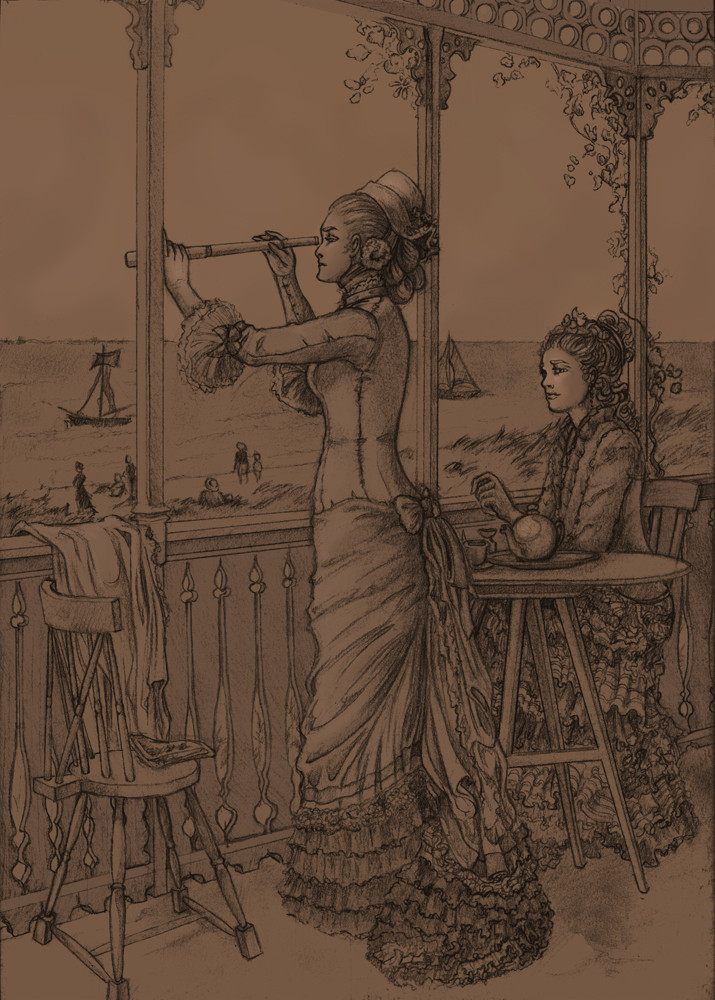
 Birgitte-Gustavsen — Study of On the Lookout
Published: 2008-08-02 20:16:20 +0000 UTC; Views: 1105; Favourites: 23; Downloads: 16
Redirect to original
Description
I’ve been planning to do some studies in the future of various kinds, and the old classic of using reference was the first one. The original for my study is On the lookout by Frederick Hendrik Kaemmerer (1839 – 1902). You can see a version of the painting here [link]I can’t seem to make those delicately partly turned faces right, they just turns out as plain profile or slightly wonky profiles. That chair is also much too small, but by the time I realised how badly there was just too much that would have had to be undone.
Colour might suit it better, but I’ve rather run out of patience with this one. How poor Frederick found it is beyond me, personally I suspect it of being commissioned work myself
 (Wink)")
Well, the next time I decide to make a study of old work, I think I’ll try for something a little less detailed
")
Related content


Comments: 10

Hey Brigitte, i like your "old" studies. Sometimes its good to change abit to find again equilibrium. Feedback is usally very rare, so we dont know always where we are standing in our art. I know from my own experience, that speedpaints and too many brushes or too many texture effects can give you an illusion, when the reality is another. Please try again with this Victorian-fashion art. They are delicious.
edit: trying again something old isnt necessarily a step back.
👍: 0 ⏩: 0

 (Smile)")


as StephieSama said, in yours, the ladies have a lot stronger expression, looks less static than the painting....you put a lot of attention to details, I like how you 'reconstructed' things, i mean, how the people in the beach look like people instead of reproducing the paint brush strokes in the painting
The head of your ladies look a bit more bigger, that makes it look different too....positions where you can see the area under the chis are painful to do....well..i cant
but...i really like it, I like how you use pencils too, the way the lines look, specially on the folds
👍: 0 ⏩: 1

I could have sworn I replied to this one
Well, I’m pretty sure it went along the lines of thank you for your thorough comments
")
👍: 0 ⏩: 0

Wow, amazing detail on this. The dresses--I'm just in awe of them.
👍: 0 ⏩: 1
Thank you. The dresses were indeed an excellent education in patience
👍: 0 ⏩: 0

Perhaps it's because your's isn't oil paints, or maybe it is because you changed the angle of the faces, but your version has a much more modern feel. I think it's because the women actually seem to be actual people, rather than emotionless subjects. Your woman with the telescope seems to look through it with intent and actual purpose, not just casually glancing through it like the woman in the original seems to be doing. And the seated woman- I'm still wondering what is is I see in her look. Perhaps some jealousy or contempt... Whatever it is, I totally love it.
👍: 0 ⏩: 1
A very generous interpretation
")
👍: 0 ⏩: 0