HOME | DD
 Black85 — ColorTestCulinaryArt

Published: 2007-07-10 22:13:41 +0000 UTC; Views: 1828; Favourites: 36; Downloads: 27
Redirect to original
Description
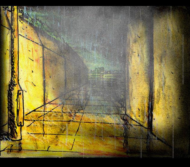
Color test for the illustration I've been working on part time!Related content


Comments: 34

Wow, what a great Idea.
i also think that cooking is a kind of Art. Like this very much!
👍: 0 ⏩: 1

The cooking stuff would need to be blown up for the purpose of the illustration... I like it indeed though.
👍: 0 ⏩: 0

mmmmmmmmmmmmmmmmmm, delicious!!
Love the drawing!!!
You made a form and created the character inside, right?
The colours are great too!!!
(so sorry my english is not...)
👍: 0 ⏩: 1
Yeah it is pretty much the way I draw now, Silhouette shape, and then details... It is fun to try making the details a bit off the shape so it looks somehow flat at some levels!
👍: 0 ⏩: 0

 (Smile)")

Nice work fellow animation maniac
Love the etchy line style, quriky characters and colour choice. The main character is nicely framed. If I absolutely had to suggest any change it would be maybe to tone down a little the red bottles on the top of the cabinet? I think keeping the more intense colours near the area you want us to focus like you have down with the flame.
Keep up the good work. I wish i could check your animations but for some reason they dont seem to work...(or im doing something wrong...!)
--
In my own little crazy world, and you are welcome to visit!
[link]
👍: 0 ⏩: 2
Thanks for the comment and advice!! That's really sweet darling
👍: 0 ⏩: 0
Thanks for the comment and advice!! That's really sweet darling
👍: 0 ⏩: 0

haha thanks! I'm still stirring the colours in my mind...
👍: 0 ⏩: 0

this digital?
hows work going? you already all moved in with your bro?
i just came back from a holiday with my girl, went to Turkye, now it's raining back here in Belgium hehe
she just got her grades back from this year, first year in college, she failed on most of them, had to confort her, she's ok now
(dunno y i'm saying this ha)
hey, i even love all the favorites you got..
you already seen Ratatouille? it releases her the first of august
👍: 0 ⏩: 1
This is digital for the colouring! The trick to make it feel like watercolor is to use a wacom tab, a brush with bleeds in photoshop and put a texture in Overlay blending over it!
Yeah I saw Ratatouille!!! Man this was amazing in all the ways! the only thing I didn't like is the translation in french I got! I would have prefered to either see it in english or french from France! For your girl (you mean, girlfriend?), a good fuck is usually the best cure for everything! She will need to study more and spend less time with you I'm affraid! I quit my waiter job and restart the credit card thing I was doing last summer! I'm still drawing-wasted... Can't wait for it to come back!
👍: 0 ⏩: 1
hmm, im gonna try that photoshop trick
cus [link] is doing digital all the time, and it looks SOO traditional, i love the look
so texture in overlay..
yeah, that's true, you has to do a bit more during the year; but she lives in another city during the week, so most of the time she's going out with her friends over there
i'm doing a thankyou wallpaper to her dad (we stayed there in Turkye), i'm doing it in 50's animation style
some real fun blogs:
[link] = i bet you know him, pixar animator, does the Linguini voice
[link] = dreamworks animator (girl)
[link] = some guy (fun style)
[link] = blog about the book (we got it at school) i love love love it!
take care buddy
👍: 0 ⏩: 1
Yeah actually Betteo taught me that! Look up his scrap he has tutorials! Thanks for the links they're REal cool!
👍: 0 ⏩: 0

OH that is too cute*! 
👍: 0 ⏩: 1
funny... I'm actually a lot inspired by a comercial guy! Willie Real, my new idol (added to all the other ones)
👍: 0 ⏩: 0


Si tu veux qu'on voie vraiment bien ce qu'il fait sauter dans sa poêle, tu devrais les mettre beaucoup plus en évidence que ça. Right now j'suis plus attirée par les pots de peinture sur le top des étagères, qui, selon moi, sont de moindre importance. Le mec en arrière-plan est pas important non plus. Bref... je saturerais les couleurs des objets dans son poêlon, pis le cuisiner, pis le reste je le ferais plus terne.
N'empêche, c'est nice.

👍: 0 ⏩: 1
J'ai pas coloré rien dans la poêle. C'est un test pour tout le reste qui entoure la poêle. J'étais juste tanné puis je voulais voir les commentaires sur ce que j'ai de fait. Tu as raison pour les saturations! Merci
👍: 0 ⏩: 0


Nice colors! I really like the face on the guy in the back.
Sorry I haven't been commenting on some of your stuff recently, I've been busy cleaning out my room and closet (which is really packed). I only have a few days to get my entire room clean for some relatives to stay in, so not a lot of time to draw or do fun things for me, including check deviantART.
👍: 0 ⏩: 1
d'ont worry, it seems to be a general attitude during the months of june-jully... Everyone is art-depressive or doing anything but creation! Even the studios are closed! I feel empty and I guess everyone feel the4 same. I can't draw a thing without it looking stiff. Anyways, lets profit of that summer to get in shape!
👍: 0 ⏩: 1
Hey, I'm already in shape! You callin' me fat?
")
👍: 0 ⏩: 1
Yeah COW! Haha, I don't know what you look like and, frankly, your drawing skills would make them all bend over anyways!
Talking of the oposite sex...
human...
unless you're an hermafrodite... gghuuu
HAHA
👍: 0 ⏩: 1
it is just a test, I'll do it with water colors when I'm sure of everything!!! Thanks for the appreciation, as usual!
👍: 0 ⏩: 1

you just put soo much work into your art, tests etc. Its inspiring
👍: 0 ⏩: 1
Research is more important than anything! It shows how much research has been done when you look at a piece!
👍: 0 ⏩: 0

Ça manque de contrastes, l'oeil sait pas où aller, et l'action du personnage principal est difficile à décoder, essaie de mettre ça en emphase avec un contraste de luminosité plus prononcé (mettre la gauche, le plafond et le perso secondaire plus foncés), je pense qu'il y a moyen de mieux encadrer l'action décrite dans l'image.
Je me demande aussi si la brush que tu as utilisée est appropriée pour le crosshatching que tu as fait, il me semble que ça ajoute à la lourdeur des visuels, ou bien c'est la saturation des couleurs qui est peut-être trop élevée, je suis pas trop sûr. Mais quand tu fais un traitement de ligne de ce genre, je crois que tu dois le mettre davantage en valeur, surtout parce que tu l'as bien fait, essaie pas de le noyer comme ça.
👍: 0 ⏩: 1
ouaip t'as raison, c'est que j'essaie de dupliquer l'effet d'aquarelles! Je fais des tests sur l'ordi avant de colorier le vrai dessin!
👍: 0 ⏩: 0