HOME | DD
 blackeagleonline — LookofToday

Published: 2006-01-01 17:09:47 +0000 UTC; Views: 2532; Favourites: 67; Downloads: 790
Redirect to original
Description
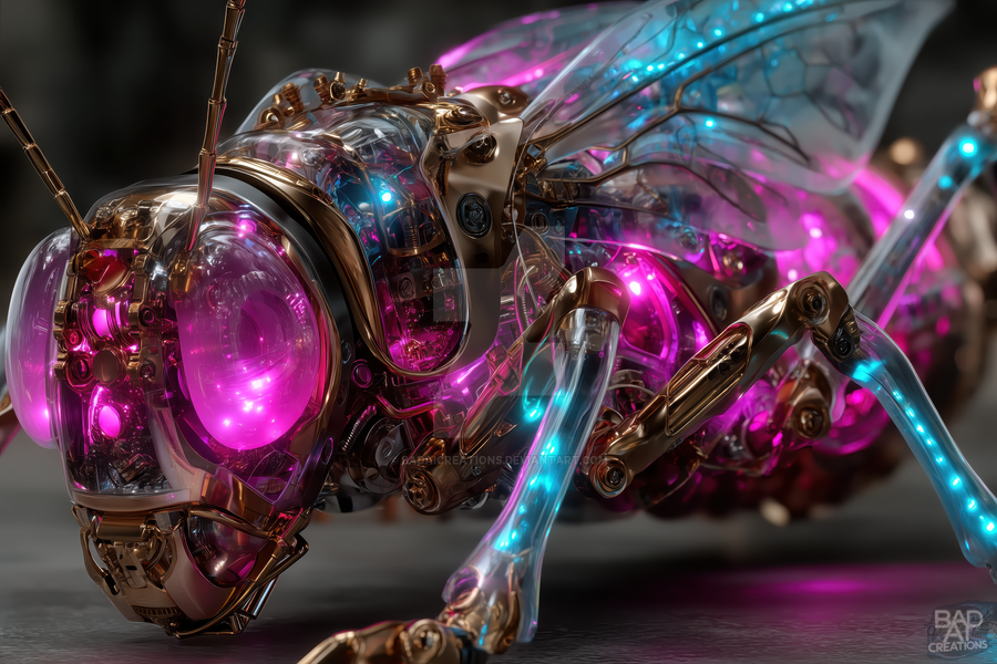
just testin a new styleevokeone
Related content


Comments: 45

it's good that you'r tryin different hgins man, thats the faste way to evolve. what about the piece? i like it, good colour pallete and forms. the only thing you could work more is typography
👍: 0 ⏩: 0

pretty amazing mate, really loving it. Fantastic detail.
Also, hope to see you around EJ when its up and running again!
Later mate.
👍: 0 ⏩: 0

definitely gives off a feel of passion for me. Wonderful work and use of space too 

👍: 0 ⏩: 1


I'm liking this new style, colours are great and I really like this.
👍: 0 ⏩: 0

")

cool man! alleen jammer dat je em geinvert hebt nu zijn de kleuren niet zo mooi, maar wel anders dan normaal
de rest is supervet!
")
👍: 0 ⏩: 0

And a pretty good style it is too.. I like the way the circles are integrated into the image, and I quite like the blurring of the duplicated render too.
👍: 0 ⏩: 0

vind em lekker clean en heel anders dan wat je normaal creeërt, verrassend
👍: 0 ⏩: 1

__Keep it up buddy

👍: 0 ⏩: 0

Hijs best gaaf, al had ik wat meer 2d gedaan als ik jou was. Nu ben je beetje snel uitgekeken

👍: 0 ⏩: 0


great work as always. I like the new style you're working on here the long spikey pieces work well in filling the piece while the render itself is 'simpler looking' - not actually simple, but looks simpler, if you know what I mean. love the lighting again
👍: 0 ⏩: 0


the name Van Vuuren or Van Buuren?
anyways pretty sweet style.
elegant and flowing.
just the way i like it.

👍: 0 ⏩: 1

my name is van Vuuren and no that has nothing to do with the trance asshole behind the tables van buuren
👍: 0 ⏩: 1
lmao guess you get asked that a lot.
Wasn't really wondering for that reason, though it crossed my mind. Just have a couple friends with the last name van Buuren and the county I'm in is Van Buuren. never heard of the other one until now. Was just wondering if it was just a simple typo or an entirely different name.
thanks for the speedy reply.
lookin forward to the next piece.
👍: 0 ⏩: 0


frickkken slick stuff here. so sexy il ove the colors and the sleeek shapes great stuff!
👍: 0 ⏩: 0

I think you could make some more pieces in this style eric. Cool work
 (Wink)")
👍: 0 ⏩: 0


This new style is pretty damn good mate, like this one alot. Fav for sure.
👍: 0 ⏩: 0

awesome very sexy
i'm in love with the colors
text looks a little pixelated tho
👍: 0 ⏩: 0


heb ik ook gedaan om deze kleuren te behalen, het orgineel was donker grijs met groen, en toen ik klaar was had ik zo iets van jah het ziet er wel leuk uit maar dit is al zoveel gebruikt, dus d8 ik wat tegenovergestelde was, en das roze, en ik denk das veel mooier en orgineler als groen, maar jah  (Smile)")
👍: 0 ⏩: 0

tbh vind ik het niet zo
het lijkt nogal alsof je er op einde gewoon een invert layer over hebt gegooid
je kunt beter vink
👍: 0 ⏩: 1
heb ik ook gedaan om deze kleuren te behalen, het orgineel was donker grijs met groen, en toen ik klaar was had ik zo iets van jah het ziet er wel leuk uit maar dit is al zoveel gebruikt, dus d8 ik wat tegenovergestelde was, en das roze, en ik denk das veel mooier en orgineler als groen, maar jah
👍: 0 ⏩: 0


i just found this looking around and i must say its sooooooooo nice hun i love the colours and everything deffo a
👍: 0 ⏩: 1

but whhhhhhhhhhhhhhyyyyyyyyyyyyyyy did you invert this ?!?! it was so much better before.
👍: 0 ⏩: 0