HOME | DD
 BlahRascal — Coffee and Vinyl

Published: 2015-03-14 23:30:05 +0000 UTC; Views: 208; Favourites: 6; Downloads: 3
Redirect to original
Description
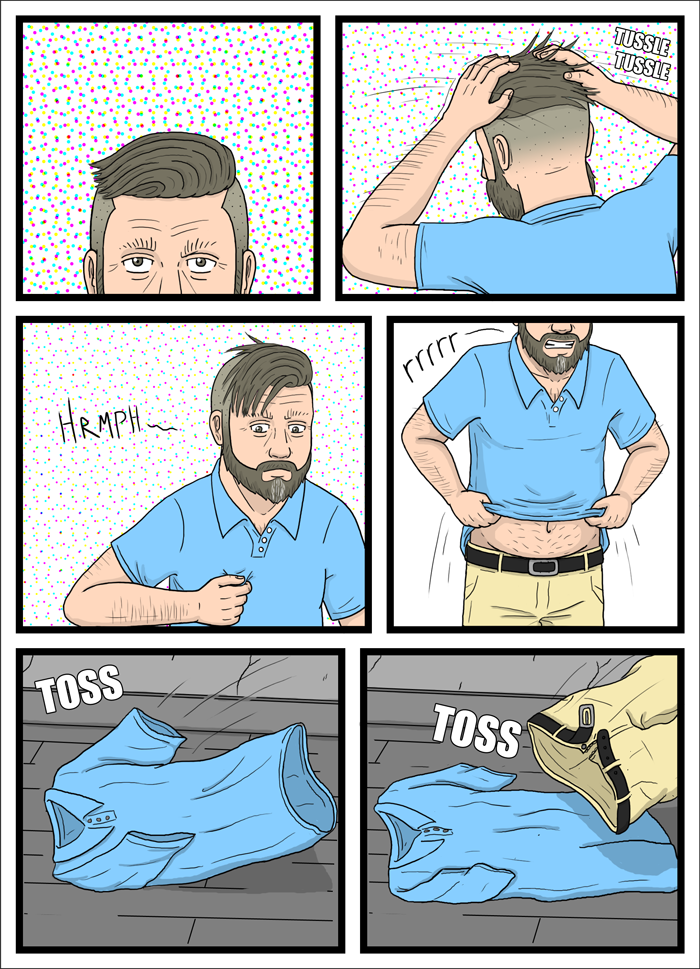
So I think this is the final version of one of the prints I'll be selling at Flame Con, but before I set it in stone I wanted to workshop it a bit. The plan is to charge maybe 5 bucks for an 8.5" by 11" glossy kinda thing, but I'm going to be getting a large format printer pretty soon so something bigger isn't out of the question.I don't know, what do you think? Questions, suggestions, criticisms, concerns?
Related content


Comments: 15

If you're selling prints, make sure it's laser printed so the colours don't fade.
👍: 0 ⏩: 1

I've been looking into the Epson Artisan 1430. I hear good things about it and it seems to be pretty ideal for comic-type prints and stuff.
I'll definitely take all the advice I can get though. It's all a bit overwhelming, to be honest!
👍: 0 ⏩: 1
Home printing is usually inkjet, and businesses usually have laser jet.
I just know that if you sell inkjet pics as prints, they will fade quickly in the light (6 months to a year) and will disappoint.
I sold some prints last year. I went to a proper paper store. Japan has them, I don't know if they have them in North America. But a specialty shop that knows grades of paper. I bought A3 sheets and had them laser printed. It was about 80 cents a sheet, and 40 cents a print. I sold them for $8. very profitable.
For something like this, I would recommend printing your 8.5x11 on nice B3 paper (if you can get it in the States), and expand your colours to bleed off the page. Then, have the print shop trim the edges so that the colour 100% fills the page. Cutting edges is usually 10 cents a cut, so 40 cents to trim a stack of prints. It would cost about $1.50 each total (smaller paper, smaller print size) and give you a product that looks professional.
It took me a lot of trial and error to get to this point  (Wink)")
👍: 0 ⏩: 2
Wow man, thank you. This is all very excellent advice. The paper issue is still what I'm most undecided on right now. I'm leaning towards a more glossy finish, but I've also heard people swear by more semi-gloss types.
👍: 0 ⏩: 0

This is very good advice.
Go for a professional printshop, someone that actually employs people who know about printing.
👍: 0 ⏩: 0
Awesome, and a little cheeky.
Please don't take any offense from this.
I get the intention of having Daniel squeezing his shoulder blades together, but currently he looks a little grotesque.
His arms are out of proportion, they look too long and it looks like his biceps are a little on the large side.
Hope that helps, I tried to find good reference but this is a tricky pose.
Maybe you could approach artists you admire and see if they could give you some pointers?
👍: 0 ⏩: 2
I just updated it with a slightly tweaked version. Still could probably use some work, but I feel like it might look a liiiiitle better? I mean like, what even is anatomy, right?
👍: 0 ⏩: 1
Pssh, yah, right?
I think it's looking more human.
You're a brave man, that's a truly tricky pose, I salute you.
btw, just found this cartoon image that may help, about halfway down the page.
Helping!
👍: 0 ⏩: 2
Thanks man, this actually helped a lot. Or I feel like it helped a lot...I dunno. Anyway, I've tweaked it a lot more and comparing it the original I feel like it's at least a little better!
👍: 0 ⏩: 1
Looks heaps better.
Here's hoping it sells well for you.
👍: 0 ⏩: 1
Thanks man, I always appreciate the kind words. I'll probably end up messing around with it a little more before I send it off, so if you have any other suggestions definitely don't hesitate to share. Thanks again for the feedback!
👍: 0 ⏩: 1
No prob, maybe set up a camera on a tripod (real or makeshift) and try to take an image of yourself, that's always the most convenient and useful reference.
👍: 0 ⏩: 0

I agree with Snail (although I've only seen the corrected version). Maybe the neck curves too much?
👍: 0 ⏩: 1
Yeeah, I'm still having trouble getting it right! Do the arms looks okay to you, or do you still think they need some tweaking?
👍: 0 ⏩: 0
No offense taken at all, that's exactly the sort of input I was looking for!
I did have a lot of trouble finding a good reference, to be honest, and the proportions of the arms in particular gave me a lot of issues. I'll try to tweak it a bit and see if I can make it look a little more...human?
👍: 0 ⏩: 0