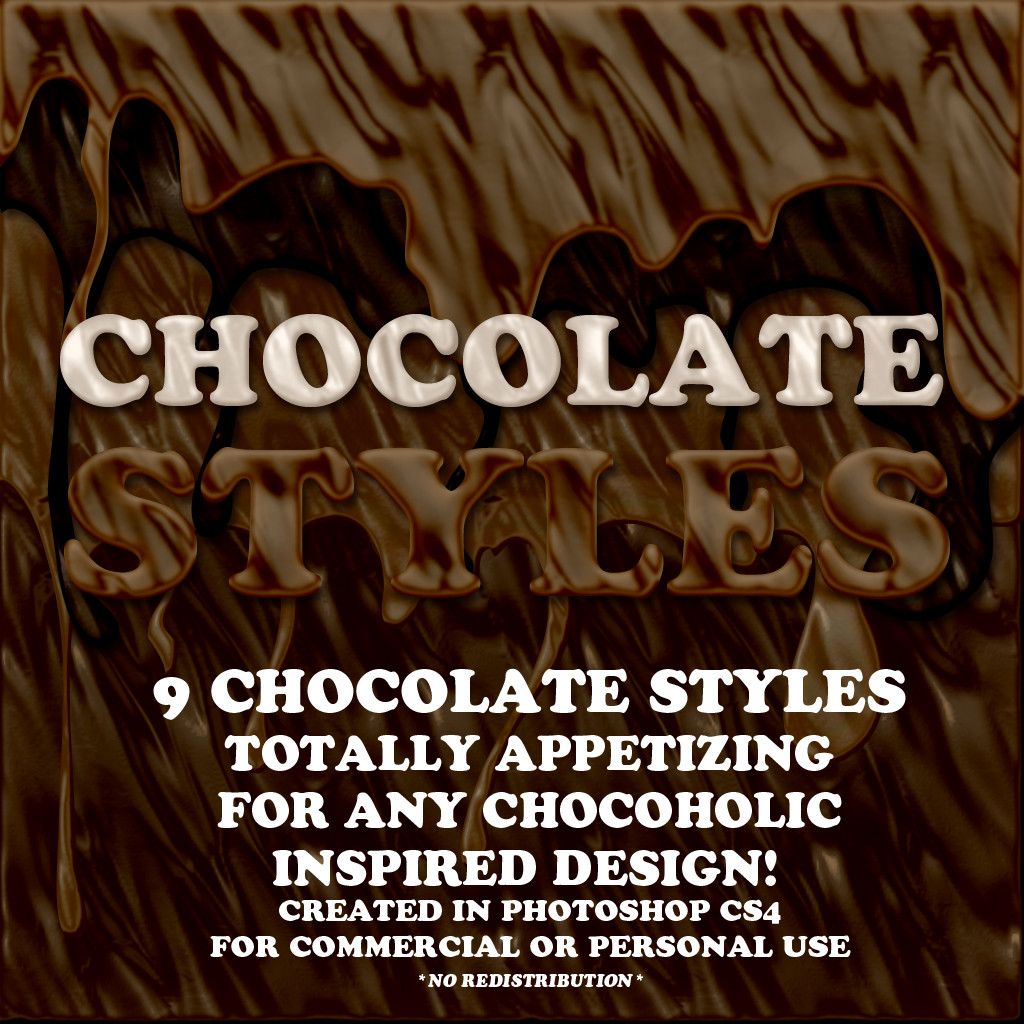
HOME | DD
Published: 2005-10-11 05:01:49 +0000 UTC; Views: 6378; Favourites: 65; Downloads: 775
Redirect to original
Description
I'm feeling really cynical and pissed off today in an OCD manner. Or maybe thats the flu? Dunno.Either way, enjoy.
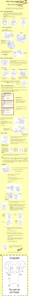
1st Comic Page: Property of ~slave2F8
2nd Comic Page: Property of ~blank-death
3rd Comic Page: Draw in 50 seconds by me, ~blank-death and inked crappily by ~slave2F8
This was inspired by another sarcastic tutorial by another deviant....something about a how to draw cats....I lost track of hers. If anyone could tell me, it'd be appreciated.
SIDENOTE: I wanted to list EVEN MORE COMICS/MANGA, but then I woulda run out of room.......I also despise hypocrites who seem to generalize anime/manga with HUGE SHINING EYES and such. That's like saying anything with four wheels is a GOOD CAR. It just doesn't work that way.
DISCLAIMER SO I DON'T GET BANNED: IT'S MY OPINON
AN ANNOYING EDIT YOU SHALL ALL SEE:
Rather than making you all tread their way thorugh TOKYOPOP's miasmatic [I MADE UP A WORD!!] pages, here are the links to VIEW the things I speak of. I must warn you though, REFRAIN from BUYING, DIRECTLY/INDIRECTLY supporting these people's COMICS IN ANY WAY, 2 of em already got $10,000 for their "AMAZING ENTIRES". Instead, go to your nearest bookstore and read the pages, and feel free to inflate you ego/pride, it deserves it. :]
Mail Order Ninja aka the Visual Abomination that is apparently worth $10,000 in the eyes of TOKYOPOP: [link]
MBQ: It might be more 'complex' looking than that of Mail Order Sludge, but then you realize, its been done about a thousand times before and a thousand times better; in fact, I found a comic [manga] from 2001 in which the begininings are extremely similiar and the main character is practically a more human reflection [and does not have a fancy racial tag attached to him]: [link]
Both are rather shallow and extremely hypocritical, if I had my way, they would be limbless torsos. I would also add in senses, but they have none. Enjoy.
Another comic to visit which has been rightfully ignored would be Shutterbox and PEACH FUZZ. I guess you could call these the feminine side of the crap spectrum.
These two on the other hand just plain out SUCK.
If you see anymore, feel free to tell me, but to what I currently see the other ones are fine [if not visually than with content, or better yet both].
Related content


Comments: 71
blank-death In reply to ??? [2010-05-16 05:04:05 +0000 UTC]
Oh dear, well this day was bound to arrive...
Ironically enough I cannot find any decent links for any good-sized visual samples of the mentioned works.
Welp, time to try and google-fu some more, thanks for telling me though.
👍: 0 ⏩: 1

Yeah, I was wondering how crappy the artwork is. I mean, I personally have called out a lot of Tokyopop stuff as crap, but I thought that's just me being picky.
👍: 0 ⏩: 1
blank-death In reply to AngelERenoir [2010-05-16 23:43:43 +0000 UTC]
Here are some tiny samplers for Mail Order Ninja:
[link]
[link]
The funny part is that I believe these are from the RUNNING issues which have "better" art than the winning entry.
Here is MBQ, which is better looking (comparatively): [link]
[link]
Allegedly Felipe Smith's art has improved but this is based on something I heard about him doing actual Manga in Japan...however I have not really seen/heard anything else about it, so I honestly wouldn't know.
If I had to name objective criticisms about both of these (setting aside GLORIOUS STYLE and content execution), it would be that their lines blow and that everything/everyone looks significantly OFFMODEL all the time. Another thing would be godDAMN the overdone screentones.
👍: 0 ⏩: 1
So which one is good and which one is bad again? I thought the first two linked pics are decent. The third link don't work (404 error) and the art in the 4th link... Well, it looks more like a strip in the paper than a comic page.
👍: 0 ⏩: 1
blank-death In reply to AngelERenoir [2010-05-17 04:45:48 +0000 UTC]
As I said, the thumbs don't convey it well, but if the links could show at proper/physical book size that all the lines look like they were quite literally made with the line tool. And there is no "good" one they hover around the same point of "bad" just one is marginally not so horrible.
Regardless I cannot think of many who would pay $10 per book for this quality of artwork as neither have notable writing or mind blowing premises (kids with access to KOOKY things and GOTTA BE A MANGA/COMIC ARTISSST!).
As for why I think MBQ is "better" (I use this term very very loosely) its because it is a one-man show who's at least trying to avoid the "well lets try to badly mimic mainstream anime from the 90s" and because he's (or was, five years ago) fairly young. Another thing to keep in mind with Mail Order Ninja, aka the first two links, is that it is a Writer+Artist team, it took TWO people's creative efforts to bring it to fruition, if they were young I'd cut slack, but they weren't and aren't.
I hope that clears things up and frankly don't sweat the 404d image, it was just the a jpg of the cover of MBQ.
👍: 0 ⏩: 1

lol. This is the funniest tutorial I've looked at so far. And I agree with waterdancer. Peach Fuzz is lame.
👍: 0 ⏩: 0

Funny tutorial!
Ah... I definantly agree with you on this one. Tokyopop's manga line is just one of those great mysteries that I will never fully understand. You see, I know that there are good artists out there... but tokyopop just manages to haul out all of the crappy comics... The only American stuff that I found intrigueing was Dramacon and Vampire Kisses
👍: 0 ⏩: 0

Love your tutorial, and I HAD to click it because you used one of my favorite phrases! Just about everyone in my family has been dubbed a "foolish mortal"! Lol, great job!
👍: 0 ⏩: 0


XD i know! MBQ and Mail Order Ninja fail. They shouldnt be published.
👍: 0 ⏩: 0

Erg... this is what drives me crazy about Tokyopop's so-called manga!
I get that they're trying to market graphic novels, but they're a MANGA publisher for pete's sake! Since when did they decide to start marketing American-style comics, comics where there is good art but is isn't in manga-style and just all out CRAP??? I'm not saying titles like Peach Fuzz or Bezinghast (sp?) are bad, they're actually okay. I just think that some of the others, like the new one, Avalon High would be better off being published by a diffrent company.
I was going to enter RSOM, but I dunno now. When I think about it, it seems most of the entries are too "Americanized", and I don't want to be critized as being an artist who publishes one of THOSE comics...
Blah...Now that I'm done with my little rant, I'd like to congratulate you on this wonderful tutorial.  (Smile)")


👍: 0 ⏩: 1

... :/ American manga isn't that bad. It's just the crap that Tokyopop accepts that's bad.
👍: 0 ⏩: 1
Hm..You've got a point about that...
Now that it seems like they're actually getting some better-quality stuff in, hopefully they'll come to their senses. If they don't, hopefully the good will be able to balance out the poorer stuff that they've been publishing.
I apologize if my previous comment offended you; I was really ticked-off when I wrote that because I'd just read a manga produced by Tokyopop that I really didn't like and it happened to have been created by an American artist...
👍: 0 ⏩: 1
No prob. I agree.
👍: 0 ⏩: 0
blank-death In reply to chibigirl45 [2007-10-26 21:44:11 +0000 UTC]
It's all a matter of opinion. A majority of the "American Made" manga that RSOM has produced does not impress me....and yes I have read the overflow of "teasers" of them that they happen to spew forth. There are a couple winners but many of them I begin to question what was going on. (Besides, this spawned from irritation, and nothing "good" comes from being irritated.)
Here is a bullet-point justification/clarification.
Mail Order Ninja: Nice, a comic made of Line Tool...what I always wanted and what I LOOK FOR IN EVERY COMIC/MANGA I wish to purchase! I usually try not to judge something on "appearance" but there is no story or characters or...much of anything to offset it.
MBQ: Rather COINCIDENTALLY it rather looks like a manga I once read that was published in 2001; also who doesn't LOVE 1980s humor? It's so cutting edge it CUTS ITSELF. I'll pass on the "genre that attempts to be satire and fails because it reads like a LiveJournal with POINTY VISUALS".
Peach Fuzz: It resembles the fruition of a "How to Draw Manga" (which in on itself is a poor example, as it CLAIMS to try and "mimic" the style and doesn't do that).
Shutterbox: (Not an RSOM but why not throw that in?) Read a volume of it and wondered what was going on in the creator's head.....
Others: There are many others, but I would prefer not to waste anymore space.
Now for what I *consider* good reads...aka the gems of RSOM:
RE: Play - Art, story, characters and everything else is there.
Mark of the Succubus - Unique in that it doesn't TRY to be like the "other manga".
Offbeat - Once again, strong in visual style and story style.
Hopefully this will help you understand why I was so "harsh" and see no need to "loosen up". There are always "winners" and "losers" in this and I'm *stating* how I *personally* see it.
👍: 0 ⏩: 1

ohhhhhhh now i get it
hehehe whoops...
👍: 0 ⏩: 0

y'know- the sad thing is- the "winning prize entry" is still about 200 times better than what i can draw. D:
👍: 0 ⏩: 1
blank-death In reply to HaganeOokami [2007-08-08 06:35:52 +0000 UTC]
MAIL ORDER NINJA IS MADE OF FAAAAAAAAAIL
AND MBQ IS MADE OF ART THIEF
👍: 0 ⏩: 2

HOMG YES. oh, man, i was reading this again for kicks, and i was ROFLMAOOOO. well... i wasn't on the floor, but there was definitely some serious R and LMAO.
👍: 0 ⏩: 1
blank-death In reply to slave2F8 [2008-01-07 01:42:32 +0000 UTC]
lawl, you should also see the spelling and GRAMMAR errors too....but yeah fun times. Anger is comedy with violence!
btw isn't the progress AMAZING?
👍: 0 ⏩: 1
Hey you're back! : D
yes, yes, that is indeed true. which is why YOU (or gramma) SHOULD SUBMIT SOMETHING AND SHOW ALL THOSE PEOPLE WHAT ART TRULY IS!!11 *sugar-high*
👍: 0 ⏩: 1
blank-death In reply to HaganeOokami [2007-08-08 08:18:47 +0000 UTC]
the blonde one took the advocate pages and is inking them
👍: 0 ⏩: 1
: D~~~~~~! *writhes on floor in ecstasy*
👍: 0 ⏩: 0

When I first came across this, it made me laugh so hard
But then I just realized now that I didn't fave it.
Problem solved.

👍: 0 ⏩: 0

BEST TUTORIAL EVAH!
Tokyopop has some good titles, but I can think of very little. I mean c'mon...peachfuzz? It's fuckin' ferrets man...

👍: 0 ⏩: 1
blank-death In reply to lovethepimphand [2007-01-24 04:45:45 +0000 UTC]
I can only think of two that are actually decent. D:
I think the kind heads of Tokyopop should...use that thing between their ears in a more logical manner.
Ah well, thems the breaks. D:
👍: 0 ⏩: 0

lawlz, that is fabulous, i will be using it as a reference XD
👍: 0 ⏩: 1
blank-death In reply to Love-is-evoL [2007-01-22 06:57:04 +0000 UTC]
lawl is right, WE MUST SPREAD THE RSOM. o_o
👍: 0 ⏩: 0

This tutorial is AWESOME!! Everything is simple and great XD
👍: 0 ⏩: 1
blank-death In reply to JackKeahi [2005-11-16 00:57:38 +0000 UTC]
Uh, glad you found it useful?
👍: 0 ⏩: 1

Funny!! ")
the cat one you're talking about is it this one [link]
👍: 0 ⏩: 1

This is the first time I've seen a tutuotial on comic plot and story here. Faving it because it looks good even though I've only scimmed it!
👍: 0 ⏩: 0


Right on, man.
RSOM makes me so pissed, because of the obvious lack of talent in the submissions and the horrible AMERICANIZED "manga".
*gag*
I'd rather just publish on DA, thank you very much. :3
👍: 0 ⏩: 1
blank-death In reply to faerie-chan [2005-10-17 23:40:28 +0000 UTC]
I think the only exception to the rule would be Van Von Hunter, and maybe one other one, but the better/actually good ones are publishing with other companies. Some are just smart like that.
I'd do that too. Unfortunately, TOKYOPOP still has more publicity than DA.
👍: 0 ⏩: 1
A shame. ._.
I personally didn't really like Van Von Hunter...
👍: 0 ⏩: 1
blank-death In reply to faerie-chan [2005-10-18 07:06:48 +0000 UTC]
Eh that's okay, I like it. At least the illustrator/author is humble unlike the rest, and that in itself is worth some extra points.
👍: 0 ⏩: 1
That's always a good thing. :3
👍: 0 ⏩: 0

ya, i cant beleive peach fuzz got ANYTHING it was SO effin lame. mail order ninja and mbq look iffy, but i havent bothered looking into them at all. *shrug* shutterbox, however, i found semi- entertaingn, but then again ive only read the 1st one. *shrug* you are rightfully venting! OH OH OH BUT GUESS WHAT!!! i got a job!!! drawin comics!!! HUZZAH!!! ya see, ya see, theres this amatuer publisher in my town... and well he hired me and my friend.
👍: 0 ⏩: 1
blank-death In reply to waterdancer [2005-10-14 06:08:10 +0000 UTC]
sure thing I guess.
Nothing like balancing out a mock tutorial with an actual one. :]
I hate both Mail Order and MBQ, if you see a 10 page, nay, 5 page preview, you shall see.
👍: 0 ⏩: 1
hee, alright! =3 *looks forward to tutorial*
👍: 0 ⏩: 0

My god!!!LOL This is the funniest tutorial ever!!!!!!
👍: 0 ⏩: 2
blank-death In reply to Alexajua1991 [2005-10-12 03:07:45 +0000 UTC]
Gald you like it! [pity it wasn't more helpful]
👍: 0 ⏩: 0
blank-death In reply to Alexajua1991 [2005-10-12 03:07:42 +0000 UTC]
Gald you like it! [pity it wasn't more helpful]
👍: 0 ⏩: 0

Oh man, I adore you 

👍: 0 ⏩: 1
| Next =>