HOME | DD
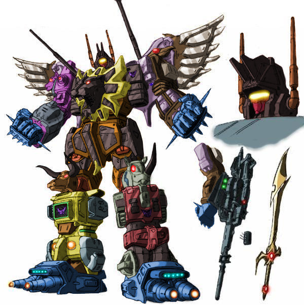
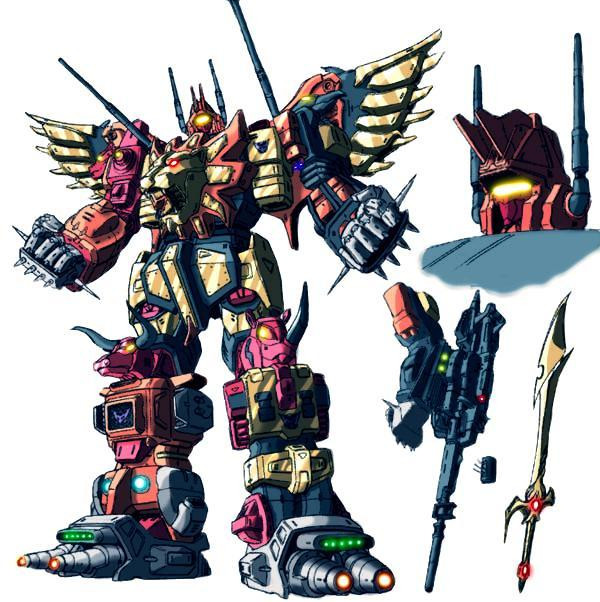
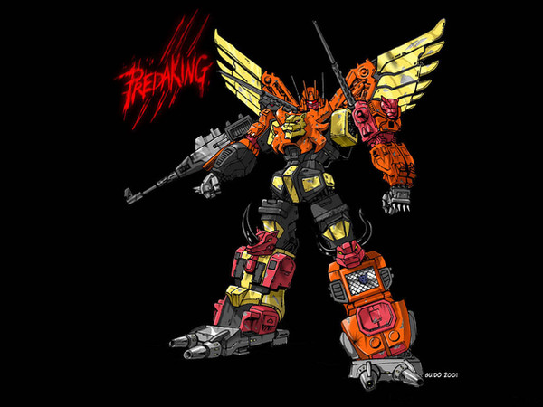
 Blitz-Wing — Predaking colours

Published: 2007-09-19 12:25:46 +0000 UTC; Views: 18909; Favourites: 386; Downloads: 2763
Redirect to original
Description
colours are done not sure if im happy with him or not but its doneRelated content


Comments: 66

Great detail and coloring as always. I really like you unique style but he doesn't look quite as intimidating as usual because you minimized the back mounted wings is all I can guess.
👍: 0 ⏩: 0


no Predaking is a transformer from way back
👍: 0 ⏩: 0

You have some truly outstanding work! Not only do you have great attention to detail, but the dynamics of the chosen poses are fantastic. I love your work!
👍: 0 ⏩: 1

Hmmm this will take some getting used to, Predaking looks alot more humanoid in this pic.
He almost looks like a native american I know I have quite the imagination huh?
I love the coloring you did on him though,.
It turned out pretty good overall blitz.
👍: 0 ⏩: 1
thanks i kinda like the tribal idea since their all animals and what not
👍: 0 ⏩: 1
indeed that was a very interesting take bro.
👍: 0 ⏩: 0

It reminded me of those old school mechs Like Dancougar, Gaiking
👍: 0 ⏩: 0

Predaking is one of my fav combiners around. Amazing job on the colors.
👍: 0 ⏩: 1

awesome pin up. but the bot seems abit scrawny to be a gestalt.
👍: 0 ⏩: 1
yeah i think its the upper legs their too long
👍: 0 ⏩: 1
imo the shoulders aren't broad enough.
👍: 0 ⏩: 0


I dig it Blitz! I've been watching all your pieces of the Prediking team individually and finally this - the big combiner! I love it bro!
👍: 0 ⏩: 1

amazing
i can just begin to think how much dice i had to roll for is damage in D&D
👍: 0 ⏩: 0

kick ass...the colors make this pic rock even more
👍: 0 ⏩: 0


welcome! I would like to see superion or defensor!
👍: 0 ⏩: 1
i was thinking of doing the stunticons next after i do a few stand alone characters
👍: 0 ⏩: 1
I would like to see superion! That was so cool.
👍: 0 ⏩: 0


love it. maybe a little more of a mettalic feel in the colors? that aside, it's awesome.
👍: 0 ⏩: 0


I really like the slimmer design, it's very effective for him. He seems a bit empty as far as his armament goes, maybe if he'd had his sword... But regardless, it's still freakin awesome! keep up the really good work!
👍: 0 ⏩: 0

Excellente once again! Predaking's now ready to kick Autobot ass! Now for the command code!
"PREDACONS - FORM PREDAKING!"
👍: 0 ⏩: 1
i was thinking it could be themed for each team
the combaticons could say have something like formation Combination while the Predacons say something like merge for the kill
👍: 0 ⏩: 1


 (Smile)")


Another impressive piece Blitz-Wing. I dig the colors and the "You, come here!" pose.
👍: 0 ⏩: 0

It's cool but there's something I think should be different. I'm not too sure what. Perhaps the head colours? I dunno...
👍: 0 ⏩: 0

")


Looks gorgeous to me, but I understand your dissatisfaction. Colors are more than fine with me. the head could have been better. The funny thing are the two fingers on the right hand: is he going to poke somebody's optics out?
👍: 0 ⏩: 0

Nice work, but I think that the lion head needs more light
👍: 0 ⏩: 0

I'm diggin it all but the face for some reason. I don't know, it just doesn't do it for me, which is funny because I actually LIKE ninjas.
Hmmm, maybe it'll grow on me?
👍: 0 ⏩: 1
yeah alot of ppl dont seem to like the head design i dont know why i kinda like it
👍: 0 ⏩: 0

| Next =>