HOME | DD
 bloknayrb — WIP

Published: 2008-11-12 15:52:23 +0000 UTC; Views: 3915; Favourites: 81; Downloads: 247
Redirect to original
Description
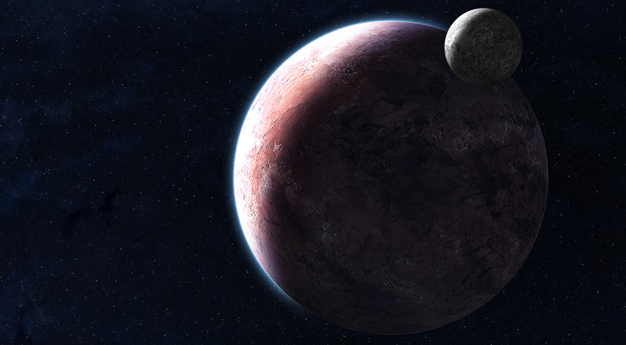
Working on this (obviously). The rings are made from a spectral map of Saturn's rings, so I can only take as much credit as is due for making them actually look like rings instead of a horizontal gradient (Wink)")
Rip this apart guys, tell me what needs to be done because I've hit a wall and don't know where to go.
EDIT: I've done some more work. Please be sure to hit download to look at the details and therefore be in a position to give more effective and accurate critique
Related content


Comments: 78

I've tried using your tutorial to create rings similar to this but I can't get it right. Do you have this planetary ring saved (or similar to this) in a .png or .psd format that I may use, giving you credit of course?
👍: 0 ⏩: 1

Hm... What about the tutorial is unclear or difficult? Maybe I can clarify a few points for you?
👍: 0 ⏩: 1
Oh no; it's not your tutorial at all. It's me. Something I am doing (or not doing) isn't right. That's why I asked if you have this ring saved as a .psd, .png or similar format. It's such a great looking ring!!!
👍: 0 ⏩: 1
Ohh I wasn't paying enough attention. This ring was actually not created using that method at all, so it's not your fault
I actually created this ring using a spectral map of Saturn's rings. I duplicated the map till I had a long bar and then used the polar coordinates distortion to create a curved version, which I duplicated and then cleaned up to finish off the rings.
I've uploaded the PSD so that you can use the result yourself (though I of course encourage you to try and do it on your own, it was an interesting learning experience) : [link]
👍: 0 ⏩: 1
Oh, I agree. I like to learn new ways to draw stuff. Sometimes I just can't put it together, you know?
👍: 0 ⏩: 1

These rings are pristine, how'd you make that light glow on the right side ?
👍: 0 ⏩: 2
wtf. thumbs dont work in comments now? It's your piece "Out There"
👍: 0 ⏩: 0
Those rings are actually based on Saturn's rings, I can't take full credit. You mean the reflection?
👍: 0 ⏩: 1
Oh well i was gonna say they're absolutely perfect. There's a glare on the rings coming from the lightsource. It looks great, you need to do more space work
👍: 0 ⏩: 1
Yeah, I took a map I found somewhere of Saturn's rings (in bar form) and messed around till they actually looked like rings. It's a good way to take a straight gradient that you like and turn it into rings, if you're willing to take the time.
And, I know you already know that most of my gallery is space art, so huh?
The glare on the rings was, if I remember correctly, a linear dodge layer painted white.
👍: 0 ⏩: 1
I see, well I'm talking about you need to produce more exaggerated pieces like :thumb140967338:
Its a beautiful piece, and other pieces in your gallery just look like you rushed them. I wanna see more mind-blowing pieces!
👍: 0 ⏩: 1

How do you do those kinds of rings?! (optinal question.) Can't help but think that the shadow is to harsh. 0-o I think i looks amazing!
👍: 0 ⏩: 1
Well for these rings I found a spectral map of Saturn's rings online. I put them in photoshop and duplicated them to make them longer (find a spectral map and you'll understand why I had to). Then I used the polar coordinates filter to make them into a semi-circle. I duplicated that layer and flipped it to make a complete ring system, and the rest was all the transform tool.
I usually use circular gradients to make rings, but I wanted to go for a slightly different look, and I think these came out pretty decent.
As for the ring shadows, you have to keep in mind that the view here is from quite a ways off. At this distance the shadow would be razor sharp, even sharper than what I did here.
👍: 0 ⏩: 0


")
 (Smile)")
really splendid. i have a soft spot for ringed planets... ;}
my only crit would be that i don't like the lens-flare effect. it distracts from the actual sattelites. and the edges of the shadow across the rings should be softened just a bit.
👍: 0 ⏩: 1
Technically the ring shadow is correct because at this distance any blurriness wouldn't be visible, judging from photos of Saturn that I've seen.
Alas, I have a soft spot for lens flares. I try not to use them, but every so often I just can't help it!
👍: 0 ⏩: 1
i'm sure you're right... but it looks so harsh...
👍: 0 ⏩: 1
I guess... I'd quote General Chang and say that in space all warriors are cold warriors, but that wouldn't make much sense here...
👍: 0 ⏩: 1
heheheh. we're all in the dark when the lights go out.
👍: 0 ⏩: 1

Coming along quite nicely!
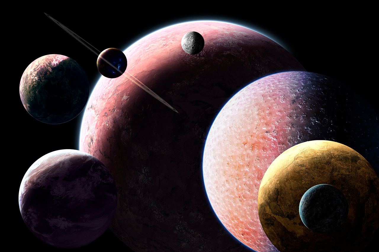
Now for the suggestions - and I haven't read the other comments, so sorry if I repeat anything that others have already mentioned. I would suggest taking away the darkening at the top of the sun as it seems to be fashioned in a very linear, reiterative manner - either this or fashioning some gases across the sun so it seems more natural. Similarly one might take away the prominence of the lens flare, that large circle in front of the gas giant is a little disheartening.
A little more transition with the asteroids would help too I think, as whilst it looks excellent, that large asteroid suddenly cutting into smaller ones does seem a little incongruent. Preferably you could have the larger one and some larger chunks/debris floating across from it, so the smaller asteroid belt is in the backdrop, with the larger one in the foreground. A slight desaturation of the planet to the left behind the rings might help, as its blue is a little dense. Perhaps a slight emphasis on that awesome aurora would make it an even more awesome feature? The sun's radiance ends in a bit of a burnt manner also, a soft fadeout would look far better - along with this there is a line to the right which seems more like a compression band than a ray, though it could be edited to look as such.
That little nebulae top left is great too - perhaps some more subtle variation in it would look nice too, perhaps some pale green/aqua toned smooth brushing (think Ov3RMinD's style) would really add to it, this sort of brushing would be nice to develop elsewhere where you've brushed also, albeit in a more subtle manner. I am also unsure as to whether that small moon would look better a tad smaller, or with an even smaller moon to the left/below of it a bit.
Eitherway looking good, hopefully the suggestions were helpful.
👍: 0 ⏩: 1
Very... I definitely see what you mean about the dark spots above the star. Those look terrible now that I'm paying attention. I actually plan on adding a lot more asteroids, as well as totally eliminating that big one and re-brushing it from scratch. My biggest gripe aside from the stuff you mentioned though, is the placement of the nebula in the top left. When I was brushing it I wasn't really paying attention, I just got so involved in adding details that I totally neglected composition. I also can't really figure out how I'd make the aurora more prominent without overdoing it... I might end up recoloring this whole thing at the end...
👍: 0 ⏩: 1
Fair concerns. I would suggest giving the aurora a semitranslucent prominence with a slightly desaturated appearance kept, so it would blend in a bit with the planet still whilst being notable. Not sure if that helps, but it shouldn't be too distracting if kept with the theme and done in a subtle manner which keeps it evident. The nebulae actually wasn't too annoying to the composition I found, although making it more subtle along with working on the rest of the backdrop could help it come along. Good idea with the asteroids, though.
👍: 0 ⏩: 1
I hear that. I've been giving it some thought and have decided to scrap this for now. Maybe one day I'll get back to it, but for now I just can't seem to work up the motivation to go any further
👍: 0 ⏩: 1
Ah alright ")
👍: 0 ⏩: 1
Maybe one day but right now I feel like I just want to start something new
")
👍: 0 ⏩: 1


Too late at night to read everyone else's comments, but in my opinion those little asteroids with the grainy detail look AWESOME, the image needs more of them (maybe even silhouetted against the main lightsource - but proceed carefully with this as it may distort the primary focus of your composition). I'm suprised I haven't seen this before, I still look at art here and there.
")
👍: 0 ⏩: 1
Yeah, I'm still working on this one. I don't know, Looking at it again I'm not so happy with the asteroids, but that might just be a placement issue... Not sure, I guess that's part of the reason I can't seem to finish this
👍: 0 ⏩: 1
The placement issue is that there are not enough of them! (imho)The rest of the image feels unfinished, blank - it needs more contrast/detail (unless you're aiming for a minimalistic composition, in which case the asteroids needn't be present). Gary Tonge has couple examples of what I'm on about... [link] and [link] . I'm sure you've already seen these but they're worth staring at for a few more hours. 
👍: 0 ⏩: 1
You're right, I just need a LOT more of them. By the way, those giant ice chunks blow me away every time I see them... God he's awesome.
👍: 0 ⏩: 1
Crazily awesome. And I very much agree with your conclusion. May I ask the technique you used by the way? (for the asteroids) they look painted... you have my msn?
👍: 0 ⏩: 1
Yeah they're painted, my MSN is bloknayrb@live.com, hit me up whenever
👍: 0 ⏩: 1

yeah some more details would be great, colors and contrast are really awesome though.
👍: 0 ⏩: 0


Atmosphere (a bad term, I know) is just perfect for space picture in this. Maybe some stars in the background wouldn't hurt, but space really is just black, empty place; not the nebulae infested rainbow hell you see on NASA's shooped pictures.
Keep it up.
👍: 0 ⏩: 1
| Next =>