HOME | DD
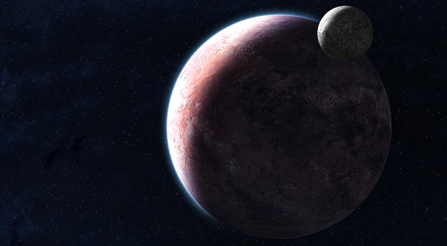
 bloknayrb — Planet Practice
Published: 2007-11-29 20:20:37 +0000 UTC; Views: 1992; Favourites: 38; Downloads: 88
Redirect to original
Description
Just some practice with planets and field of vision/focus.Rip it apart.
EDIT: Its not blurry anymore... I guess it isn't particularly realistic, and I'm no so sure I used it correctly here anyway.
EDIT AGAIN: Fixed up some small things like compositional issues
Related content


Comments: 73

Fair enough, though I don't necessarily agree. This is four years old so I hope you don't mind if I leave it as is?
👍: 0 ⏩: 1


NP! I like it, especially the planet and as it's a big planet as in the pic the shadow which is perfect should have more details like when to duplicate it then move it downer in smae direction with less opacity.
👍: 0 ⏩: 1
It's four years old, I think I'll just leave it as is
👍: 0 ⏩: 1
Not rly thought it was classical though. Anyway, hope you will remember the suggestion/tip for 4 years IF the world won't end in 2012.
👍: 0 ⏩: 0

Good stuff. How exactly do you make your planets surface texture? It looks much better than what I work with. Is there a tutorial out there (aside from the earth-like planet ones)?
👍: 0 ⏩: 1
Well my planet creation process is pretty long and involved, and no two of my planets are made exactly the same way. Basically though, I get a few very high resolution textures that I feel would look realistic as a planet's surface and then use the close stamp tool to blend them together. Making any planet is basically the same as making an earth-like planet, but with different colors. I've found that in many cases, keeping the original colors of the texture works very nicely and looks the most natural, with some slight changes for lighting and to make it fit better with the rest of the image.
The more you tweak your planet, the better it will look. As they say, time is money. The more time you spend on it, the closer it will come to looking like what you want.
If you have any other specific questions, feel free to note me!
👍: 0 ⏩: 1
Thanks for the reply.
That method makes sense. I was wondering specifically what kind of textures to use. Like are they closeups of rocks, or satellite photos, or stock textures...? I kind of took a break from that kind of art so I never figured out all of the tricks. I plan to return to it though, maybe look for some good tutorials. The Greg Martin stuff is great but only a start. I'm still looking for a good nebula tut...
anyway thanks
👍: 0 ⏩: 1
Well the kinds of textures you want to look for are actually ones that look mostly flat but with a lot of natural looking variation so that they resemble satellite photos. You can add in your own depth with an emboss layer later. You have to be careful using anything that has shadows that are any bigger than a pixel or two across because it throws off the sense of scale.
As for painting a nebula, you won't find any really good tutorials out there because it's impossible to truly teach someone anything other than the very basics. The best I can tell you for that is to just keep painting and use a lot of layers.
👍: 0 ⏩: 0

some sexy texture of course the upper one is kinda boring because its white like moon but i guess it was your intention
👍: 0 ⏩: 1


Alright, zing. Technically, this is great. But still, composition and colours, that thing that technically-minded artists who understandably want to get the planet-making and starfield-painting badges on their belt, kinda let the side down. If they're ignored at the expense of progression in learning how to draw Earth's successor, big problems occur later on when you've got the best planets in the fucking world but they just don't work in the image.
The big planet feels off-kilter, so the image is vertically imbalanced. Equally, that pinkish red and blue are around ninety degrees apart on the colour wheel, clashing pretty nastily. Other than that, the horizontal balance is spot on. Just crop the image until the space between the top and the moon's surface is the same as the space between the bottom and the planet's surface, lay down one or two colourizing layers over the top (not necessarily the "colorize" layer mode, play around with it) and you'll be dead on target for what people miss as a winner: simple scenes that transmit everything about an image efficiently instead of blowing your below-average popcorn muncher away with explosions, shuttles, vast nebulae, collisions, lightsaber battles... you get the picture.
Keep it up, man.
👍: 0 ⏩: 1
Thanks. I've been thinking about what you said, but I still like the way the blue and the pinkish-red contrast, so that aspect of the image probably won't change. I do, however, agree with your other crits, so this'll be changing soon.
Thanks a lot!
👍: 0 ⏩: 0

You´ve made a great work. The textures are well done and realistic, crips.
Just find the dark side of the planet and moon could be a little darker, unless there´s a star nearby lighting that side.
 (Smile)")

👍: 0 ⏩: 1
Cool, thanks! I left them a bit bright to enhance the 3d feel of them, but of course realistically speaking they'd be darker
👍: 0 ⏩: 0

i think the texture on the moon looks very flat but overall it looks good. you could add something in the space behind them to make it more interesting
👍: 0 ⏩: 1

I love it it look realistic I think it looks like photo
👍: 0 ⏩: 1

i like it
but in space where object are hundred of thousand of kilometres apart
you wouldnt get DOF blur
unless you have a stupidly giigantic lens
👍: 0 ⏩: 1
I was considering that, but I decided to do it anyway because I think that in space art you can use depth of field not for realism, but more as a way to draw the eye to specific areas.
Or I can just say yeah, its pretty big.
👍: 0 ⏩: 1
epicly big^^
heck, i wanna 40'000 meter diameter objective
hmm...yummy
👍: 0 ⏩: 1
Good thing I have a great backpack to lug it around in

👍: 0 ⏩: 1

the moon is definately waay too far out of focus
👍: 0 ⏩: 1
No worries... You might see it as constructive critique!
👍: 0 ⏩: 1
Oh, it is, the "dammit" is for too many people saying they don't like how out of focus it is...
👍: 0 ⏩: 1
I'm not saying I don't like it... It's a good attempt ")
👍: 0 ⏩: 1
Is it blurred at all?
👍: 0 ⏩: 1
Well, let me tell you about why people always want sharp planets... You know a little about photography? Or about Light?
An image is out of focus if light falls on the film from different angles... The smaller you make the opening called the diafragma, the less light will fall on the film, but the sharper the image will be (because the ray's of light come from one angle only...). The thing with light from planets is that it's very far away from us... so the light rays are almost from one angle only. That's why space photo's are always sharp! I guess that is also the way people want it to see...
👍: 0 ⏩: 1
Oh, I know why, I just think it's a good way of directing the eye to specific areas, thats all
👍: 0 ⏩: 1
I understand, but you made it far too unrealistic  (Wink)")
👍: 0 ⏩: 1

Other then the moon (you noticed I think) Looks great!
Starfields real good, Diffusion of reflection from sun and atmos is good. Looks sort of baren and lifeless, likely you wanted that. So thats good too.....
Very commendable work Amigo! I only wish I could do planetscapes. So you have my Envy
👍: 0 ⏩: 1
Thanks buddy
Practice makes perfect, why not give it a try?
👍: 0 ⏩: 1
Would if I could.
I am using Corel Dream 3D. A simple lil model program that came bundled with Corel 8. It don't do starscapes and planets and textures and a whole, huge, list of things.
I will have to wait till after the holiday season, when I will try and get aquainted with Blender, before I try anything ambitious. I am kind of pushing D3D past it's design limits as is.
So, I'll just talk folks like you into doing real cool starscapes and then heartlessly steal them for my backdrops
I Keeeeed!

👍: 0 ⏩: 1
Heh, I didn't use 3d for this, this is all photoshop.
👍: 0 ⏩: 1

You WUZ Kidn. Bout Makin those in PS
C'monnn, U Wuz Kidn.......

👍: 0 ⏩: 1
No... Did you really think I was joking?
👍: 0 ⏩: 1
No, Just amazed.
It is such a nice and detailed job... Well, It was incredulous you did that in PS. I was sure you did what you said, no doubt. But it made my jaw drop. So the phrase "No WAAAAY DUUUDE" came out, sounded to Bill n Tedish, and I wrote what I felt.... Un-Freakin-Believable!!!!
Perhaps to you these are not all that tough a creation. But to us newbies it is like magic Mon Ami!

👍: 0 ⏩: 1
No, it's just hard to discern nuance from the typed word
Thanks a lot!
👍: 0 ⏩: 0
| Next =>