HOME | DD
 blugoo — THE-ViBE-GoES-ON
Published: 2002-08-28 09:18:52 +0000 UTC; Views: 1664; Favourites: 10; Downloads: 208
Redirect to original
Description
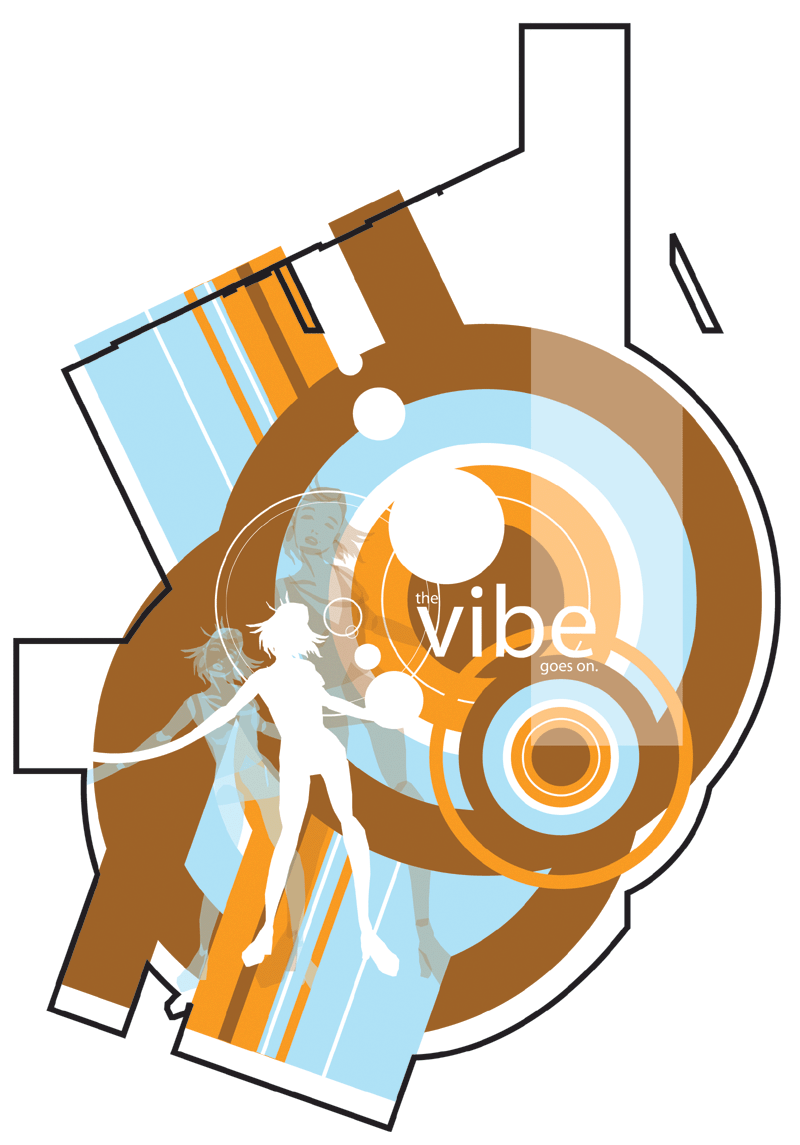
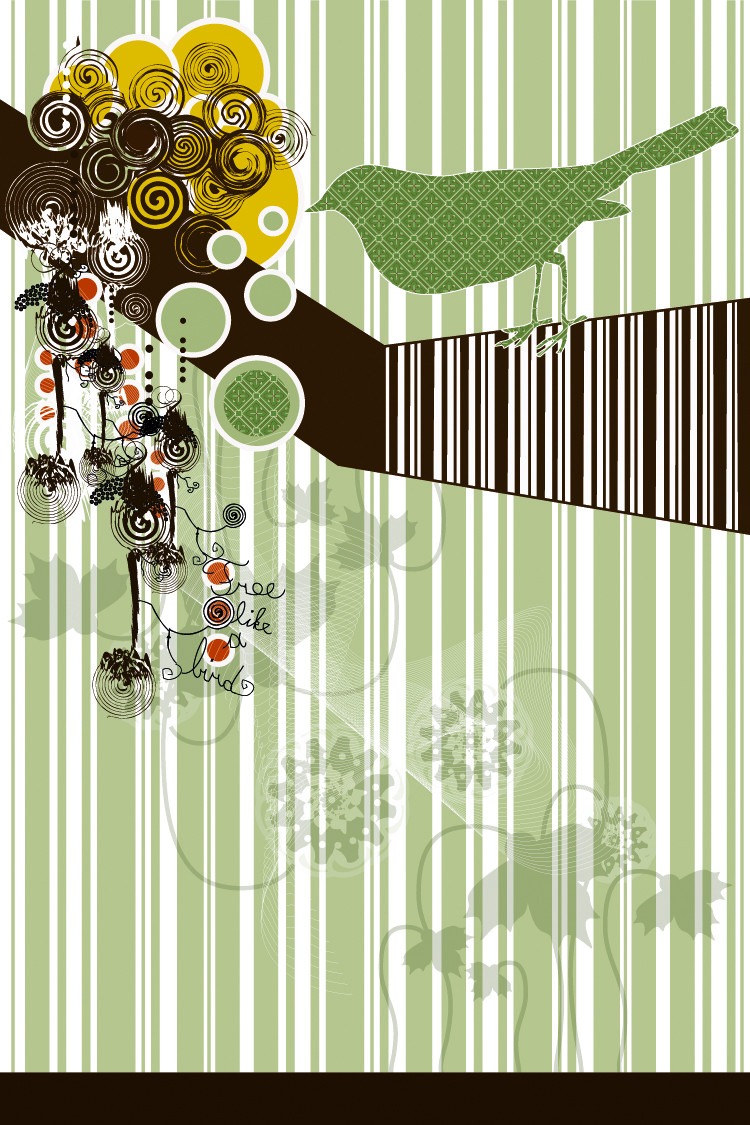
This is what I wasted an entire Design lesson on...The colors? At first I was pretty pleased with the scheme, but now I'm not so sure... I don't think I got them quite right. It's kinda large, too, and I was debating whether or not to crop it but in the end I decided to upload the whole image.
And yeah, I know, MAJORLY cheesy line in there. I should have just left it with "VIBE". Anyhoo, as always I would love to hear any comments or criticisms...thanking you
Related content


Comments: 38

very nice.. hope you dont mind but i used this and kinda remixxed it.. if you dont like it jsut tell me.. hope you dont want me to take it down.. oh yeah link - [link]
👍: 0 ⏩: 0


good use of scaling and color choice. The knockout of the female figure adds the right element of interest.
👍: 0 ⏩: 0

I'd agree with leaving it just as "vibe", or even "the vibe".
You could even use another phrase somewhere else in the work, like "let it move you" or something like that.
I really love the colour scheme, but her leg on the right seems a little funky at the calf.
Nice work!
~Orion
👍: 0 ⏩: 0

I dig the colour scheme... the whole peice works well, very sporatic, but still good... I especialy like the girls silohette... you're obviously very talented.
👍: 0 ⏩: 0

I love the colors you chose to work with! In ALL your pieces, you always know whatr to use, it seems.
👍: 0 ⏩: 0

very nice, very retro. i like the black outline and the colors
👍: 0 ⏩: 0


Wow this looks really amazing ... well done ... I love it !!!
👍: 0 ⏩: 0


The black lines grooving under the pastels almost appear to be the floor plans for some kind of building. On the other hand, when I look at the center of the circle and draw a point to the edge of the black line.. I see an old 5 1/4 diskette shape.. or the lens of a camera. I've never seen so many odd things in one of your pictures. Craziness! The vibe goes on... it could either be a slogan/song for a soft drink or a british soap opera title.
👍: 0 ⏩: 0

Oh wow! This is some great design work! I love the colours used and I love the movement of line. Very nice work!
👍: 0 ⏩: 0

I really like the colour scheme, but i guess it is a little different to your other pieces. I just love the way it all goes together, even the black line
👍: 0 ⏩: 0


Ok, i haven't read the other billion and a half comments on this, but I LOVE the COLOR scheme, it's just really retro cool. The whole design is just fantastic EXCEPT the black line that goes around the whole thing, it's horribly distracting and doesn't fit the color scheme. Please get rid of that line, please .....
👍: 0 ⏩: 0


love the colours and character. Great work though think the black lines are too thick
👍: 0 ⏩: 0

The charactor has very long arms hehehe
Your use in illustrator is fantastic!
looks like a productive lesson to me
👍: 0 ⏩: 0

dude - i love this design- its very cool and the illustration is really great !!!
good work
👍: 0 ⏩: 0

Not a waste at all. I love the shapes and layout of this piece. Very nice vector work, lovely colors, and very slick overall. Great work
👍: 0 ⏩: 0

looks really good.. and yea.. the vibe goes on is kinda cheezy.. but either way.. its a really cool design.
👍: 0 ⏩: 0

I like the black outline and how some of the colours aren't contained by it. I also like how it has an appearance of being a machine...
Jess
👍: 0 ⏩: 0

I like the color scheme, very earth toned.
However, the upper branching out box in the right lacks color, while it provides balance it also distracts the eye.
My center focus is on the main image, yet then my eye moves up and to that empty box like outline. If you have a few bars of color branching out into the box like you have in other places it might center the visual interest a bit more.
👍: 0 ⏩: 0


really nice...not my kinda theme, but I like how you've done this. especially the global shape is cool.
👍: 0 ⏩: 0

great work sean, what is waste there ? it's so kewl, u got design-talent, that's sure maybe some more really thin-elements in it would be kewl. maybe a contrast to the thick black outline, but the rest is so amazing! these colors are splendid, i've seldom seen brown in addition with blue and orange
!
👍: 0 ⏩: 0


wasted?
I'm in love with this, time well spent!
trust me, the color scheme kicks ass,
and did i mention,..
so do you!!!!
xoxo,
~katy~
*picks up jaw*
👍: 0 ⏩: 0

Colors are great. OVerall design is perfect! This is what i call: Having the guts 2 do it different! I'll keep on watching u're work in future... Perfect
👍: 0 ⏩: 0

I like it... I've always had a thing for color combinations involving browns. This one worked out great. And the composition is quite nice. Man I need to learn how to do this xD.
👍: 0 ⏩: 0

Very cool. I dig the color scheme and the chick's silo rocks.
Definately something to be proud of.
Great job.
👍: 0 ⏩: 0

I quite like the colours. And all the shapes. In fact, the only thing I don't really like is the big heavy black outline. I just doesn't sit well to my eye. The way you've included the girl looks excellent. And as for the text - I've seen cheesier.
👍: 0 ⏩: 0

I like the feel (for the lack of a better work) of it. Very "70's" slash Charlies Angles feel too it (I mean that in a good way)
👍: 0 ⏩: 0


Wouldn't say it was a waste... really nice work... I love the colours... kind of 70's like...
👍: 0 ⏩: 0