HOME | DD
 Blur-Falco — Sonic the Hedgehog (In My Style)
#blur #clothes #falco #fanfiction #hedgehog #poster #realistic #redesign #sonic #style #superhero #art
Published: 2019-05-04 17:53:59 +0000 UTC; Views: 1480; Favourites: 21; Downloads: 0
Redirect to original
Description
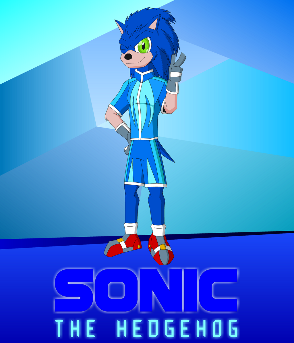
Alright, I know there have been a lot of complaints about a bunch of crazy realistic Sonic pictures on Deviantart for years. But our first version for the upcoming "movie" was worse than most of them, so I'll do whatever the hell I want with him. And I've been trying to draw a realistic Sonic for years with absolute failure, and I decided just to draw my version of him with my own nerdy touch and art style.
I was going to save this for a fanfic I planned on, but with everyone doing their own version of Sonic across the internet, I'll grab some of that action before it dies out.
If I did a more "realistic Sonic movie," it would take place in the same universe. The only change I would make is that things would make sense, which means no cartoon logic. Other than that, it would be 80-90% of the same universe! And I feel that, even though I've never made a movie, I can do a much better one with this Sonic than what's going on right now.
The face is always the tricky part, and the hair was just going to be normal hedgehog hair. But after seeing this pic from seen here: www.deviantart.com/anhesart/ar… , I can easily say that's one of the best realistic Sonic pics there is. Yeah it has a couple flaws, but it has less flaws than most. Anyway, the hair is what got me to draw the hair on this Sonic you see here because it's just so hard to get the form right.
The superhero look comes from a visual representation for speed and Sonic's spines. I also updated the shoes for a more blatant sci-fi feel.
Sonic belongs to Sega and Yuji Naka, not to Paramount and Jeff Fowler.
So let me ask? Does the art style do him justice?
How much better is it than the movie version?
And how do the clothes look?
And I designed both of the fonts you see (or at least if they were predesigned, I have no knowledge of it). So how does my logo look?
Related content


Comments: 17

So I saw about the description about the upcoming Sonic the Hedgehog movie about his ugly appearance. Expect what Hollywood would do to anime and video games. For me, seeing his live-action counterpart is really an eyesore, but will wait for how the redesign will look like. Now onto the review.
Good design to be honest. I like the uniqueness of the clothing design. I mean Sonic in actual only wears shoes. I'd imagine the actual Sonic would also wear these kinds of clothes! XD Especially I like the blue color that represents ur Sonic, gives it that vibrant electric feel. And also giving ur Sonic those sports gloves sure makes him very sporty! High tech running shoes gives that futuristic look FTW!
However... some concerns... u still need to work on ur anatomy. Especially on how the proportions are done. The body itself would need some work, he looks kinda scrawny to me. Also, Sonic's eyes are not TOO green. His pupils are much larger. But nonetheless, it's still great. I mean I respect ur style. Also it really looks really better than Jeff Fowler's depiction of Sonic!
Keep it up! I hope my advice would help u become better in the future.
 (Wink)")
👍: 0 ⏩: 1

Thanks!
I'm glad you like the clothes. That coloring there was pretty tedious to get right since I was working with so many blues.
Though some of the "anatomy problems" are really just a part of the art sryle. It calls for a little oddity. The large-ass irises and pupils I use are a staple for it that I developed years ago, and I use it in most of my art. And I needed this Sonic a little scrawny since he's a 15-year-old who stays in shape. The art style is intentionally jagged and is supposed to be a little awkward depending on the situation. And the brighter shade of green has a little story to it, but I'll save that for the possibility of the fanfic.
Any very specific anatomy problems you can point out for me?
👍: 0 ⏩: 1
No prob!
It's mostly the torso area that need work since it looks scrawny to me.

👍: 0 ⏩: 1
Ah, I think I see the problem. See, the shirt is longi than his upper and lower torso. It reaches below the waist. I designed it this way so his "superhero clothing" would appear more casual. But there's a little bit of area under the shirt that's actually waist. But now that I mention it, I didn't give him a but...
👍: 0 ⏩: 0

Hello, here from Project Comment!.  (Smile)")
So reading your description, I take it you were going for a superhero look? I'll be basing my feedback on the assumption that was what you wanted to communicate with your Sonic design. ^^
First, this is definitely better than the unholy terror that is the upcoming movie Sonic design. It manges to succesfully convey the "cool" aspect of the original design (unlike the movie version which is just... derpy, IMO). The slender athletic build definitely helps the look.
However, if you were really going for that superheo look, then I have some suggestions. Human figures/human-esque figures with "superhero" visuals have idealized proportions. For males, there's a puffed out chest, narrow waist, a height equivalent to eight heads etc, as well as defined physqiue. To me, the biggest weakness of this piece is the largely undefined physique/musculature, and the proportions. Proportionally, I think the width of the shoulders is too narrow relative to the head and the waist; masculine figures have an inverted triangle shape with very broad chest/shoulders. I feel if you broaden those parts while keeping the waist area narrow, it would further convey that strong, superher-esque look you were going for.
For the physique, I suppose it's just a matter of anatomy studies. The most glaring thing you can imrprove on would be how you draw the legs; here you've drawn the calf muscles directly under the area of what is supposed to be the knee when they should really be lower. The knee itself doesn't look defined. I won't get into specifics, but anatomy studies would definitely help in this aspect. ^^
I think the clothes look fine, but perhaps the blue blends into the body too much? Perhaps you can add a few red accents to unify the whole look with the bright red shoes. But I do like the design.
Hope this helps.
👍: 0 ⏩: 1
Thanks for the comment!
Light superhero look. Maybe that was a dumb way of phrasing it on my part, but you got the "cool" part down. Much of this possible fanfiction idea is about applying the cool correctly. However, there's a good reason I can't make Sonic HR Buffnstuf: canonically speaking, he's 15. Plus, his power is about speed. Knuckles will have a more masculine physique, no doubt, and possibly Shadow and definitely Vector. But by "superhero" I meant an added influence to the Sonic aura that helps balance out the "cool" vibe my fanfic calls for, and that you pointed out pretty effortlessly.
Besides, Robin is a teenage superhero and he's not usually buff.
And about the knees, I didn't bother defining them. I know logically, the muscles should be lower, but part of the idea of this picture is to show off an "art style" instead of perfect anatomy. That's typically how I draw legs. It's supposed to be a lightly exaggerated art style. It's an adaptable one as well, which can mend with realism and abstraction depending on what's demanded.
👍: 0 ⏩: 0

Awesome man, it is like one of those authentic illustration styles ")
👍: 0 ⏩: 1
Thanks a bunch! Believe it or not, it took me 9 and a half years to get it right. All the concepts had some serious flaws.
👍: 0 ⏩: 0

It's really good that you mentioned the Sonic movie, because I don't think there's any way that people could see this and not immediately think of that, and even though not everyone reads descriptions, people who want to argue with you about this and actually want to come correct when they do it will see that there is a detailed description, read at least 1/3 of it, and realize you get it so they don't have to argue with you!
Also, how fast would Sonic be if you made a realistic Sonic movie? Would he be 85% as fast? :3
 (Cool)")
👍: 0 ⏩: 1
I've been thinking about that. He'd probably go around Mach 5 at his max. I admit I don't know much about the science of speed, but it is a story based on a kid's video game with a character who's spin dash can burst through steel, so I'm not worried. I'd keep all the powers of the characters the same.
Speaking of which, a part of me is planning on writing some extra details in the possible fanfic to pick fun at how Hollywood handles things, like a real backstory or picking fun at the idea of "cartoon logic."
👍: 0 ⏩: 1
Thanks for commenting on my art, btw. Much appreciated.
👍: 0 ⏩: 1
Sure.
You replied to yourself, though, instead of me, so I almost didn't see
yw
👍: 0 ⏩: 0
Thanks. Anything you think I can improve on?
👍: 0 ⏩: 1

Perhaps making the neck a little shorter and his second color which looks like human skin could get some improvement too, unless that what you wanted to do.
👍: 0 ⏩: 1
Believe it or not, I actually shortened the neck before posting it. I needed to leave some room for the neck fur to be as noticeable as the collar. And the beige was a tricky part. I kept messing around with different beiges until I found one I liked. Thanks for the criticism.
👍: 0 ⏩: 1
Good luck in the next post then my friend
👍: 0 ⏩: 0