HOME | DD
 BoffinBrain — Old DAv6 Concept - Message Center
by-nc-sa
BoffinBrain — Old DAv6 Concept - Message Center
by-nc-sa
#bar #center #centre #comments #da #deviantart #deviations #feeds #folders #interface #message #messages #notes #page #rss #search #spyed #v5 #v6 #widgets #dav5 #dav6 #frontpage #searchbar #messagecentre
Published: 2008-05-17 01:26:40 +0000 UTC; Views: 12164; Favourites: 67; Downloads: 250
Redirect to original
Description
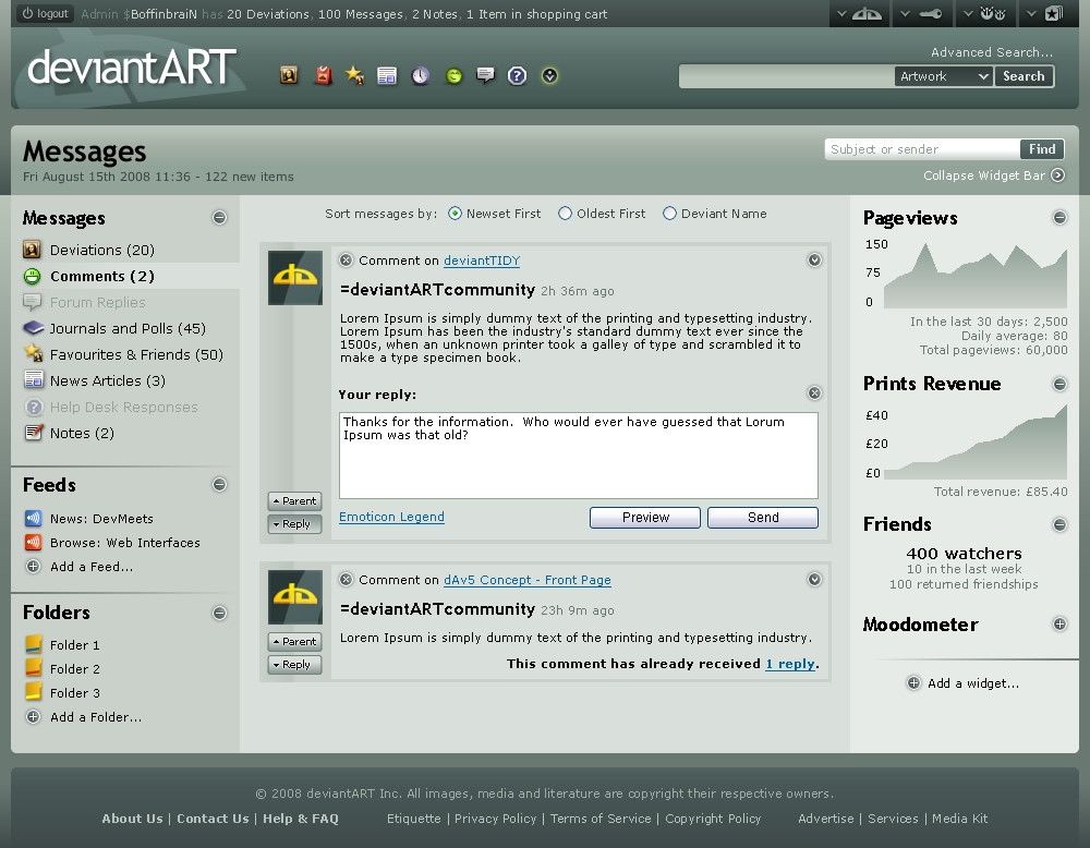
This is the second concept shot, and in my opinion, far more interesting than the first. Details on the overall layout, theme, header and footer are described in the first concept and the details describing the buttons on the user toolbar are written in the second concept .One Page Fits All
This concept is based on $spyed 's Message Center Mockup - where all message types can be accessed down the left hand side. When one of theses is selected, the main contents change. If an item has multiple sub-items (such as for notes, where there will be subfolders like Inbox, Sent and custom folders, plus the option to compose a new note), these will expand when the item is clicked.
'Feeds' in dAv6 will be more prominent, whether they're accessed directly in RSS or via some similar system, and should be available for News, Galleries and Forum threads among others.
Anything you see in the central section can be dragged by its border in order to put it in a folder (at the bottom of the left hand panel), or by clicking the downwards-pointing arrow, choose an option to move it to a folder. I don't see why there should be any limitation on the types of items you can put in message folders either. Notes, comments and deviations could all sit side-by-side. And why not make them different colours? And put folders inside folders? Anything is possible!
On the right is the widget bar. I think the word 'widget' is rather overused in this web-2.0 world, so if the creators can think of a more imaginative word to use instead, then I welcome that. The types of widgets on display are pretty self-explanatory. This bar can be collapsed if you want more space for the main message pane. Messages, deviations or notes of the current type can be filtered by using the Find box in the upper-right corner of the header.
With regards to comments themselves, you might have noticed that sometimes when you (if you're a subscriber) have a comment, you may miss the fact that someone has posted a reply to the comment (either someone else, or the same person as a follow-up comment) and there's no way to know that without going to the comment page. Stating that the comment has had a follow-up reply will help facilitate the nested comment system.
See the other concepts: Front Page , Advanced Search
Related content


Comments: 146

It sure is! People keep going back in time and finding these old gems.
👍: 0 ⏩: 0

I have no say! It's just an unofficial concept. Who knows what might happen in the future? It still contains ideas that could be implemented in the current message center.
👍: 0 ⏩: 0


This is beautiful! I think this would make for a pretty epic script.
👍: 0 ⏩: 0


The idea behind this for the message center sounds like a very nice one, I hope they add change the center to look like this, since it looks easier to manage in my opinion.
👍: 0 ⏩: 0

I like this, it gives me a hint of what is going on in the environment of the picture.
👍: 0 ⏩: 1
Thanks. I still prefer this myself over the one we have at the moment. It just looks clearer, as well as having more features. I virtually never look at the left hand side of the message center any more because they took the counters (next to each message type) away and thus they look the same whether they're empty or not.
👍: 0 ⏩: 0


100 messages? Gosh, I wish I had that many XD I love messages
👍: 0 ⏩: 0


Very well done. But I REALLY need a "Delete All" option. One that takes one click.
👍: 0 ⏩: 1
At least you can quickly select all messages of a certain type and then delete them.
👍: 0 ⏩: 0

I really prefer this to how the message center is set up currently.
")
👍: 0 ⏩: 0


It seems much better than the currently used message centre. 
 (Wink)")
👍: 0 ⏩: 1

")
Well I hope they implement the widgets some time. They were planning to do that all along, but I guess it's a way off yet. I'd certainly like to see 'feeds' as well as that would allow you to subscribe to searches and gallery categories in similar ways to a deviant.
👍: 0 ⏩: 0

I like it, but I think it's a bit cluttered for my tastes. Great work though!
👍: 0 ⏩: 1
Indeed it might be a little busy on the small size of the preview, but bearing in mind that most displays are larger, and that the widgets can be collapsed and in that state it's much the same as the current message centre. Speaking of widgets and feeds, I hope those come along soon! You're a stealthy admin - I haven't seen you around before. What do you get up to?
 (Smile)")
👍: 0 ⏩: 1
In response to widgets. A few people have suggested widgets for journal pages. I'd like to hear your opinion on my journal
")
👍: 0 ⏩: 0


I'd find the oldest first button to be very helpful and the left and right side bars are fantastic! I can't wait to see what dAv6 really looks like! If it is anything like this I'll be ecstatic
👍: 0 ⏩: 1

It's like they copied your design! YAY

👍: 0 ⏩: 1


This is awesome! ")
👍: 0 ⏩: 1
Well, they're based on $spyed 's sketches, so I would hope so. I certainly hope that if they make widgets, they're collapsable.
👍: 0 ⏩: 1

I love it, would be nice if DA coded it for use...
👍: 0 ⏩: 1
Well, this is based upon the concept sketches, so expect the final result to look a little like this.
👍: 0 ⏩: 1
You will be, in a few months' time, when v6 is rolled out!
👍: 0 ⏩: 2

Is it only for subscribers?
👍: 0 ⏩: 1
We don't know yet, but so far it sounds like there will be no limitations to those who aren't subscribed.
👍: 0 ⏩: 1
Ohh, This is official? Awesome! Can't wait!
👍: 0 ⏩: 0

Its a great concept. I like the whole lay out.
The new buttons (collect,etc) look great. Are you going to color them? If so I would say use very little or gentle subtile colors. I like they way they look now.
And widgets?! Nice! ♣☻
👍: 0 ⏩: 0


Looks very nice, kind of like an email setup. I love how you've chosen to incorporate "widgets," those line-graph statistics will come in handy for me! And Folders, what an excellent idea! Must go give props to $spyed , but in short: beautiful job on visualizing it and "cleaning" it up!
Just one question, which I couldn't find in the deviation comments: Will this eventually become the dA v6 Message Centre?
👍: 0 ⏩: 1
Of course, we cannot know that until it's released. The other interfaces ended up looking a lot like Spyed's sketches, though.
👍: 0 ⏩: 1

it is a very nice design, i can't wait to see it comes active.
but one thing i think if the upper-part icons(in the left-hand side of the search bar) can be a bit larger...it would be easier for user to see and choose the categories.
just my little suggestion...
👍: 0 ⏩: 1
Yes, they could be. The aim was to keep them under 20x20 so they could be used in menus.
👍: 0 ⏩: 1
| Next =>