HOME | DD
 BoffinBrain — Old DAv6 Concept - Message Center
by-nc-sa
BoffinBrain — Old DAv6 Concept - Message Center
by-nc-sa
#bar #center #centre #comments #da #deviantart #deviations #feeds #folders #interface #message #messages #notes #page #rss #search #spyed #v5 #v6 #widgets #dav5 #dav6 #frontpage #searchbar #messagecentre
Published: 2008-05-17 01:26:40 +0000 UTC; Views: 12166; Favourites: 67; Downloads: 250
Redirect to original
Description
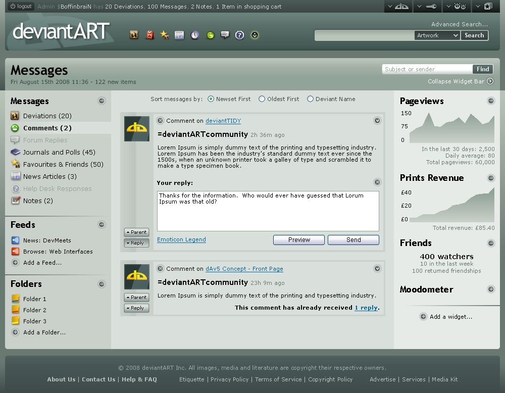
This is the second concept shot, and in my opinion, far more interesting than the first. Details on the overall layout, theme, header and footer are described in the first concept and the details describing the buttons on the user toolbar are written in the second concept .One Page Fits All
This concept is based on $spyed 's Message Center Mockup - where all message types can be accessed down the left hand side. When one of theses is selected, the main contents change. If an item has multiple sub-items (such as for notes, where there will be subfolders like Inbox, Sent and custom folders, plus the option to compose a new note), these will expand when the item is clicked.
'Feeds' in dAv6 will be more prominent, whether they're accessed directly in RSS or via some similar system, and should be available for News, Galleries and Forum threads among others.
Anything you see in the central section can be dragged by its border in order to put it in a folder (at the bottom of the left hand panel), or by clicking the downwards-pointing arrow, choose an option to move it to a folder. I don't see why there should be any limitation on the types of items you can put in message folders either. Notes, comments and deviations could all sit side-by-side. And why not make them different colours? And put folders inside folders? Anything is possible!
On the right is the widget bar. I think the word 'widget' is rather overused in this web-2.0 world, so if the creators can think of a more imaginative word to use instead, then I welcome that. The types of widgets on display are pretty self-explanatory. This bar can be collapsed if you want more space for the main message pane. Messages, deviations or notes of the current type can be filtered by using the Find box in the upper-right corner of the header.
With regards to comments themselves, you might have noticed that sometimes when you (if you're a subscriber) have a comment, you may miss the fact that someone has posted a reply to the comment (either someone else, or the same person as a follow-up comment) and there's no way to know that without going to the comment page. Stating that the comment has had a follow-up reply will help facilitate the nested comment system.
See the other concepts: Front Page , Advanced Search
Related content


Comments: 146


I like it but it's a bit too...full, IMO. Cluttered. A little overkill.
👍: 0 ⏩: 1

Like I've said to others, the interface should look a lot better on larger screens than shown in the demo, and also when widgets are collapsed.
👍: 0 ⏩: 1
o ok. I should probably have read some of the other comments first...
👍: 0 ⏩: 1
I don't blame you... Reading through all the comments takes ages.
")
👍: 0 ⏩: 1

really nice... just a couple of things:
-how about the nav bar on the top right to display the icons only without displaying the solid bg for each of them
-the background where the avatar resides is better with a plain bg rather than a 2 color gradient, in my opinion
👍: 0 ⏩: 1
Heh, I just like gradients a lot.  (Wink)")
👍: 0 ⏩: 0

The feature I love most about this is the "Oldest First" selection. I've got dozens of messages I can't get to because of my newest messages.
That and this look generally awesome.


👍: 0 ⏩: 1
Cheers.
And the other annoying thing about old messages is that if you receive a constant influx of new comments, you can never reach the end.
 (Smile)")

👍: 0 ⏩: 0

Whoa. I WISH my message center looked like this...;o;
Awesome concept! I hope some of your ideas will get heard out.
")
👍: 0 ⏩: 0


looks a wee bit to flash for me
but im willing to try it out anyways
👍: 0 ⏩: 1
Perhaps, but as I've said to many people, the widget bar can be collapsed to make things easier on the eye. I'm sure people would easily get used to it.
👍: 0 ⏩: 1
Yeh
it does look at lot more proffesional
guesse ill just have to try it out


👍: 0 ⏩: 0

This sort of comment breakdown is exactly what I miss in dAv5. Hope that some of your ideas are implemented.
👍: 0 ⏩: 1
Thanks. Has one of these ideas been used in a previous dA, then?
👍: 0 ⏩: 1
Well back in v4 it used to tell you what type of messages you had in the bar. Right now it says, for example '2 deviations, 15 messages' whereas before it would have said '2 deviations, 2 Misc. Messages, 11 Comments 2 Forum Replies' or something similar. I just miss that in v5, I hope it makes a return to v6. I like how you've incorporated it here.
👍: 0 ⏩: 1
Oh, well the abbreviated message counts are still there, if you hover your mouse over the 'X messages' in the header. deviantTIDY also puts the message count back.
👍: 0 ⏩: 1
Yeah I just never liked doing that mouseover.

👍: 0 ⏩: 0

Wow! This is great. Not liking some of the gradients but the look and user friendliness of it is wonderful!
👍: 0 ⏩: 1
Which gradients are the most offensive to you?
👍: 0 ⏩: 1
the main header
the text inputs (search etc...)
the preview and send buttons don't fit with the rest of the look
👍: 0 ⏩: 0

a bit too cluttered. Would be nice if it was an advanced option for users to pick from
👍: 0 ⏩: 1
I've packed a lot of ideas into a relatively small screenshot. Imagine it without the widgets bar on the right. Would that be better?
👍: 0 ⏩: 1
The widgets is actually a neat idea and makes dA more web-2-ish. I didn't notice the "collapse widgets" arrow so I think it is cool that you can pop it up and back as you please, instead of having it forced on you.
👍: 0 ⏩: 1
Definitely. After all, most of these figures won't change much over the course of a day or even a few days, so they're interesting for all of five minutes, until you just want to get down to srs bsns and use the space for comments and notes. Still, rather fortunately, most people have displays wider than that I have chosen to portray this interface.
👍: 0 ⏩: 1
Yeah... I am still surprised they still make screens that only support up to 1024 x 768 like my office laptop. I have seizures! When I go home and see 1280 x 1024 (which is still small) I see it as heaven.
I miss my 1600 x 1200. Now if I have to use photoshop I weep
👍: 0 ⏩: 1

👍: 0 ⏩: 0

But perhaps something you'd get used to? You don't have to use all the features, of course.
👍: 0 ⏩: 0

Very smooth and tight, I like it 
👍: 0 ⏩: 1
The idea was that the button would look permanently depressed when the reply box is open.
👍: 0 ⏩: 1

Why is it exactly you're not working in the creative staff?
👍: 0 ⏩: 1
I'm still in full-time education for now, so I can't work yet.
👍: 0 ⏩: 1
It's forbidden to work while attending school/college/university where you live?
👍: 0 ⏩: 1
No no... 
👍: 0 ⏩: 1
Yeah it would be tough, but the stuff I see from you is just a bit more thought-out in some areas and more polished.
👍: 0 ⏩: 1
Well thanks. Let's hope $spyed takes a look.
👍: 0 ⏩: 0

That little gradient on the side of the messages bugs me for some reason.
<--- that gray part.
👍: 0 ⏩: 1
I was just tweaking it, so I reduced the gradient while I was at it.
👍: 0 ⏩: 0

Once again, another fantastic concept! If only dA would listen too you
")
👍: 0 ⏩: 1
True ")
👍: 0 ⏩: 1


I like the widgets thing, that's pretty cool (even though it came from $spyed 
👍: 0 ⏩: 1
Oh so tempting, I just might have to take you up on that.
👍: 0 ⏩: 1
| Next =>