HOME | DD
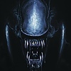
 Boltax — Irish Transformer Design.
Published: 2009-04-05 19:46:38 +0000 UTC; Views: 2226; Favourites: 18; Downloads: 13
Redirect to original
Description
So here's my entry for the Irish TF boards' "Draw a Mascot for the Irish TF boards" contest. It was a lot of fun to draw up a design and try and make it as Irish as possible without being... offensive and cliche:Here's the link:
age=1"Irish TF boards
Yup, I officially got the least number of votes so far, making mine the worst entry. Ouch.
So what did I do wrong? There's a few things. The first I'll get out of the way immediately because it has nothing to do with the art -- the way this thing was voted for was unusual. It was an email-based voting, and anyone could vote, not just members of the Irish boards. Which basically means that there's a social networking aspect to the contest which... well... I'm not very good at those things. All I did was put a link in the chat channel I talk in... and didn't really follow it up any more than that.
Now, about the art/design. There's a few problems here I can see right off the bat.
1) I didn't give him a name -- bad move.
2) I didn't give him a bio, also bad move.
3) I didn't colour the thing. Looking at the list of entries mine does look a bit bland compared to the other full-colour entries.
I did TRY to colour the bastard -- if only because there's features on there designed for colour -- but I couldn't get it to work right so I gave up on him. Maybe I'll colour him up some day.
4) Maybe Beast Wars was a bad choice? I dunno on that one.
5) I think the design is solid, but it's drawn in a very static toy-based sort of fashion. An arm is turned strangely to show off detailing and articulation -- it's drawn like it's meant to be a toy... so it lacks that OOMPH of an awesome pose. It just doesn't look badass enough, either in its robot or alt mode.
I approached the whole thing too much from a design standpoint and not from a 'create an awesome character' standpoint. It's not the first time... my stuff always seems to look... odd next to other people's choices in these sorts of comps.
Ahhh well.
Anyway -- tell me what you think guys... because I really am curious for some feedback on the entry... or on any of the entries. Actual talk about the ART in the comp is thin on the ground out there.
Related content


Comments: 7

I like beast era the most anyway so you would have had my vote. Still color would have helped I think. What about Warbuck for the name?
👍: 0 ⏩: 0

Bah, they don't know what they're missing. It's yet another awesome and toy-ready design from you, plus it's a new Beast Wars character to boot.
Outstanding, sir. As always.
👍: 0 ⏩: 0

 (Wink)")


lol, sorry dude, i was accidently using my fiance's account (jojuya) when I wrote that... forgot to sign her out. However I still voted for ya, maybe she needs to vote for you...
")
👍: 0 ⏩: 0

This is an awesome piece, just sent in my vote for ya  (Smile)")
About the art though, I think you picked a good alt mode. But BW is my favorite series so, there it is.
Just a really solid design. I really want to see more of these.
👍: 0 ⏩: 0