HOME | DD
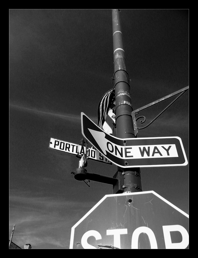
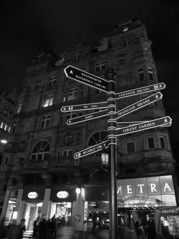
 brain-of-j — Sign Pole
Published: 2003-08-10 02:16:57 +0000 UTC; Views: 1273; Favourites: 22; Downloads: 734
Redirect to original
Description
Not much to say, just something random on a walk about today. Color photo converted to b&w with Photoshop. Not real symbolic or anything, I just like the way it looks. Ahh well. *shrugs*Related content


Comments: 41

Hey there, great picture, hey I am wondering if I can use your picture as a background in an idea I had for a cd-cover? i'ts nothing big, its just an idea for a band I know. Im going to do like 10 different covers and your picture was in one of the ideas I have. I can send you the idea if you want and I am not gonna take any credit for your picture, Im just wondering, anyway. Cheers!
👍: 0 ⏩: 1

yeah, sure thing, go for it. just send me a copy of whatever you go with.
👍: 0 ⏩: 0

")

I thought I'd comment since you only have 38 comments! Hark! But anyways, like fae11 said (2 years ago) what the heck with engineering man?! Photography! I'll be your roadie...or groupie...or...fan...or...______(fill in blank, but be conservative here) Nice shot to by the way

👍: 0 ⏩: 0


Uhm, the sign is curved. Yes, it is. Very sinuous and stuff. Never mind.
👍: 0 ⏩: 0

i like the way it looks also. Looks great in B&W
👍: 0 ⏩: 0

i really like this picture, that's in calumet right?
👍: 0 ⏩: 1
hey.... yeah..... it... is....
a local, eh?
thanks, by the way
👍: 0 ⏩: 1
yeah, unfortunatly local, i don't look, sound, or act like it though, well i do drink alot,...
damn.
👍: 0 ⏩: 0

sharp detail.
i like the angle of the shot. gives a raised effect.
stop > i wish we had kool signposts in england.
another job well done.
👍: 0 ⏩: 0

WOW... this was the first thing i saw when i looked at your page... and i must say that i just LOVE it. I dont know what it is abotu it that is so inviting. great photo. i love the b&w.
👍: 0 ⏩: 0

I think this would look really good in colour, it would be interesting to see anyway. I say that because there's a lot of sky, and in the photo here it looks dark, but I'm thinking that in the original, it was bright blue? The contrast between a red stop sign, and bright blue sky would be really striking. But because this is in black and white, it does begin to hold symbolism, perhaps because of the bent one way sign. You could read a lot into it, but really, why?  (Smile)")
👍: 0 ⏩: 0

I really like it! It looks good in black and white. And there's something about the "One Way" sign being bent out of shape.
👍: 0 ⏩: 0

i was totallyjust in portland that place is spiffy
and great quality on the photo
👍: 0 ⏩: 0


this is so amazing. you're right, it's not anything special, but it is at the same time. VERY nice contrast and nice angle. you took something that in everyday life is very boring and made it the most interesting photo on this page! Great job!
👍: 0 ⏩: 0

It's so simple, yet so cool! The colors of the sky are awesome.
👍: 0 ⏩: 0

Very nice composition and attention to contrast. Well done.
👍: 0 ⏩: 0

this is insane. i love everytrhing about it. the composition, contrasts..its just perfect.
👍: 0 ⏩: 0

woahhhhh great shot! love the color, the signs, the angle, the everything. good effect with the clouds in the background
👍: 0 ⏩: 0

Damn that's very sharp!
Details are amazing.
Only thing I don't like is that it was converted instead of being shot in B/W
")
👍: 0 ⏩: 0

WOnderful angle, and offset. The whispy clouds in the sky really add a lot to it. Great contrast as well. Keep up the good work!!
👍: 0 ⏩: 0


nice photo. I like the bl/wh. Good contrast. I think the bent sign definetly adds to it, makes it more original. The shot has more to it. The angle and cut off of the stop sign makes it look cool.
👍: 0 ⏩: 0


I dig it. Its really cool, the mechanics of this photo are great. The eye is naturally lead to the neg space at the top of the photo while the STOP at the bottom is cut off which adds a nice touch.
Very well done.
👍: 0 ⏩: 0

excellent composition!
okay.. you were thinking about engineering?
look at this shot!
gather more... learn, delve into this craft. it's all there.

👍: 0 ⏩: 0

I especially like how the "one Way" sign is bended.
👍: 0 ⏩: 0


interesting shot
it would have been interesting also
if you'd taken a step backwards to give it more space on the left.
👍: 0 ⏩: 0

the b&w choice was a good one. hey even though you say it isnt symbolic, doesnt mean it isnt. perspective, texture, this shot has it all and if you wanted it to, it could easily have a meaning.
👍: 0 ⏩: 0

I like it...it's got a cool perspective and feel to it.
I like the B&W as well
nice work
-D9K
👍: 0 ⏩: 0

it's pretty funny. because it looks symbolic. i'm glad it isn't.
👍: 0 ⏩: 0

Hey gave you a fav! I'm so psyched, buying a Canon PowerShot G3 this week. Can not wait to PLAY

👍: 0 ⏩: 0

this one definitely caught my eye.. I really enjoy photos of "random" things... and from different perspectives. There's just something about it.. I'm not so sure it wouldn't have been so interesting if the sign wasn't bent...cus then it'd just be..normal.. but it had something unique about it.
I would definitely hang this up on my wall.
👍: 0 ⏩: 0

Stuff looks good in b&w dunno why but hey its cool.
👍: 0 ⏩: 0

Good shot
👍: 0 ⏩: 0

very cool the angle is geat and the b/w is a nice touch as well good job!!
👍: 0 ⏩: 0