HOME | DD
 breakerr — Fragile

Published: 2004-03-10 05:07:40 +0000 UTC; Views: 2250; Favourites: 68; Downloads: 975
Redirect to original
Description
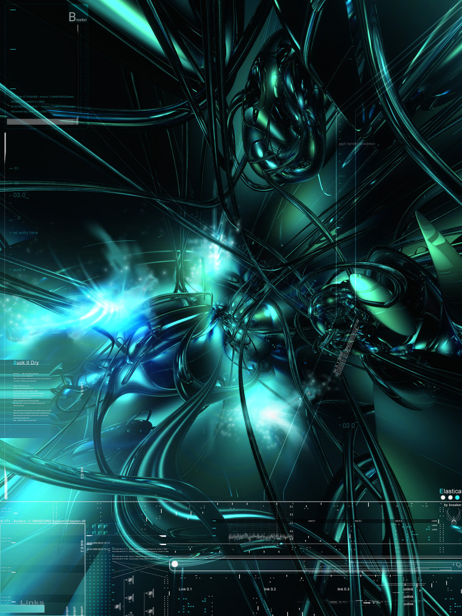
________________________________________ _________________________FragileJust a collab with one of my older friends around
 wich is the great He is a very good bud and one of my older source of inspiration(dont know why he stop making BryceWorks
 ") ) since quite long.....so he send me a fractal image and I twisted around and played with layers and my keyboard to add more on top of it and make it less fractal and a little more technical and abstract
) since quite long.....so he send me a fractal image and I twisted around and played with layers and my keyboard to add more on top of it and make it less fractal and a little more technical and abstract ")
Some stuff in the oven but making them slowly, so hang on there .............L8er.
________________________________________ ______________________________

Related content


Comments: 88


very sweet work, as always.
i don't suppose i'd be allowed to use this as the bg for a website i'm working on eh? *begs*
👍: 0 ⏩: 1

You will need to ask if he tells me that is Ok, then you can use it
Take care.
👍: 0 ⏩: 0


Nice! Kinda looks like an embrio splitting for the first time. Very cool!
👍: 0 ⏩: 0


Thanks for the support man  (Smile)")
________________________________________ ____________________________
👍: 0 ⏩: 0

Beautiful work, I like the motion blurred looking bit in the top half, looks awesome, Good Job on the 2d too
👍: 0 ⏩: 1
Thanks for the support
👍: 0 ⏩: 1

this looks so much better than the average fractyl. very nice job on this one. i am digging the gold on black with the light level changes too. nice
 (Cool)")
👍: 0 ⏩: 1

stunning fractal piece mon.....
u done a gr8 job here....keep up the spirit my fren

👍: 0 ⏩: 1

the flower and the background is great!!!
but why are there little annoying yellow lines all over the pic?!
the lines take some attention from the flower and it makes the pic look very not harmonius..
remember for the future that if you put little lines or squers the they should be a bit blury or not so symetrical or just don't put them!
lol very nice!(:
👍: 0 ⏩: 1


")
The dots/lines/squares/ general typography with little symbols is just a style and is a matter of taste, Im not willing to start a war or something, for you is distracting and bad, for others without the dots and typo, lines, squares is just another fractal from the pile, and I was aiming to add something diferent to the everyday fractal images we see around.
Thanks again and L8er
👍: 0 ⏩: 1
ok understandable but the you should make the spots lines and whatever to stick out even more! if you make a symbol then make it that way that it will look as a part of the flow and not just as a squre.. and i suggest you to make them more in the shape of diamonds..
👍: 0 ⏩: 1
yes sir
Thanks for the suggestion man  (Wink)")

👍: 0 ⏩: 0

that's amazin
u've got sooooooooooooooooooooooo many coments
look's like a massive explosian that's got into a some sort of plasmaball thing

👍: 0 ⏩: 0


Came out really good. I should attempt some fractal art.
👍: 0 ⏩: 0


aww shit! i wanna see that everytime i log in 


👍: 0 ⏩: 0


It's nice, impressive colors and very neat 2D .. not to sure about the upper part..
but great collab guys

👍: 0 ⏩: 0

wow, thats awesome, it looks very misterious and soft like if I want to tutch it. truelly amazing, as usual
👍: 0 ⏩: 0

yeah ...... nice job, man. i like it. its prety cool..
one piece more to my favorite ")
👍: 0 ⏩: 0


Well I must say that the two of you have done a very good job in this collab. I see that the image shows the quality chemistry between both artists and their personal talents. I'm very proud to see that my hubby's work * greenarmani was an influential piece to this collab. ~breakerr , you've really added a technical and unique flare to this image. It's interesting because my husband was commenting on how great it looked and that he wished he could create 2D images as good as you've done. I congratulate the both of you and I really do hope to see additional collabs in the near future. Take a bow boys 
👍: 0 ⏩: 0

Awesome work guys. I saw this fractal before ~breakerr had it and it was NOTHING like this. I love the techy-abstract flow to it. The fractal work is impressive too. Keep it up guys, let's see some more collabs with Fractal/3d Abstract. Maybe we could do a 3way collab.. lemme know, note me or something. Good work guys!
👍: 0 ⏩: 0


awesome.. i like this.. nice job guys... the design is great.. minimal yet slick
👍: 0 ⏩: 0


it turned out very nicely. i would love to see the image that he gave you so that i can determine how much change actually occured.
👍: 0 ⏩: 0

very nice stuff guys, i love the brushwork, nice color fits very well.
+Fav
👍: 0 ⏩: 0

my god this is absolutely beautiful! I love the warm feeling this has to it! everything about this is perfect!
👍: 0 ⏩: 0

that is nice bud, look forward to seeing some new works..
typo is improving also.
+fav
👍: 0 ⏩: 0

yeah very very nice work u2...nice fractal work on this...and amgnfic 2d!
👍: 0 ⏩: 0
| Next =>