HOME | DD
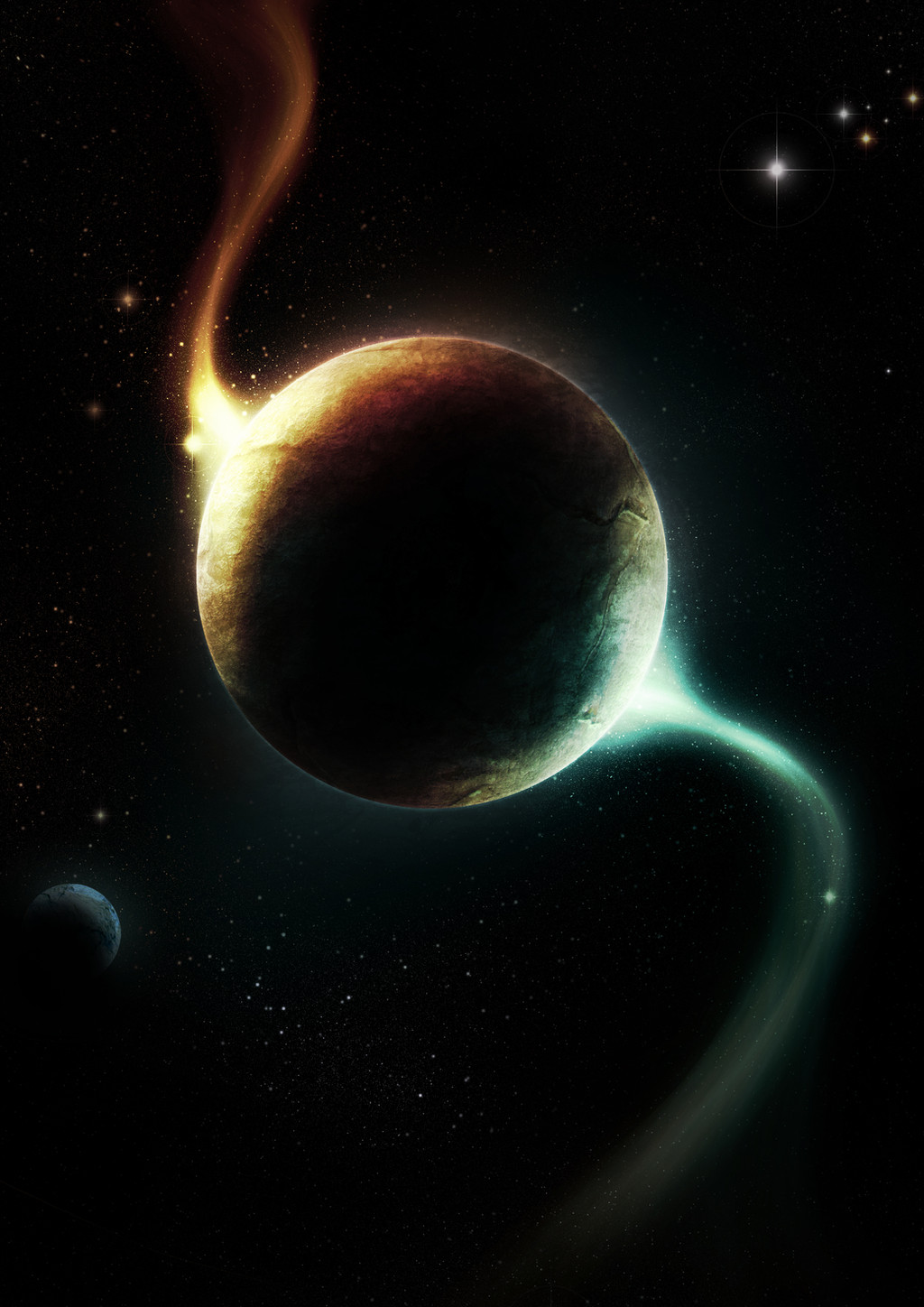
 Broken-Lithium — ecstasy

Published: 2010-01-09 17:54:27 +0000 UTC; Views: 3862; Favourites: 98; Downloads: 127
Redirect to original
Description
first piece with my new intuos 4 (Smile)")
thank's to the people at spaceart chat for the help
hope you like
Related content


Comments: 44


Ecstasy isn't just a drug ")
👍: 0 ⏩: 1

just a quote from mr. mackey ")
👍: 0 ⏩: 0

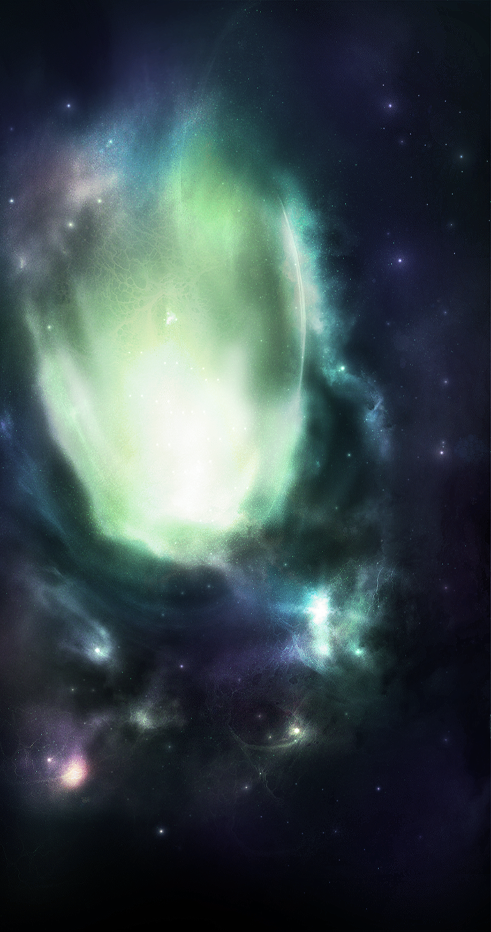
the nebular and the stars do look like two different layers - try to meld them together. other than that i like it
👍: 0 ⏩: 1
yeah thanks, im definately going to change the stars
👍: 0 ⏩: 0

I have a couple of suggestions:
Blur some of the stars nearer the bottom of the pic to give a deeper depth of field, especially over the nebula. That area looks flat.
Also, the nebula looks to opaque, and I find myself looking for some form it in because of that. Adding a little bit of haze might help considerably, as well as adding a small concentration of stars at some points in the nebula.
I am a little bothered by the eye movement of the piece, though. The nebula is obviously central emphasis of the image, and it moves the eye around the picture quite nicely. But the planet- it just seems out of place. Like an awkward break in a sentence. I almost wonder if the picture would flow better without it, or how it would look large along the bottom of the image (like the planet is a lot closer to the viewer than the nebula, and you can only see part of the planet... like it goes off the bottom left corner kinda... and I think I'm making less sense with this suggestion the more I try to explain it *sigh*)
I hope something I've said here is of some use to you! Good luck!
👍: 0 ⏩: 1
Thanks a lot for the indepth comment! it helps a lot
👍: 0 ⏩: 1
Glad to be of service!
👍: 0 ⏩: 0


Very interesting piece, the nebula looks more like a painting to me
👍: 0 ⏩: 1
Haha, I meant a traditional painting
👍: 0 ⏩: 0

Quite an original and nicely-illustrated nebula there, there a good sens eof low and colour but also an eerie dark and forboding feel to it too ")

👍: 0 ⏩: 1

I love it!
I just got an intuos4 as well
👍: 0 ⏩: 1
Haha thanks
They are amazing aren't they!
👍: 0 ⏩: 1

haha thanks i guess
👍: 0 ⏩: 1

did it not come across as poitive? lemme try again
HOLY SHITBALLS THAT IS AMAZINGLY AWESOME.... how was that? xD
 (Wink)")
👍: 0 ⏩: 1
hahaha thanks a lot
👍: 0 ⏩: 0


Good job. Good think you got rid of the bottom planet. My only suggestion would be to remove the purple ring of the giant. But it is just a matter of personal taste
👍: 0 ⏩: 1
haha cheers, i might remove it, haven't decided yet
👍: 0 ⏩: 0