HOME | DD
 brokencreation — Strider
by-nc-nd

Published: 2012-07-14 01:04:27 +0000 UTC; Views: 5313; Favourites: 168; Downloads: 123
Redirect to original
Description
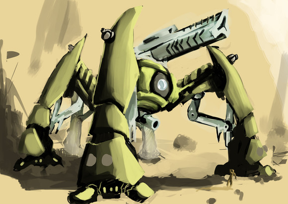
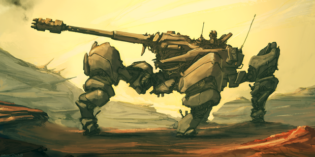
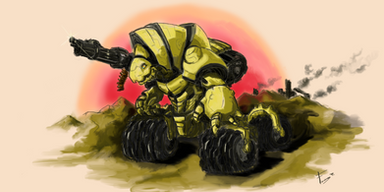
well this is the completed work i been doing for A LONG TIME XDall in all about fifteen to sixteen hours from start to finish and to be honest i feel it was completely worth while . i used textures and photos of cliffs and rocks i found on google . may be cheating but it deffinitly brings it more into reality than just a simple painting ^^
so please tell me what ya think and be honest okay people critique and such is more than welcome so it can help me improve even more in future it all helps me!
Related content
Comments: 47


Well first off the stuff that I think it working. The color palette is nice and restrained which helps keep the eye focused on the machine in the foreground which is a plus as this is really a portrait of the machine when you break it down. I like the care that's been taken to differentiate between the texture of the strider and the rocks behind it as well as the fact that they're in the same color family but of course, different enough that neither blends with the other. I even like how free and kind of loose the digital painting is. It seems considered while still looking different.
The issue I'm having is with the background. The legs in the back of the Strider are less detailed than the rock behind it and that starts to get a bit confusing. Also, on the right there's next to no background at all. I think in the foreground you could push the details on the metal a bit more. Some scratches or marks. Also, if there's a focal point on the strider, an area you want the viewer to focus on more than others, really emphasize it by perhaps a different color or a crisper edge. I'd avoid making it the eye though because the, being in the center it kind of becomes a big target and freezes the eye movement.
👍: 0 ⏩: 2

you got a good point i like having belanced non clashing coloure but yes i noticed all of what you said about my drawign a few days after posting this piece ^^ but thank you very very much
👍: 0 ⏩: 0

Well, I think it's pretty fair to express your own point of view without to be afraid of the artist's reaction! This is a good critique from my point of view, especially if the critic was very tolerant and restrained! Well done! I believe that any kind of a critiques like this one should be marked as fair, because it is better for the artist to hear a more realistic thoughts instead of simple and unmeaning "Cool", "Super", "Wow", etc.
👍: 0 ⏩: 1

you got a real good point i hate people saying omg i love it XD it just builds my ego and makes me think i dont need to push it.
👍: 0 ⏩: 1

Ego is a nice thing as well; but when the artist stop to grow in his genre it's always bad!
Wish you good luck and if you'll need someone to speak with "call" me!
👍: 0 ⏩: 1


*Fingercrick*
Righto! Let's see...
The only real point where I think a major change could be made would be the background. The problem as I see it is the matter of detail. Your style seems to work not on lines and fine strokes, but in shading and solid looking objects. On the left side of your picture we see a very detailed background, which clashes with the rest of the picture which doesn't have that high level of detail. Indeed, it looks like the background image was a real rock while the rest of the picture is... a picture. I can see the foreground rock spire on the left blends into it better, but again, nothing else in the picture has that level of detail.
If the entire image was the detail level of your leftmost rock mass, the picture would work, but that is not how I've seen most of your pictures. You do much better at the detail level of the central character, with things being suggested by shading and contrast. The right side of your image works much better; the sketch peaks and shading in the background, suggesting a large rock mass.
Again your colorscheme works well; I think you have a... tendency towards yellows and browns, you do some of your best work utilizing those colors. (Certainly I don't think you're a red or green man.) Here we have the whole gauntlet of colors from black to brown to yellow to white, blending and mixing well together, with your aforementioned use of shading to suggest depth and texture. The gun stands out because of its greyer and darker tone, making it more solid, and one of the foci of the picture. (The other being the eye, with its contrasting light and dark colors and circular shape.)
The structure is brilliant also, we get a real sense of perspective with this character, the hind legs fading into the background, the fore legs taking up much of the picture's center. What I like especially is the positioning oft he feet and use of the joints. This is not something that is a bunch of solid spires, this is something that moves and alters its positions itself in response to its environment. This is indeed what actual robotocists are trying to do and it is brilliant.
I like too the structure of the legs, spiderlike, but the secondary struts are a nice touch. It is not the traditional steampunk 'shove lots of detail and complex-looking parts in' method, but something that is simpler and sleeker and indeed looks like it might well be possible to make as a working physical model.
Very nice, I wonder how long it took to conceive of the concept and sketch out the basic design?
👍: 0 ⏩: 1

well the basic sketch took all but a few minuets on a programme i use called alchemy ^^ it makes shapes and stuff to draw with and that is how this was bourne ^^ but yeah i see what ya mean .i should only really do high detail back ground when its just a background drawing ^^ but thanks i will keep this in mind in future
👍: 0 ⏩: 1

Looking forward to more from you in future.
👍: 0 ⏩: 1

When I read the title I thought it was some sort of tribute to the Strider franchise. I realize that it is not but I can definitely see it being an awesome boss battle that would fit right into the newer game!
👍: 0 ⏩: 0

nice *two thumbs way up* really awesome. love how its set up
👍: 0 ⏩: 1

i love the angle it has :]
👍: 0 ⏩: 1

heh why thank you very much nwn
👍: 0 ⏩: 0

yay, you've finished this one X3
coolness is cool. Sometimes really cool i'd better say
👍: 0 ⏩: 1

this is sick man! kinda reminds me of a dragoon from starcraft hehe
👍: 0 ⏩: 1

i havent played it so i wouldnt know but thaqnks for the praise
👍: 0 ⏩: 0

thanks pal ... wait .. OMG Wall E icon I LOVE IT
👍: 0 ⏩: 1

You're welcome.
And thank you, too!
👍: 0 ⏩: 1

seems to be the end of the world as we know it
👍: 0 ⏩: 0

This is actually pretty sweet. I love the colors on the machine, and that background just kinda brings it all together.
Nice job!
👍: 0 ⏩: 1

thanks ^^ but in future i best not be too carried away with background this one is too detailed in places >w>;
👍: 0 ⏩: 0

The transition of the mountains on the left to the ground could be a bit smoother, but the rest is superb work.
👍: 0 ⏩: 1

yeah probably could be but it was a first for me to be so detailed . will have to work on that in future
👍: 0 ⏩: 0

this looks very epic 


good work ma friend 
👍: 0 ⏩: 1

i plan to do more like this . and year the floor is bland so it dont destract you from it . now all i gotta do is be more adventurouse on stuff and experiment even more
👍: 0 ⏩: 1

okay your welcome
👍: 0 ⏩: 0

thanks dude . tile well spent i tink
👍: 0 ⏩: 1

That's very awesome BRO! Tho the ground seems a bit bland compared to the rest of the background.
You gotta teach me a little bit more, is kinda hard to understand with your accent, and last time was kinda rushed
👍: 0 ⏩: 1

true well last time i had a shitty internet and i was like .... ahhh CBA XD and the ground is bland so you dont look at it too much and keep focus on the robot
👍: 0 ⏩: 1

well it looks bland as if it wasn't finished or rushed, but whatever, the ground isn't what it truly matter does it? I am just a little bit too perfectionist.. XD
👍: 0 ⏩: 1
