HOME | DD
 bubabaloozahd — Contest With Himura 3

Published: 2011-06-02 02:35:25 +0000 UTC; Views: 1185; Favourites: 18; Downloads: 25
Redirect to original
Description
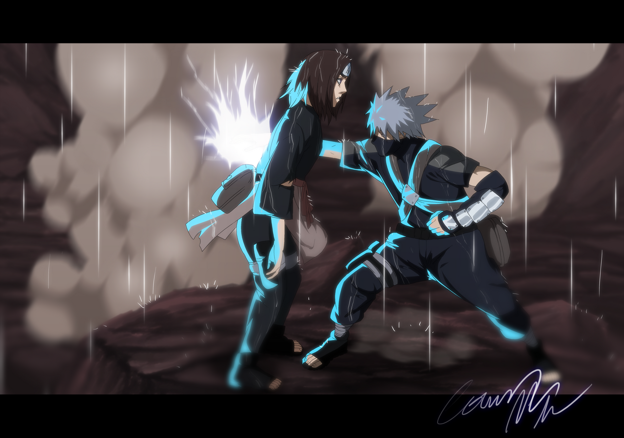
My contest against Himura") Here's his...
Here's his...[link]
Related content


Comments: 20

you guys both suck hmmm i give the win to..... NO ONE JAAJAJAJAAJ
👍: 0 ⏩: 1

Dude whats wrong with you?
👍: 0 ⏩: 1
You just are in love with the taste of my dick
👍: 0 ⏩: 0


This isn't Suzuki. Mine ( I get it a lot) looks suzukied C:. His is standard style?
👍: 0 ⏩: 0


this is awesome!!!!!!!!!!!!! what pencil seize did you use and did you blur it
👍: 0 ⏩: 1
Thanks  (Smile)")
👍: 0 ⏩: 1
Nice Buba, I think the Eyes would look better if you feathered the shine but other that than awesome xD
👍: 0 ⏩: 1
I actually didn't like the feathered shine, it looked off to me XD
👍: 0 ⏩: 0


Totally agree with RaXeon, the lines on this one are better.
👍: 0 ⏩: 1
It's just the giant resolution I use. You know everyone has their own style right?
👍: 0 ⏩: 0

i think yours is better.. most likely becouse of the lines,shading and the nice detail in the scratches^^
👍: 0 ⏩: 0

They're both as amazing as they can be, both have they're strong points, its really hard to decide, so I think its a tie
👍: 0 ⏩: 1