HOME | DD
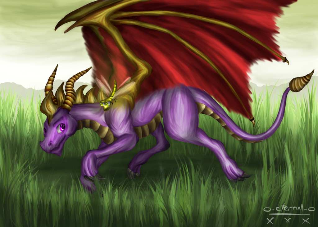
 CalebP1716 — Spyro

#digitalfanart #digitalpainting #dragons #fanart #fantasy #photoshoppainting #valuestudy #artstudy #spryo #spyrothedragon #grayscalecoloring
Published: 2016-09-07 01:59:39 +0000 UTC; Views: 1547; Favourites: 141; Downloads: 13
Redirect to original
Description
Well, I'm finally finished, I couldn't really think of anything more to add, so I decided that it's probably time to finish! I added some scales, though to be honest they aren't as pronounced as I originally thought that I'd make them to be, but I think that just the subtlety of them would be just fine for this painting, besides, this is my first Spyro painting ever, so I think that in the future I'll have more time to figure out how I want to make the scales.The time it took me to create this piece is approximately 7 hours or so, give or take, but I think that in the end it turned out alright. I'm looking forward to doing more paintings like this, it was a fun study, and my brother already said maybe I should stick to creating some more Spyro content, or even perhaps attempt drawing Crash Bandicoot, just something different for me to draw from the typical stuff I do.
Anyway, I hope you guys like how this piece turned out, thank you very very much for checking out my work, it means a whole lot to me, and in case you're interested, here is the original image that I was using as a direct reference for this piece: tvtropes.org/pmwiki/pmwiki.php…
And here are the previous WIP's (Work in Progress's): and
Related content


Comments: 41


Originality
Technique
To be clear, I'm a sucker for Spyro fanart for how much I love the character.
The mimic of the picture on the game's case is remarkable. The detail is well-captured: from lighting and shadows to the visible scale lines. His wings look like something you would want to touch and show that your strokework is consistent. The expression is wonderfully accurate as well. However, you seem to have missed the spines on his back, my one complaint. There are probably more spines on his tail in the game as well. To be true to the "Dawn" in the game's title, it's nice that you have a colour transition in the background. The light hues and the dark hues are balanced. You managed to stay true to his image while still showcasing your own style.
👍: 0 ⏩: 1

well I think his technique was better then 4 stars, I'd say 4.5 stars is more proper. otherwise I agree fully with your critique.
👍: 0 ⏩: 0

Leaving proportions aside, this glowy painting style is pretty nice! Keep it up
")
👍: 0 ⏩: 0

It looks really good! You're getting better!
👍: 0 ⏩: 0

Sick! Awesome work  (Smile)")
👍: 0 ⏩: 0

You just made Spyro look adorably awesome
I approve of this painting
*Gets all the memories*


👍: 0 ⏩: 0

Nice! But theres too much darks. Remember that a dark value close to a liggt value will appear darker. nd a light value close to a dark value will appear briggter. There agould be suddle value change around your liggt and shadow. And a black shouldnt really be used. You should look up complimentary colors for shading;3 parzon spelling errors but my phone has auto correct.
👍: 0 ⏩: 1

Haha, darn auto correct, gets me every time! XD And yeah, I totally agree with ya, I'll be sure to keep that in mind next time as I work on my shading, but hey, that's why I'm doing these value studies, trying to get better at fixing these mistakes. And the colors that I used, well to be honest, I didn't really have much say in what colors to choose, but I'm also trying to figure out the best blending modes in photoshop to add color to a black and white image, I mostly use overlay for the most part, but I also use soft light, and multiply, and adjust the gray tones slightly up or down from the midtone range, that way I don't get too harsh of a contrasting light effect... though that didn't quite work out with this painting.
I hope to get really good one day, and your work has been a huge inspiration for me to try and get better at painting. So yeah, keep up the great work buddy! ^^
")
👍: 0 ⏩: 1
one tip try to use swatches I save natural colors form photographs into swatches for fast use . pick photo you like and save the colors.:3
👍: 0 ⏩: 1
Hey, that's a good idea, I have thought about creating a color palette using swatches, but I was gonna hand pick the ones that I typically use for most of my paintings, but using natural colors from photographs would be a good idea as well. One of the things I've wanted to check out to get better at painting, especially wildlife, would be a video series from Aaron Blaise. He's an insanely awesome artist who use to work for Disney, and is a master painter in drawing wildlife, or even fantasy creatures. Heck, just watching his speed paints are fun to watch, in case you're interested, here's his youtube channel, I've been learning a lot from him lately, especially in learning to draw the human figure. www.youtube.com/user/AaronBlai…
Btw, I'm sorry to ask this of you, but if I could get you to give me some pointers on my most recent painting of the Joker, I'd really appreciate it, you're an insanely awesome artist, and I value any advice I can get from you. My Joker painting was done as another grayscale to color study, so any help I can get will be awesome, thanks!
Here's the link to my Joker painting: Joker: Arkham Origins
👍: 0 ⏩: 1
^^yea I see some minor issues that are really easy to fix. mey I paint over and in detail explain things? kind of a tutorial i mean.
👍: 0 ⏩: 1
Yeah, that'd be great man, I'd really appreciate it, thanks!
👍: 0 ⏩: 1
your painting missed ambient light. and the yellow on the shirt looked off it shouldnt be there if theres no artificial light so I introduced light from a lamp to the left. on linear dodge layer I used a desaturated yellow to do this. and painted in the same layer wth same color some yellows to the side. I also defined more hairs in the hair using the ambient light mixed with the hair color. in this piece I have a tint of purple in the entire image. also a little bit of green. I made a Linear dodge layer and painted in the entire image with green and lowered opacity. and color balanced and brought purple or magenta into the mid tone. this creates harmony in all colors.
I also made the skin closer to the artificial light a tad bit more yellow. and ended it by liquifying the face into a perspective. a lot of those things are my own prefrences... but download the file I linked and see the Psd
👍: 0 ⏩: 1
Awesome, I checked it out in Photoshop, and I really like the improvements you made, I'll be sure to keep them in mind as I continue my work. Quick question for you, do you have a preferred way to study/practice that may help. And thank you very much for your help, I really appreciate it Zilvart, it's been a pleasure receiving these critiques from you. I'll do my best to improve, and hopefully get better. ^^ Oh, and keep up the great work yourself, I really love checking out your art!
👍: 0 ⏩: 0

This reminds me of the [cancelled] Spyro movie poster.
👍: 0 ⏩: 1
What!? They were gonna make a Spyro movie?? Oh man, that would have been really cool!
")
👍: 0 ⏩: 1
Yeah there was a poster release a few years ago but apparently it got cancelled :/
Here's the pic: www.darkspyro.net/film/images/…
👍: 0 ⏩: 1
Hehe, I bet it's because of the first line in the poster "from the producer of Eragon", they completely ruined that movie, I've read all the books, and the way they ended the Eragon movie, it'd practically be impossible to make a second. It sucks though that they didn't make it though, I'd still see the movie if it had been made. Spryo is an awesome character, and I hope that they'll bring him back into his own game again one day.
👍: 0 ⏩: 1
I hate how Activision took Spyro and mutated him. He looked cool in the first and second Spyro series.
I thought the Eragon movie was alright. Then again I have yet to read the books so I wouldn't know :/
👍: 0 ⏩: 0

Thank you very much, I'm happy that you like it!
👍: 0 ⏩: 0

Thank you very much, I'm glad you like it!
👍: 0 ⏩: 0


This is very well done.
crash bandicoot! played a little of his games, mostly crash team racing(so not much of the actual story) but hes awesome
👍: 0 ⏩: 1
Thank you very much Wolf, I'm glad you like it!
And yeah, I didn't play much of his games either, and my favorite was the team racing one as well. ^^
👍: 0 ⏩: 0
Merda sancta, you made this yourself?! It looks so much like on the back cover of the game's case!
👍: 0 ⏩: 1
Sure did, and I'm glad you think so, I was hoping that I'd be able to capture a fairly accurate depiction to the original!
👍: 0 ⏩: 1
I love Spyro, and I loved playing "Dawn of the Dragon" ^^
👍: 0 ⏩: 0

The smooth scales work nicely IMO
And Crash Bandicoot is the other PS1 main charcater i remember so that would be sick
👍: 0 ⏩: 1
I'm glad you like the scales... I was a bit nervous with how they'd look, so I'm glad you like them man! ^^
I never did play Crash Bandicoot very often, except for the racing one, which was probably my favorite!
👍: 0 ⏩: 0
