HOME | DD
 Capnchef — David Grier's Rondo of Blood
Published: 2006-07-23 15:57:24 +0000 UTC; Views: 6775; Favourites: 97; Downloads: 91
Redirect to original
Description
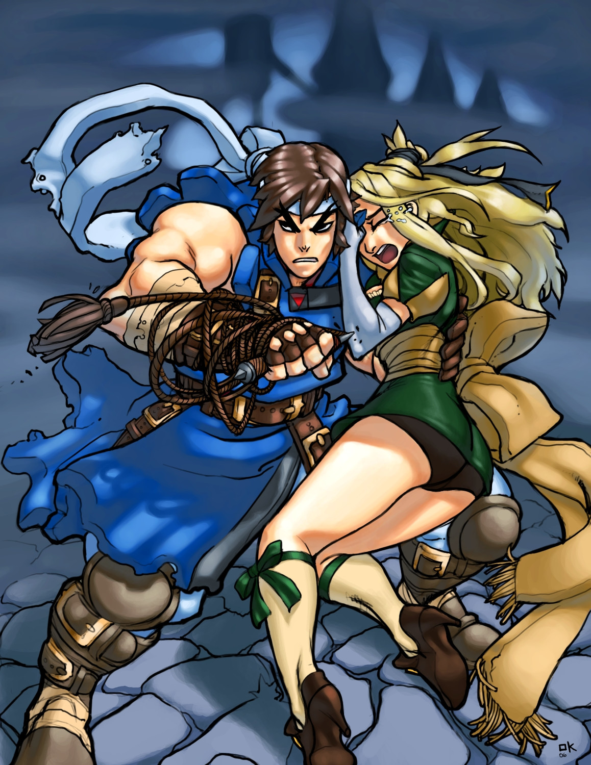
David Grier's Rondo of Blood piece( [link] ). He gave me permission to color it, and even sent me the high rez lines, which was pretty rad of him. Not quite finished yet, but I'm rather proud of what I'd done so far so I figured I'd show everyone. Crits and comments are most assuredly welcome! Thanks.Photoshop CS
**EDIT**
Finally finished! Whew! I'm really proud of this piece. I may not have done the linework, but I'm happy that I did a full fledged background. From this point onward, no more "finished" pictures without backgrounds. Period. And hey, thanks Dave for letting me color this, and thanks to anyone who takes a look at this.
Related content


Comments: 39


Old name for this artist: chuck-piresart.deviantart.com/
The sketch was his, I just added colors.
👍: 0 ⏩: 1

This looks great
P.S. Maria wouldnt cower like that, right?
👍: 0 ⏩: 1


that's Richter and that's Maria!
and the best, the color is..... AWESOME
very decent work!
👍: 0 ⏩: 0

Thanks dude! Did you visit David Grier's dev art page? He's the guy who did the original drawing, I merely did the color work. ")
👍: 0 ⏩: 0

My gosh this is awesome.O.O Beautiful coloring.
👍: 0 ⏩: 1
Welcome a pleasure to fave.
👍: 0 ⏩: 0

I hate leaving just somewhat generic comments, but DAMN! ._. Even if you just did the color and background, thats really something! D:
👍: 0 ⏩: 1

This rocks ass. I wish Konami would release Rondo of Blood here
👍: 0 ⏩: 1
yeah, I dunno why they won't. it would make quite a lot of money
👍: 0 ⏩: 1
I know, it would sell like hotcakes among us Castlevania fans
👍: 0 ⏩: 1

 (Smile)")

Wow, that's awesome. Forget lighting differences, that background just makes it look cooler.
👍: 0 ⏩: 1
Heh heh thanks. I'm not going to change this one at all, I'll leave it as is. The lighting is just something I need to be even more conscious of from now on.
👍: 0 ⏩: 0

Hey thanks Kizer
👍: 0 ⏩: 0

dang marty this is good! your really know what your doing!
kudos on this man
👍: 0 ⏩: 1
Thanks Joe
👍: 0 ⏩: 0

You did a great job a colouring it! like it a lot
👍: 0 ⏩: 1
Hey thanks
👍: 0 ⏩: 1

👍: 0 ⏩: 1

A few things jump out at me.
The piece of the coat that is flowing behind him looks to light compared to the part on his thigh. Reason?
The background looks nice - but maybe you could have extended the top of the image to have that (thing) be more clear.
Is it a castle? Anyway... the only other thing is that maybe there should be a darker area (or maybe overall) just before you get to the light in the background.... or maybe I'm not understanding what's back there.
The only other things aren't on you.
The Feet are cut off. Why not extend the bottom of the frame to include the feet instead of awkwardly cutting them?
His eyes are hard for me to read - I can't easily make out the iris. Some color might help. Ehh whatever.
Looks great.
👍: 0 ⏩: 1
Heya Guy, yeah theres a couple things that in retrospect I would change, now that its finished. But its finished and I'm not going to go back to it, I'll just take what I learned and apply it to the next piece.
"The piece of the coat that is flowing behind him looks to light compared to the part on his thigh. Reason?"
-I was going for some of the close-up atmospheric haziness that you see in a lot of art nowadays, when I colored the figures. But when I did the background, I had completely fogotten about it, hence the background isn't as hazy, which kinda nullifies the effect. Good eye on that.
"The background looks nice - but maybe you could have extended the top of the image to have that (thing) be more clear.
Is it a castle?"
-I actually wanted to crop out a lot of the castle and just leave the one feature that almost every Castlevania fan would be familiar with...Dracula's Tower(Throne room). So I sacrificed common familiarity of the masses for something that only fans would know and recognize. But is was intentional. That part I don't think I would change at all.
Anywho, thanks for the great crit as usual.
👍: 0 ⏩: 0

You just keep on getting better son!
I really like the hair (that you've done so far).
So who is this now? Guy, Ryu? heh heh.
One last thing.... too big!
👍: 0 ⏩: 1
Lol thanks Guy! Yeah this is Richter and Maria from Castlevania Rondo of Blood. Also, I put the size that big so when you full view it you could take a much closer look at the details. Believe me, this piece is much much bigger while I'm working on it.
👍: 0 ⏩: 0

Cool color scheme, I like the earthy-tones on the girl.
👍: 0 ⏩: 0
I'll be updating this as soon as I finish it which will hopefully be within the next week
👍: 0 ⏩: 1

np mate ^^
u ve got a great gall too
👍: 0 ⏩: 0