HOME | DD
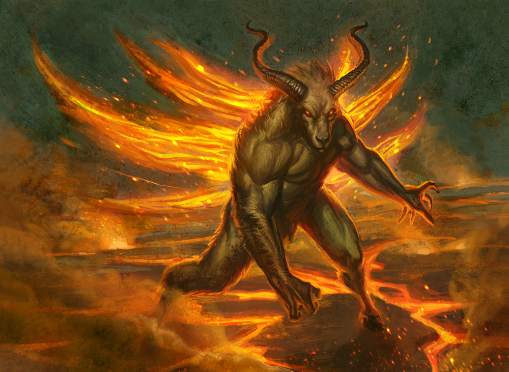
 capprotti — The Beast
Published: 2009-05-19 17:22:36 +0000 UTC; Views: 1415; Favourites: 23; Downloads: 117
Redirect to original
Description
This is a portfolio piece I finished last night. I'm pretty sure it's done, I my go back into it again later but for now it's done. Hope you enjoy!Related content


Comments: 27

Very cool drawing. It actually makes me think a lot about the Minotaur from "Dante's Inferno".
👍: 0 ⏩: 1

Great reference. I really have to read that!
👍: 0 ⏩: 2
Another interesting thing to note is that in his poem, I believe Dante envisioned the Minotaur as being part man, part bull, but from there, a quite different appearance from today's iconic image of "the Minotaur".
Even the original myth, though it states the creature as being part man, part bull, I'm pretty sure that's about it, and I always wonder what the origins where to the image we see nowadays of the Minotaur.
👍: 0 ⏩: 1
Ha, I'd like to know myself! Thanx for sharing manas101. Some pretty sweet insight there.
👍: 0 ⏩: 1
I won't give too much away, but essentially, it was the very Minotaur from Crete, and it was basically the "guard" of the 7th Circle of Hell. The seventh then, is the Circle where Dante and Virgil find the souls of those who're damned for various sins of Violence.
👍: 0 ⏩: 0

looks good, but whats the point of it? If this is going in your portfolio just to look pretty, I'd advise something else.....
👍: 0 ⏩: 1
Thanx man! But what exactly do you mean, do you think it's not portfolio worthy or that it couldn't be pushed further to be portfolio worthy?
👍: 0 ⏩: 1
when you do a portfolio, you want your best to shine, so if this is the best you could do, technically, then cool, keep it in. I think you could push the concept further though if this is not in the book just for quality sake. It may just be glanced over and you don't want any images in your portfolio to have that 'okay I've seen this before" look. You want to bring something new, something that will make them stop, stare and have something in it that will peek their interest: i.e. a new way to draw, a new way to present a mystical beast, something like that.....
The reason I know this too well is because a lot of my stuff is pretty bland, so it has gotten glossed over, so now I am trying to do new takes on things, do things I've never done before, and try to do things I've never seen done as well.....
👍: 0 ⏩: 1
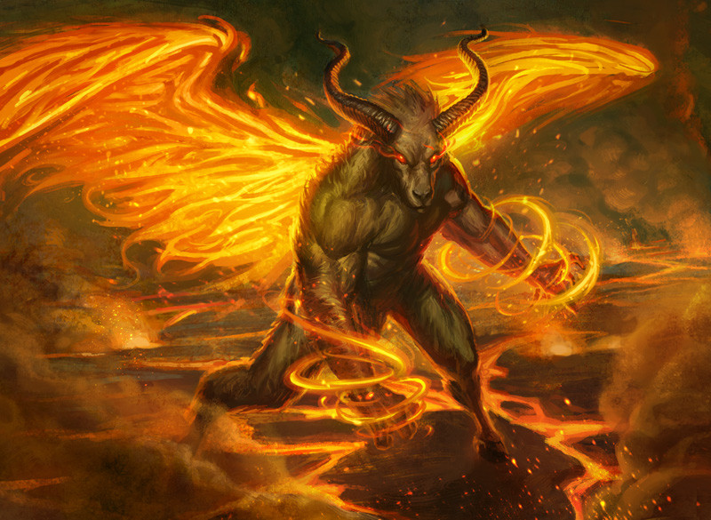
Hey Man, thanx for the feedback. I totally agree after chattin with my boy my eyes were opened to how now amazing this piece is so it's been turned up a few notches. It's at about 10 and a half right now... but I'm still trying to turn it just a LITTLE further toward 11. I'll post when I'm done.
👍: 0 ⏩: 1
can't wait till I can see the new image=]
👍: 0 ⏩: 0

Mmmmm. Great work on the beast and background!! I love it's features. However, I am not really convinced by the "fire wings" on the beast. In my opinion, they need a little more work. They look like sprouting palm leaves rather than (let's say) bat/bird wings.
Looking at your pic, I see that you spent a lot of time and effort on it and I give you max respect for that. I must tell you something and it happens to me as well. For many artists, there is always a danger of not finishing their artwork properly without knowing themselves. This is likely due to fatigue from spending long hours/days weeks concentrating on features that gives their artwork a visually aesthetic edge. Without knowing, artists tend to quicken up the pace with the "get it over and done with" approach and the result becomes apparent maybe not for the artist who created the pic, but for those who see their work.
Here's my suggestion (if you are willing to do so).In order to give the beast sprouting wings.
1) Expand your background (horizontally).
2) Make a bone frame for the the wings (the bat is much easier to make)
3) You can substitute skin membrane/feathers for flames.
I hope my constructive (helpful) critisism would prove a little usefull Capprotti. Otherwise you really made a great pic!!! ^-^
👍: 0 ⏩: 1
Man! Thank you! You put a lot of things in perspective, and made all kinds of good points. And you hit the nail right on the head about rushing to the finish line. I'm going back into it now and reworking a lot of things. Thanx again for the great crit. Exactly what I was looking for.
👍: 0 ⏩: 1
You're welcome capprotti!! Glad to be of service to a fellow deviant! ^-^
👍: 0 ⏩: 0


Looks good! I really like the reflected light off the horns and the smoke effect. very nice indeed
")
👍: 0 ⏩: 1
Thank you! Yea, that was a lot of fun to do.
👍: 0 ⏩: 0
Thanx mang! You gonna be at WWPhilly?
👍: 0 ⏩: 1

Idk... when is it? If I do, I'll prob just go Saturday... I don't really have anything to show (or money to spend  (Smile)")
👍: 0 ⏩: 0

Nice one. I love that it's slightly sketchy, also the effect on the firey wings and the pose. The background's nice without taking attention away from the minotaur-beast.
👍: 0 ⏩: 1
Thanx so much! Looking at it now, it might be a little too sketchy. But I'm workin on that
👍: 0 ⏩: 1