HOME | DD
 CaPtIne — Portfolio VI

Published: 2006-09-27 19:11:26 +0000 UTC; Views: 77362; Favourites: 337; Downloads: 2183
Redirect to original
Description
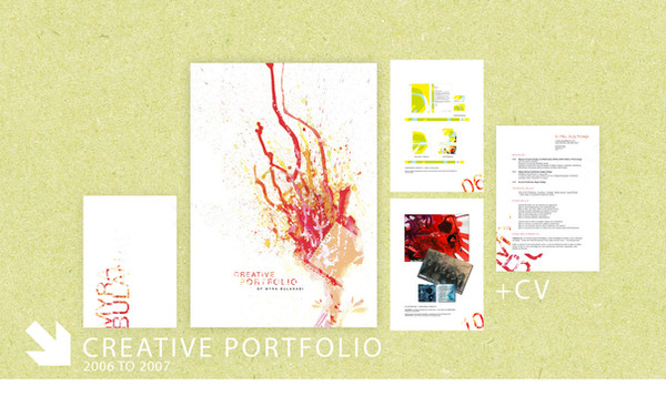
Classíque - meant to mean 'classy' more than 'classic'.It's a '
 ossibility' for my final portfolio I'm making (along with many more to come) of which will eventually consist of my photography coursework pieces for my GCSE's.
 *edited* Made darker as requested.
Related content


Comments: 60

Excellent clean design, but it lacks a bit of contrast between the background and the text
👍: 0 ⏩: 0


")


One of the best I've seen and will be easier to download in the information
👍: 0 ⏩: 0


this looks amazing
light and simple......yet elegant.....awesome design
what did you make it in?

👍: 0 ⏩: 0


Very nice job. Sleek, simple, works perfectly. Great job!
👍: 0 ⏩: 0


That's most definitely one of the best designs I've ever seen.
")
👍: 0 ⏩: 0

Huiii!!!! Great, nice work...You can make the text a litle bit darker. But it is a really nice work. I love it. The text is not realy importantly.
👍: 0 ⏩: 0


looks like hair coming from the back, maybe the grudges hair 
kewl site though
👍: 0 ⏩: 0


Wow that looks wow! And i think that the fonts must be changed too..
👍: 0 ⏩: 0

Amazing design, though fonts needs to be changed in my opinion.
👍: 0 ⏩: 0


Text and borders are way too light. More contrast is needed.
👍: 0 ⏩: 0


fresh, simple, lightly, > it looks very very great
one of the best view of my week
just chang the script font on menu and content i think
👍: 0 ⏩: 0

For me it looks just a bit too bright, but I gotta say... I love it anyway
 (Wink)")
👍: 0 ⏩: 0


the layout is way to bright but i like it very much actuallly, good job

👍: 0 ⏩: 0

i think its a good set up  (Smile)")
👍: 0 ⏩: 1

Thanks for the comment.
I'm not too sure about coding, but I had in mind to make it partly flash and have a few animations hanging around.
Do you code by any chance?
👍: 0 ⏩: 0

Very nice desing, i would say a little too light though? perhaps just me
👍: 0 ⏩: 0

this is stunning. very sleek and stylish, not overcrowded, very well done
👍: 0 ⏩: 0

Very nice, but I think the text is too light to the background, but it's nice and smooth, and simple, and I love the sort of vine wrap around.
👍: 0 ⏩: 0

It's nice, though these bright designs can create complications when they are designs to photoalbums, if the photos for example is to dark it will create to hard contrast that ain't that nice to look at, but it's a great design, nice work!
👍: 0 ⏩: 0

Nicely done. I might just make the font black. Blue on white is difficult to read for some. And, if it is, when designing websites, it's important to color cordinate fonts with colors. For example yellow upon purple, or orange is really difficult to read. Other than the font, it looks really good.
👍: 0 ⏩: 0

I love this, I just wish I could do the same. I really like the little watchamacallits on the top left corner.
I agree with the colour of the text though maybe just a little darker
👍: 0 ⏩: 1
| Next =>