HOME | DD
 cariadav — roses are red...
Published: 2004-07-23 00:29:33 +0000 UTC; Views: 449; Favourites: 3; Downloads: 66
Redirect to original
Description
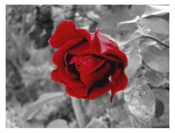
the background isnt.Not too impressed with this, but there we are. Its better than another attempt, as its all dark and better!
")
Related content


Comments: 19

It's not too bad, the idea of desaturating the background is always nice (I did the same with my trapped beauty II). But it is visible how you manually desaturated it around the flower (a yellow-green glow on the outside). Try to be more careful next time, choose a very small brush size of the sponge tool in PS and reduce the flow so you can allow yourself a couple of mistakes and touch the red. I'd also like to see the stalk and leaves in full green, so that the entire rose would stand out, not just the flower. I think that would add to the dramatic mood (something like the colored rose on the desaturated background in the legendary Guns 'n' Roses video - November Rain).
But I like your style and your ideas, especially 'cause we think much the same way.  (Wink)")

👍: 0 ⏩: 1

yeah, this one went a bit wrong... I loved the basic idea, but it went a bit screwy methinks ")
great song by the way
👍: 0 ⏩: 1
Well, you could add just a bit more brightness if you ask me (or maybe there's something different with our monitors as far as brightness is concerned?), but it's beautiful blood-red like this too. 
No problem about the comments, my pleasure. 
👍: 0 ⏩: 1
I didnt add more brightness, mainly because it changed the quality of the pictures ")
👍: 0 ⏩: 0

This one is beautiful! I kind a like the way B&W is mixed with colors. And then again; I like flowers. Great work
👍: 0 ⏩: 1


thanks 
 (Smile)")
👍: 0 ⏩: 0

wow, i really like it!! i think its really pretty!! 
👍: 0 ⏩: 1
thank you muchly!
👍: 0 ⏩: 0


I think it's beautiful no matter how un-impressed you may be i love it great colour saturation on the rose. absolutely beautiful
👍: 0 ⏩: 1
thanks
👍: 0 ⏩: 1

Think it might've been interesting to see the same picture but with rose in black and white and the leaves and such not. Very nice picture though
👍: 0 ⏩: 1
hmm.... I could try that - I'll see how it turns out. It'll either be in scraps or gallery (funnily enough) probably tomorrow. Maybe later
👍: 0 ⏩: 0