HOME | DD
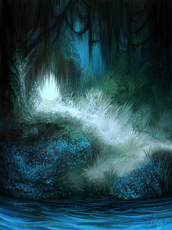
 CarolinVogt — Forrest - blue

Published: 2012-10-11 11:44:02 +0000 UTC; Views: 5513; Favourites: 231; Downloads: 126
Redirect to original
Description
facebook | tumblr | twitter | homepagePhotoshop
 (Smile)")
Take a look at the red version of the forrest:
link
Related content


Comments: 40

Hey!! i really like this artwork of this forrest :3 my friends and i are developing an pokemonadventurebot for telegram and would love to use this picture on our website as background. If its okay please answer me :3 we will also mention you on our website! :3
👍: 0 ⏩: 0

Hello Carolin!
Your beautiful ilustration has been featured as header for my followig poem, a ghazal, my entry for ‘s Prompt Two: The Ghazal:
From Afar The Shadows - Ghazal by InsanelyCute
Literature / Poetry / Humor / Traditional Fixed Forms
Thank you very much and Greetings from InsanelyCute!
👍: 0 ⏩: 0


Very beautiful.
I really adore how the colors lighten up the more they get into the background.
I also really like how you've used spots of colors to depict the trees' leaves.


👍: 0 ⏩: 1

these colors are some of my favorite ones. I looove blue
👍: 0 ⏩: 1
You're very much welcome.
Blue also belongs to my favorite colors because it's such a deep and tranquil color.
👍: 0 ⏩: 1


Hello! Your wonderful art has been featured in my Sunday Selects!
[link]
👍: 0 ⏩: 1

 (Wink)")


thanks for your comment :>
👍: 0 ⏩: 0

")


I really love this piece and the colors chosen. I like it more than the red version, myself. I get the feeling of night time and magic. Great job!
👍: 0 ⏩: 1
thank you
👍: 0 ⏩: 1
You're very welcome! It's more soothing, as well, but then, blue tends to be that way when compared to red.
👍: 0 ⏩: 0

Such a wonderful use of layers to create such depth... I love it!
👍: 0 ⏩: 1
Yes, I played with colors, layers and gradients to create the depth
👍: 0 ⏩: 0


ow... a coloração e o estilo de pintura ficaram brilhantes
👍: 0 ⏩: 1
i don't understand everything, but thx for your comment
👍: 0 ⏩: 1

