HOME | DD
 cccp-lord-soth — Mechanized-SS

Published: 2003-05-07 11:39:07 +0000 UTC; Views: 6264; Favourites: 54; Downloads: 173
Redirect to original
Description
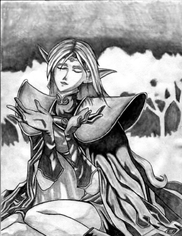
German Mechanized infantry.Done with no.2 pencil on art paper. Didnt really feel like messing with it in photoshop to clean it up or smooth out the tones so it has kind of a raw look to it with the dark shades not blended smoothly. But I dont submit much with the pencil strokes visible so heres what my pencil stuff looks like before its prettied up. I kinda like it.
Related content


Comments: 34

Holy shit man, that is real cool, I love the details in the clothes and the detials on that luger!
👍: 0 ⏩: 0


make a shading tutorial plz!!!! but frickin awesome drawing
👍: 0 ⏩: 0

Nice shading and form. It actually looks quite clean.
👍: 0 ⏩: 0


")

Hi There!
You have just earned yourself an O.D.D.(oibyrd's daily devs) feature 
PLZ NOTE - Todays' features were chosen by the watchers on my account 
ODDS (oibyrd's daily deviations) are to honor the sometimes overlooked artists of dA that I personally think deserve some exposure and also, to introduce the more popular artists to the new/overlooked deviants. I prefer to showcase ALL artwork that I love (and that includes popular artists with a fair amount of traffic to their work) in order to create a non-biased feature of the talent on dA. Please click the link below to see your work featured and to view other featured artists . If you prefer not to be a featured artist, just send me a note and I will remove you from the list. Cheers! Sandi xoxo
[link]


👍: 0 ⏩: 1
you're very welcome! 
👍: 0 ⏩: 0

Hey there, Ive been working on a project for a pulp WWII game for Darkson Designs called AE WWII: 'Unknown Tomorrow'. Currently we only have a single artist working for us and Ive been looking for more artists to join this project.
Check out the following links:
Forum: [link]
Site: [link]
This will be paid commission work you will have to do. If you are interested please email to the following adress:
info@darksondesigns.com
Cheers!
👍: 0 ⏩: 1

Hmmm
Ill check it out and get back to you.
It would definitely be an interesting project to work on.
👍: 0 ⏩: 0

aw, this is so sexcii. i really like how you can tell the difference between metal and nonmetal here, even though its like all done is like the same colour. yea the shading is awsome too.

👍: 0 ⏩: 1
Thanks for the kind words.
👍: 0 ⏩: 0

I like this one, it's soo cool..  (Cool)")
The kraut helmets look too round, but that's just my opinion.


👍: 0 ⏩: 0

Awesome!
And there, we have, the difference between a professional and a rookie. Me, I would have smudged it all up by the time I finished.
bravo,
👍: 0 ⏩: 1
Hey thanks man.
👍: 0 ⏩: 1
welcome ~
(it's woman. ^_~)
👍: 0 ⏩: 0


great drawing!
if i may ask, how black were your hands after that! you must have used up a whole pencil! especially if it was a 2B!
.....hold on. that cant possibly be right. obviously number 2's are different to 2Bs. oh well, not that it makes much of a difference to the artwork! (Smile)")
👍: 0 ⏩: 0

Wow, the shading in this is perfect! And the look real detailed! Good work
👍: 0 ⏩: 0


you remind me of a mate of mine.... he done all the WWII axis... the linework and shading is spot on... you should never smooth out your pencil lines... it somewhat degrades the image... but then again leaving it in sometimes can have its downfalls.... but this one u did the right thing by leaving it be.... great job
👍: 0 ⏩: 0
Thanks guys, Ill leave it be then.
And ya hands give me alot of trouble.
👍: 0 ⏩: 0

Wonderful pencil work! I don't think you should hide this at all beneath "touch ups" and "fixings" in photoshop. It looks wonderful the way it is! Such lovely dark shadows! I love! yum!
👍: 0 ⏩: 0

I love it! great shading, nice and deep, the way I like it. the helmets look especially nice. the hand on the guy in the middle holding the rifle looks a bit off, but in that position, it's hard to get those angles just right.
I agree, you should leave it as is. rough sketch rocks. *nods*
👍: 0 ⏩: 0

Jsut love the da&rk tone of the drawing.... its going in my favs and you are going in my deviant watch
👍: 0 ⏩: 0

thats good .. nice and detailed... i can never draw like that because it gets too dark for my liking and its easier to add more then remove it
👍: 0 ⏩: 0

Holy cow, one of the best pencil work I've ever seen and like at the same time.
👍: 0 ⏩: 0

I like it too. In my opinion, I don't think you should do anything more to it. It's amazing just the way it is. Extremely nice pencil work. .
👍: 0 ⏩: 0

wow thats cool! I like how the monocromatic feel adds to the mood of this piece !
👍: 0 ⏩: 0


nice pencilwork. i like the shadings on the helmets and faces. gives it a very *polished feel
👍: 0 ⏩: 0