HOME | DD
 cdn1 — dark art
by-nc-sa
cdn1 — dark art
by-nc-sa

Published: 2010-05-20 17:30:11 +0000 UTC; Views: 1418; Favourites: 39; Downloads: 66
Redirect to original
Description
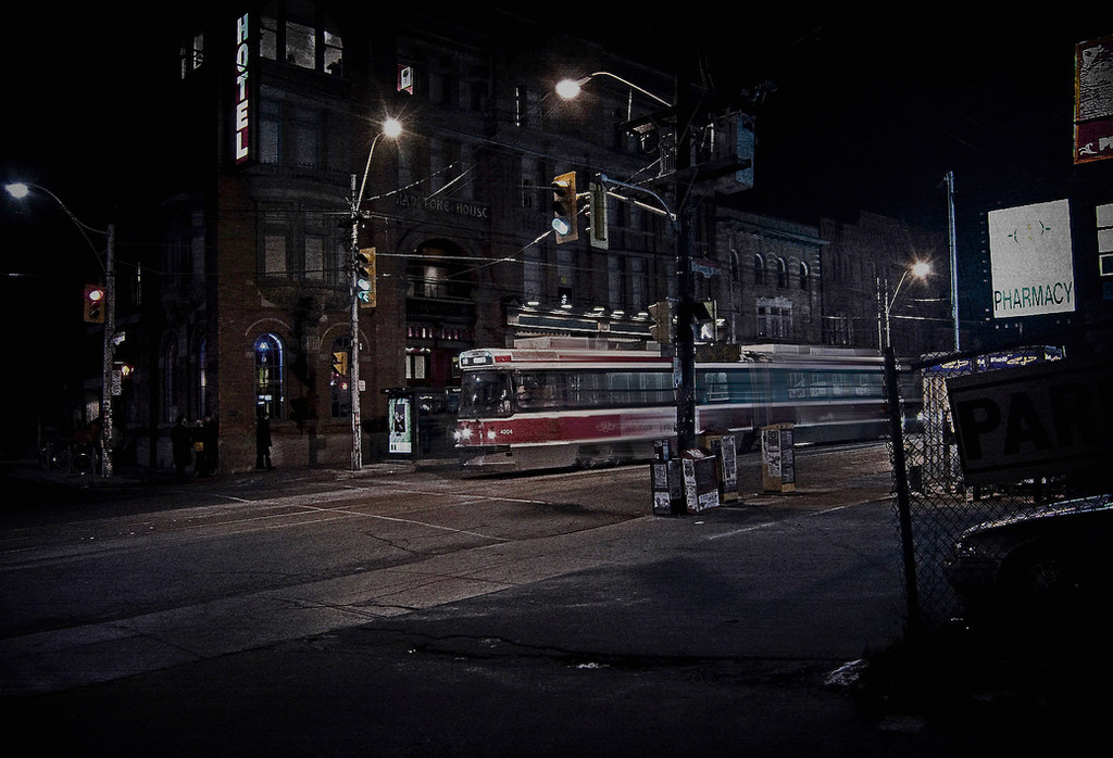
*full size please*night-artist Patrick Fitzgerald on Queen Street East, Toronto
Related content


Comments: 35

Clean, sharp, this is a fine example of proper black and white photography.
👍: 0 ⏩: 1

Coming from you that's a great compliment. Thanks.
👍: 0 ⏩: 1
I rarely work with black and white, but I'd like to think I know a good piece when I see one.
👍: 0 ⏩: 0

Delicious!...
We all sure if you go out for a photo session at night we must be ready to see some masterpieces...Neat B&W tonnes, wonderfull capture of the moment
👍: 0 ⏩: 1
thanks my friend...hopefully I will have more to post soon
👍: 0 ⏩: 1

great shot and it's so nice to see you posting again!
👍: 0 ⏩: 1
aww thanks...hope to have more soon.
👍: 0 ⏩: 1


I love the way you captured the texture of the building here

👍: 0 ⏩: 1
Glad you like it ")
👍: 0 ⏩: 1

this is so cool... is this the same street artist you told me about a couple years ago, or a different one? i remember you told me about one you kind of made friends with. anyway, love this photo
👍: 0 ⏩: 1
thanks jd! yup same guy. actually this isn't new i hated the edits i posted a few years ago and forgot about this until i came across it in my dust cluttered pic files the other day.
btw i love the new look on your facebook id. very cool indeed
👍: 0 ⏩: 1
thanks michael  (Smile)")
👍: 0 ⏩: 0

Thanks David I appreciate your comment
👍: 0 ⏩: 0
I am allways in love with your photographs especially when you capture them on the heart of the night
👍: 0 ⏩: 1
always with the kind words my friend ; thank you

👍: 0 ⏩: 1
You are my truely dear friend
👍: 0 ⏩: 0


Totally agree with the above comment, Mikey.. this image works amazingly well.. 
👍: 0 ⏩: 1


When I first saw the title, I was expecting witchcraft and stuff. I am highly disappointed. Or, I would be if I didn't find this picture to be so damn awesome. Normally, I would be kind of iffy on the idea of low contrast black and white, but you made it work somehow. It is just enough to show the differences in the shadows, but not enough to make the shadows and highlights very separate. I also notice the head blurred a little bit; I think that was a nice touch if that was intended.
👍: 0 ⏩: 1
thanks! well the blurrd head was intended in so far as i had five different similar shots to choose from, two of which had the head quite clear, but i thought the movement might bring this a live a bit.
👍: 0 ⏩: 1
No problem. And, as always, you make sound decisions when it comes to art. I would've went the "wrong" way (I put wrong in quotes since there isn't usually a wrong way in art). I would've chosen the still head. But the blur has gotta be the superior choice here if I had to guess (but I don't have any sort of comparison)
👍: 0 ⏩: 1
Certainly you wouldn't have been wrong it would have just meant adjusting the object focus in the composition. I being the invisible photographer and he being the almost ghostly artist put the emphasis on the art.
The original clear shots I posted of this in colour a few years ago focused on the artist and all else secondary. I didn't pull it because I thought it wasn't a good shot in itself but I didn't at all like the way the colours played into it and distracted from a pointed area of focus.
👍: 0 ⏩: 1
Ah, yeah, I guess as with all things: if you change something, it doesn't necessarily mean it is wrong. Changes just have to be made to adjust to the difference. And it is very odd how colors can be sometimes. Maybe we should just have a world in all black and white. (But the tree frogs would suffer a great loss without the color.)
👍: 0 ⏩: 1
Nicely put. I think it is me that is more distracted by colour. I love colour and to the point that when I edit I can get so intent on getting the right shade of red or yellow that I lose the purpose of the composition.
Once in an art class our assignment was a painting of a tiger based on the Kipling poem. In most cases I can sketch a reasonable likeness of things but when it came to painting the work I became so wrapped up in the colour tonalities and blending that poor Mr Tiger, though resplendent in an admirable pelt (are they pelts or skins?), more resembled a skulking German Sheppard in drag than Poos esteemed sidekick.
I rather like frogs and certainly don't wish to rob them of their noble attributes.
👍: 0 ⏩: 1
When I first started my painting class, I had like, the exact opposite problem: I didn't care about the color enough. I am happy to say that it is a problem no more! You can see by the way the spray paint can is on my latest painting I put up.
👍: 0 ⏩: 1