HOME | DD
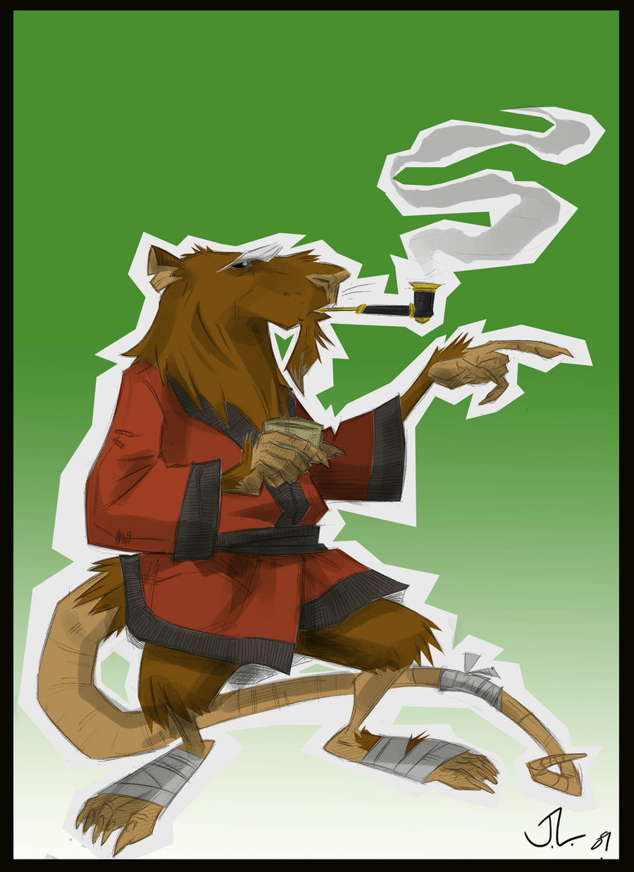
 ChainsawTeddybear — Master Splinter tiny sketch

Published: 2013-12-11 11:24:59 +0000 UTC; Views: 1132; Favourites: 28; Downloads: 11
Redirect to original
Description
Watercolor and ballpoint pen on paper, approx 2.5x2"Related content


Comments: 12


This is brilliant! I enjoy the proportions here.
👍: 0 ⏩: 1

Thank you anklerocker. He's such a basic character, and so iconic, that it's tough to make an original looking design. The next one should stand up just as well. will post in a few moments
 (Smile)")
👍: 0 ⏩: 1
This second Splinter... I love the first one. But this one... my word you knocked this one WAY out of the park. Casey Jones would be proud.
👍: 0 ⏩: 1
Thank you anklerocker. As always, more to come
👍: 0 ⏩: 0
i like it, but i feel the neck is a little too long. it doesnt share the same (for lack of a better word) "stubby" feel your tmnt style has.
👍: 0 ⏩: 1
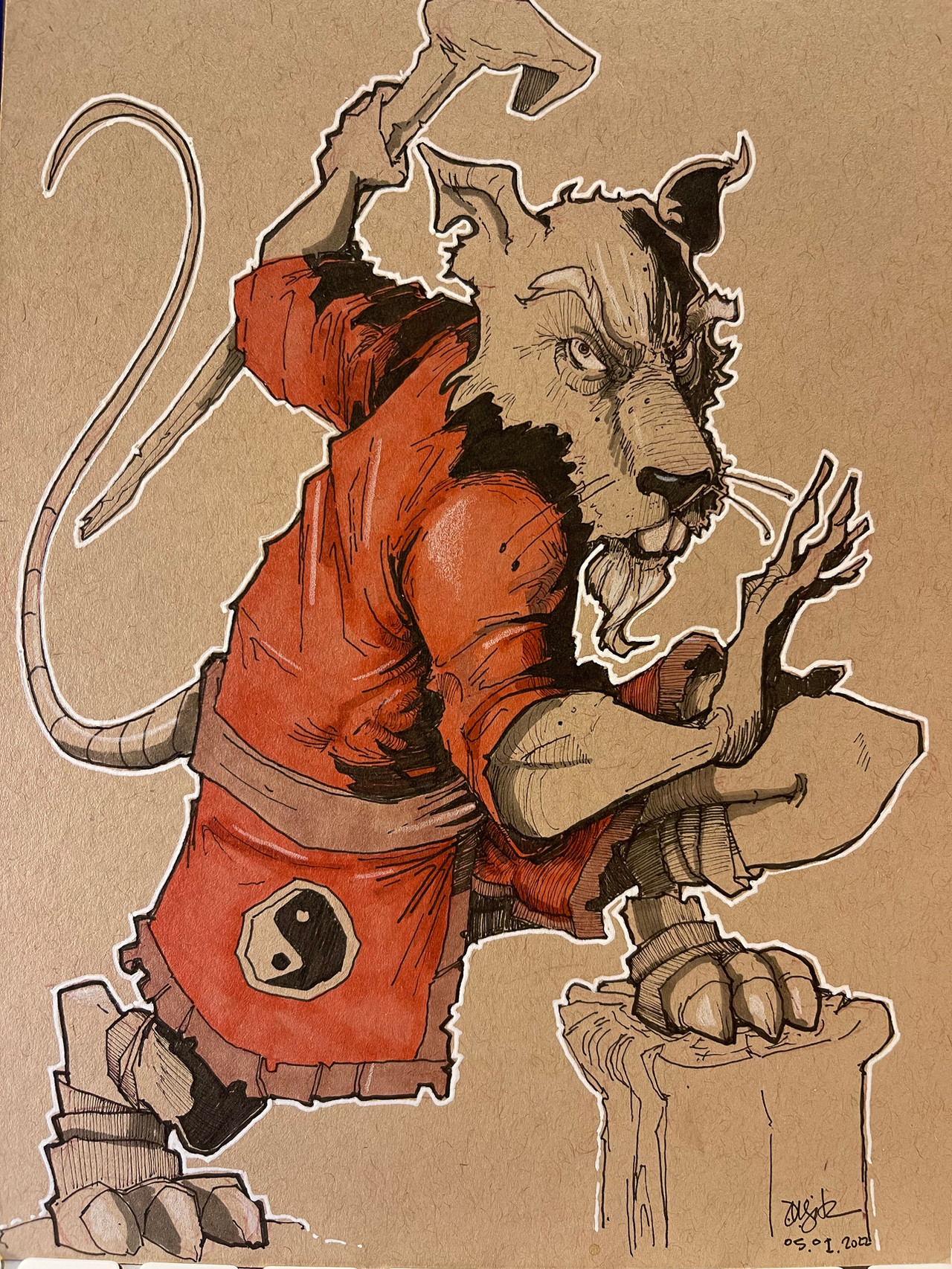
I always appreciate critiques, especially when handling a character as sacred as Master Splinter. In this case I think it's more the pose that may throw you. I certainly didn't give him that good ol' Splinter slouch. I stand by the neck design, but I did feel I needed to do another in a more traditional pose for him. So hopefully for your browsing pleasure i just posted another Splinter!
👍: 0 ⏩: 1
Oh, and I think the word "stubby" is perfect. I like it
👍: 0 ⏩: 0
