HOME | DD
 charco — Final Jambore 07 badges
Published: 2006-11-15 10:37:31 +0000 UTC; Views: 509; Favourites: 1; Downloads: 0
Redirect to original
Description
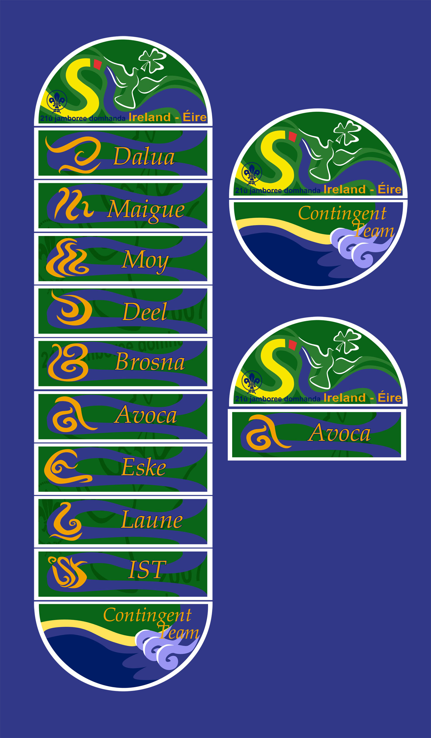
final approved design for the Irish contingent's badges for the UK jamboree next year.I'm happy with the result. Whaddaya think?
(just wanted to try he new submission thing)
EDIT:
There's something weird happening with it stretching. That should make a perfect circle. Anyone else having that problem?
Related content


Comments: 13

Like the blue ribbon effect link-up thingy. What do the different contingent names mean?
👍: 0 ⏩: 1

Not a ribbon, but a river ")
👍: 0 ⏩: 1
Oh man, now I look again, it's so obvious! The waves, the fact that it starts at the river part of the SI. *headsmack*
Now I think about it, I have relatives in Moy Valley. And I've heard of the Avoca.
👍: 0 ⏩: 0
")
👍: 0 ⏩: 1

Try zooming in on an image you know to be square, like a dA avatar and see how much it distorts. May help with fixing the hickup.
Or stand on you head.
👍: 0 ⏩: 0

Ohhh these look really nice. Lovely colours.
👍: 0 ⏩: 0

looks good. There's no problem with stertching over here.
👍: 0 ⏩: 0

looks great. no problem with stretching here. must be your browser
👍: 0 ⏩: 1
cool. I'd just set up a two screen setup, so things are going a little kawkaw...
Wow, that looks stupid written down
👍: 0 ⏩: 1
