HOME | DD
 Charlie--X — How to Save a Life

Published: 2008-04-20 04:29:14 +0000 UTC; Views: 2092; Favourites: 74; Downloads: 50
Redirect to original
Description
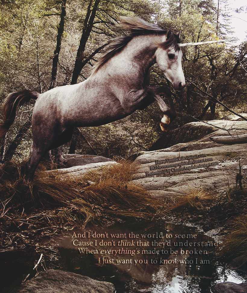
About::The background is actually a close up of sand or snow.
I really like the way it came out, the simpleness of it, its
pretty...white but I think it looks pretty cool.The guy that wrote the song said it is about(in a shorter version):
"No one could write a manual on how to save him. "
He will do one of two things
He will admit to everything
Or he'll say he's just not the same
And you'll begin to wonder why you came
Horse: ~vivstock
BG: ~Tsaven
Lyrics: How to Save a Life-The Fray
(C)Not a Freebie
Related content


Comments: 18


I'm not usually a very big fan of photomanip but this is lovely.
Be careful, though. DA has popped a few of my friends for having lyrics on their images before D:
👍: 0 ⏩: 1

Thank you
Huh, I never knew anyone got in trouble for that..interesting
👍: 0 ⏩: 1
XD; yeah most people don't. It's kind of silly but what can you do? :\
👍: 0 ⏩: 0

Thank you for the comment and favorite
👍: 0 ⏩: 1
 (Smile)")

What gets me is that the horse is facing the outside of the image, so I go to look at its head and where it's going... And I see the outside of the image. I guess it's a pet peeve of mine, but something people don't tend to think about is what direction the subject is facing. It can have a very powerful impact (imo) if the subject is facing in toward the center of the image, or toward the outside. One draws your eye in, the other leads your eye out. Generally, I try to keep in mind the direction of the objects in the piece to keep the viewer's eye going into and moving around the picture. And I think that blurring the very edges of the horse with a small blur brush would make it blend into the background more, so it doesn't have such a harsh edge.
But gosh darn it, it's so so so pretty! The mane is just... Whoa. And I love how it's such a tight shot; it's really unique. Beautiful work.
")
👍: 0 ⏩: 2

blurring wlndt be a gd idea.. cos of exactly what u said... the horse blends into the bckgrnd.
for emphasis, and depth of feild, foregrnd is preffered to be sharp in contrast to blurred out bckgrnd to give the illusion of shallow depth of feild.
the reason why the horse looks abitt weird is cos the artist didnt match the lighting, and its too flat on the plane. he shd have down the contrat slightly on the horse, and then added the shadow on its feel. also, he shd have done a better job of masking....
blurring just makes it look like the artist took a short cut. i think its better it was left this way.
👍: 0 ⏩: 2
What I meant is to take a small, soft brush and use the blur tool to blur the edges of the horse. This would get rid of the sharp edge created by cutting out the horse, and making it seem less paper doll-like and more round. When I say to blend it into the background, I don't mean so it doesn't stand out anymore, I mean that it becomes more "one" with the background and looks more like it's actually one photo, not that the horse has been cut out and placed there. When you look at photos, the subject isn't so sharp that it has a hard outline around it; it has a roundness because it has dimension. I'm not saying to blur the whole horse, just the sharp edge from cutting. Using a small blur tool would create a difference that is effective, but something that is barely noticed at all. I use this technique in almost all of my images and it doesn't look like a short cut at all.
👍: 0 ⏩: 0
woo speling errors... but i think u gets the gist of it.
👍: 0 ⏩: 0
Thank you for that.
Yea i wanted to try something..different I guess..the original idea I had need it to be for the outside, but like most of the time it came out different than that..lol
👍: 0 ⏩: 1
Ah, it happens. But still, it's wonderful.
👍: 0 ⏩: 0

very nice. i love the song. i love the colors. full of emotion. definitely a fave.
👍: 0 ⏩: 1
Thank you
I love it when poeple think it full of emotion.
👍: 0 ⏩: 0

very pretty! its blended well so its not obvious that it was photoshoped (?) & the horse was a good choice for the background. great job!
i love the song how to save a life by the fray! such a good song

👍: 0 ⏩: 1
