HOME | DD
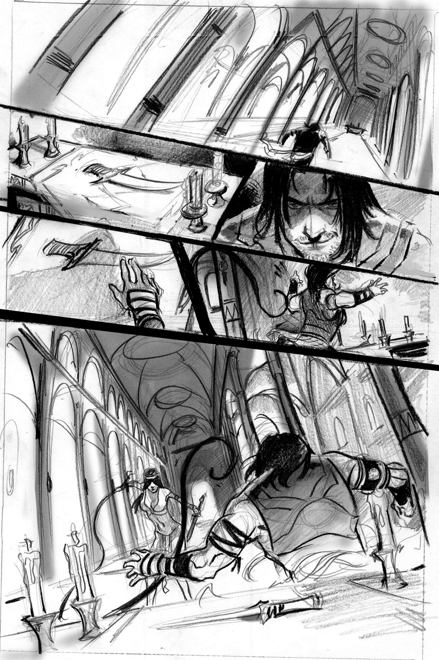
 ChaseConley — Throne Room Trance- rough

Published: 2010-04-24 19:50:50 +0000 UTC; Views: 5822; Favourites: 53; Downloads: 292
Redirect to original
Description
4 thumbnails of the same scene. I'm trying to find the best angle to show what takes place. It's necessary to show the beauty of the one specific dancer (as she is the focus)...So to single her out, I'll use the lighting...I'll have a nice ray creeping in to the throne room, maybe from a high window, so as the dance troop swirls and rotates each one will pass through this light and we (the viewer) will come in right were that one specific dancer comes through this light...Its also necessary to show the kings brother's (not the king on the throne) reaction when he sees this gorgeous dancer and stands in awe...So I dont want to get too much of the king in there so we dont know who's reaction is the most important, so I kinda wanna crop him out slightly, while still implying that theres a King in the painting.
I think the best shot is #3, though it will need to be refined some more.
Related content


Comments: 20

Thanks for sharing your process - It's great to get some insight into how artists solve problems like this.
👍: 0 ⏩: 0

Nice figures in these. For composition, I think 2 is by far the most successful: just get some light striking the face of the brother, while keeping the king mostly in shadow, and you're golden.
👍: 0 ⏩: 0

I dono what works best, but maybe what might help you narrow it down; I think that 3-4 work well compositionaly because the dancer is the focus, but the dancer isn't the first thing in the picture. w/e its worth, I find it more interesting to look at.
As for the one that goes with the necessities I would say 2. They way you drew it makes the most obvious that the brother is staring at the dancer.
Its always a possibility that the best one is the 5th ")
👍: 0 ⏩: 0

I liked #4 because if the beauty of the dancer is the key, then that one has her as the focus, also you're seeing it from the king's point of view, and that's who she's dancing for.
👍: 0 ⏩: 0

I think 3 or 4 are the best because they make the dancer the main focus and at the same time they keep all the background characters in it which help make the scene seem more action filled
👍: 0 ⏩: 0

Just my 1 cent: I think #2 is the way to go. And I love how you're so thoughtful of your process man--It seems like you really try to think about your pieces, not just slap them together.
👍: 0 ⏩: 0

I prefer #2, as we get to view the whole scene and it up to us to notice the king's brother reaction in contrast with the king's passiveness. Additionally, we've got the dancer in front, king in the middle (obstacle?) and the enticed brother in back, to me this composition packs a good punch!
👍: 0 ⏩: 0

Shot 3 or try combining shot 1 & 3
Try drawing the king in the background vaguely and you could draw the dancer facing the prince.
Positioned like below:
King
DANCER PRINCE
I wrote the dancer and the king in CAPS to show where you can put the focus of the lightning.
👍: 0 ⏩: 0

I'm going with number 2. 3 is also great but the next dancer coming up is kinda blocking the main dancer.
And the dancer in focus also has a nice "frame" around her due to the composition and the placement of the other dancers.
👍: 0 ⏩: 0

I'd have to say I like 4 best because of the relationship of the person in the foreground to the dancer.
👍: 0 ⏩: 0


I love to see that you use soft leads. I don't understand why a lot of pros use these diamond-hard leads that are like razor blades on the page. The 'cleanliness' is not worth the trade-off. I love graceful lines, like in your work. Are you using Tombows?
👍: 0 ⏩: 1

nah, its actually just an ebony pencil....
I hate hard leads, it's like fighting the paper. Especially for thumbnails....I need some tombows.
I dont really care about cleaness anymore, more the impact and the flow, which that came with time. I used to be obssessed with cleaness..Now i just go for the kinetic vibe.
👍: 0 ⏩: 1
I know exactly what you mean. I've had one too many bad experiences using hard leads. How pros use 2H drafting pencils is beyond me. Especially with layouts/thumbnails, I find myself thinking about detail instead of the overall flow and emotion. I know Adam Hughes uses a 4B drafting pencil for everything. I really want to know what Claire Wendling uses. I know she draws on translucent vellum.
Anyway, it's always inspiring to see your stuff. Keep it up.
👍: 0 ⏩: 0


i definitely agree with you.. i really like 3. especially for what you're going for with the brother and all. but as far as showcasing the dancer.. i really like 4.
👍: 0 ⏩: 0

i think #2 would suit your purposes best to tell that tidbit for the story.
3 is good as well, but the king's head is cropped off and i think his general attitude not being as excited as his brother's would contrast well.
is this to be animated?
👍: 0 ⏩: 1
I understand what you mean.
Nah this is actually a commission thumbnail.
👍: 0 ⏩: 0

I like #4 a lot for what you're trying to achieve. I think #3 has too much going on an looses focus on the brother. I think that if you put more focus on the brothers back and side of his face in a scene like 4 it would work nice?
Ah but I don't really know... I'm not very good at this kind of stuff.
👍: 0 ⏩: 1
Well I hope that the color choices for those two will be so vibrant that they standout. As he leans his head into the beam of light they will be more more warm and bright in contrast to everyone else.
4 just doesn't show me enough to feel like I'm in a throne room it has too much focus on the dancer.
👍: 0 ⏩: 0