HOME | DD
 Checkered-Fedora — light and shadow UPDATE 2

Published: 2009-04-08 13:01:24 +0000 UTC; Views: 5389; Favourites: 378; Downloads: 56
Redirect to original
Description
thanks for critiques guys. I applied a couple of them and retouched it up. Hope you like it better now ^^SORRY to have Edited it 3 times. I REALLY think I'm DONE now since im not going to rework it anymore and anymore critique will make me go from the YAY I want to learn stage to the wait so EVERYTHING about the guy sucked in the beginning now he half sucks I hate him *throws the deviation away* stage... u__u hope you guys understand and thanks for the critique thus far. No more please though. Here's what I changed since my first post.
Added shadow towards the botton of the image, cleaned up his ear, made the horns a bit more visible, gave him a second eye, attached his eyebrow to the bridge of his nose where it belonged, fixed her nose so it wasn't crooked, redid his lips, redid hers a touch as well. I THINK thats all of it.
OH GOD I'M SOOOOO freakin tired. Its 6 a.m. and I gotta say its been a damn long time since I've made an artwork that I couldn't sleep until it was done.
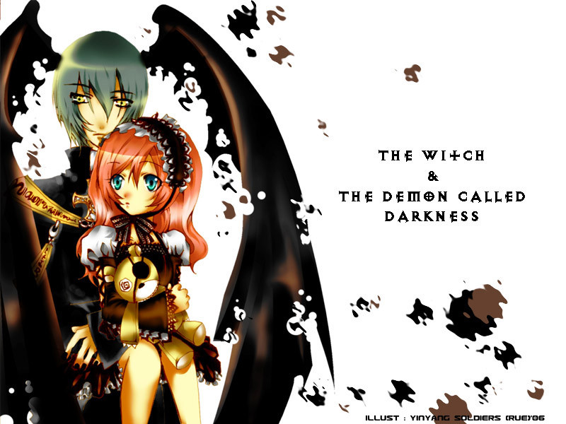
This started out as an oc session with ~Hosuni She drew the girl. But after we ended it I found myself coloring...and coloring more...and coloring more...AND COLORING MORE...yeah. In any case I did most of the coloring but hosuni mapped out the base color palette and the shadow layout on her girl. I just smoothed it out and finished it up.
AHAHAHA OMG so here is proof I can do a painterly style. I just usually dont. Ah well I learn something new about myself and my abilities every day.
So anyway lets see if I managed to make it through this description with BASICALLY spelling right

I'm gonna go die now.
Left side character and art (c) to ~Hosuni
Right side character and art (c) to *checkered-fadora
IF YOU WISH TO SEE THE IN PROGRESS STAGES I have them posted in a gaia thread. [link]
Related content


Comments: 83

Thank you hon. I'm REALLY proud of it too. And while I still know I have a lot to learn in this style I wont be so afraid to try it in the future. It feels really good to branch out from time to time.
Also thank you for concentrating more on the boy (since he was the one I drew) I agree about the lip now that you mention it. I've actually done this in the past too without meaning to and hated it then haha. So its a shame I made the mistake again. I like to call them...duck lips. I dont know why.
XD defined noses work in soft, not so much in cel. I'm hoping eventually my style will be somewhere halfway between my soft cel and this. *scratches head* I dont know how its going to happen yet though haha.
Anyway thank you for the honest critique.
👍: 0 ⏩: 1

You're welcome <33 I really love this. And I'm glad you're proud of it, because you have every right to be :>
👍: 0 ⏩: 1


Overall
Vision

Originality

Impact
It's a nice piece and the colors are beautiful, however with such a dark background and the different symbolic light sources coming from either side of the characters, a deeper palette of shadows would look best with it.
Your shading on it is very light and airy, and it would do if both were enveloped only in light but the majority of the background is dark, especially the bottom.
I would go back in starting with the bottom and make it darker on the way up to say about the shoulder and than go in with the brights. It'll really make them pop off the page and make the light airy affect on the woman stronger, and make the male a lot more sinister looking.
👍: 0 ⏩: 1
thank you dear. When I started it it was in oc1.1 and had no background (and my character was half colored)so in the end the background went in last. I probably should have arranged the background to better fit the lighting already on the characters and I didn't. Usually I do backgrounds first for that reason but since it started as a doodle session. My bad. You're right though the characters would be much more suited for the setting if they were more shaded in the bottom. Or at the very least had higher contrast shadows towards the bottom.
I probably wont revisit this current one (since it was drabble that turned into something finished and all got saved on one layer in my tired stupor), but I intend to hold onto people's critiques for if and when I attempt this style in the future.
Thank you.
👍: 0 ⏩: 1
NP :3.
If you do decide to go back and touch it up or whatnot, the lighter background, or the darker shadows towards the bottom like I suggested are both excellent choices. And would make the piece very well adapt for the lighting 8D <3
👍: 0 ⏩: 1
I might. There are a few other things I'd probably tweak too. Like where I forgot to blend the lineart on his ear haha
👍: 0 ⏩: 0
+__+ This looks absolutely wonderful with some of the reworks! I would defenintly buy this as a print :3
👍: 0 ⏩: 1
^^ Thanks. I'm actually selling them (with my friend's permission) and buttons too heheeeee
👍: 0 ⏩: 0


This piece is really beautiful; I have such a soft spot for art which depicts light and dark/shadow. Very wonderfully done!
👍: 0 ⏩: 0

It was pretty before, it's pretty now.
I'm glad you fixed the nose though. Now it's perfect (though things are never perfect) to me.
👍: 0 ⏩: 0

Wow... since it sounds like all the critique-y stuff's been said so far, I do have a couple things to say:
It looks friggin' gorgeous. The composition is amazing, and the girl is stunningly beautiful. I never saw the earlier versions of the work, but this is really lovely. ^_^ My favorite subtle detail is how you used multiple tones to enhance the shading and dramatic impact of the flesh. ^_~
👍: 0 ⏩: 0

Oooh, this is very nice! It's a refreshing break from your normal style; I was totally shocked when I saw it. I double checked the artist, even. Which sounds really bad, but I don't mean it to be! You continually suprise me, is all.
Yeah, digging myself a little hole here. I'll stop before I reach the point of no return...
👍: 0 ⏩: 1

Holy frick, this is just absolutely gorgeous! I love the coloring and all the details in the shading. This is definitely a favorite of mine.
👍: 0 ⏩: 1
Thank you. I hope I can replicate this cg style again in the future
👍: 0 ⏩: 0

I didn't draw her though, only colored her ^^
👍: 0 ⏩: 0


I think the guy and girl both look cool nice work nice angles and detail. I'm sorry you had to work so much but it paid off.
👍: 0 ⏩: 0


My critique is that I think his neck looks a bit awkward, as if he's wearing a mask instead of a head(the line defining it shouldn't be as long, and the jaw doesn't seem right). Everything else is perfect,though. It IS a beautiful piece with great colors(and lovely human faces ")
👍: 0 ⏩: 1
thanks. I'm actually going to remove the critique now though. I reworked it all day yesterday so anything that needs to be changed now requires completely redrawing. u__u thank you though <3
👍: 0 ⏩: 1
I understand, sorry to critique you so late. ^_^;;;;
👍: 0 ⏩: 0

i've had a nice wander through your gallery but i def. think this is your best piece
The composition is really nice and the style is a lot more mature than some of your other stuff, you should definitely do a lot more like this.
A bit of crit - The black area inbetween their heads seperates them into two seperate images rather than working as a whole, so the flow is interrupted and the attention focuses on the girl rather than that dashing young lad
I think if that area was a pale yellow or some sort of mid tone between the blue and the orange then it would work a lot better (:
Also, the boys face seems kinda flaaaaat... hard to describe lemme do a redline [link]
If you can see what I mean, his face doesn't look like it has much three dimensional shape to it.
oh and this is just a note for the future, you're probably sick of retouching lol
but totally beautiful piece ;D hope to see more like it
actually going through your progress shots I think this works really well
[link]
The black space doesn't really matter because the blues work to balance it out rather than the epic orange vs. blue battle, it also works with the blue/green shading you used on the boy.
BUT ANYWAY ENOUGH FROM ME im just going to sit back and enjoy your fabulous art
👍: 0 ⏩: 1
I think the flatness of his head probably would have been there but not as noticeably if it werent for the fact that I hadn't originally intended to draw him from that angle. he was actually going to be a mostly frontal view instead of the awkward back view, but the thing about OC is that two people are drawing on the same canvas at the same time so she was drawing the girl in front of my guy when all I had was a head. Course this also wasn't intended to be anything finished when we started either. I'd liked what I started so I went with wonky over completely erasing him. Your redline has him tilting his head just a hint up (which IS correct given the angle of his shoulder) and when I started the picture he was originally going to have his head tilted down, which extending the jawline and squaring it out probably would have helped with his flat head look. But the current angle of his head doesnt really fit his body either.
in any case I <3 redlines but you're right...to get yours would require litereally completely redrawing him so I'm going to let it be now. I should probably remove the critique option now since I dont intend to work it anymore. I think I've fixed just about everything that wouldn't require a redraw.
👍: 0 ⏩: 1
it's okay darling I understand ;D
👍: 0 ⏩: 0

Very Nice, definitely something to hang on one's wall. ^^
👍: 0 ⏩: 0

I really like this style from you. If it didn't kill you so much, it would be nice to see again xD
👍: 0 ⏩: 0

after seeing the first version and the one now it looks MUCH BETTER. Cause yeah the one eye was kinda weird on the guy and her crooked nose was bothering me. But it seemed like such nitpicky things i didn't want to bring up. BUT ITS AWESOME NOW. Fixing those little things really seemed to make the whole picture come together. I like how you redid his lips too!
Awesome job~ I love this coloring style. I hope you do it again sometime in the future~
👍: 0 ⏩: 1
Thanks. I'm definitely going to experiment with it in the future. I think that once I get it down a hybrid of this coloring style with my usual coloring style could turn into something really interesting and unique. ^^ I'm really glad I put on the advanced critique since it helped me really fix it up. Haha though nobody said ANYTHING about his eye and it was probably the biggest flaw in the whole picture. *his eyebrow didn't line up with the bridge of the nose*
👍: 0 ⏩: 0

This looks so much better with each touch up! (and it looked good the first time. :3 )
Super work, be proud of yourself.
👍: 0 ⏩: 1
^^ I am really happy. I really believed painterly was beyond me. I shouldn't listen to myself
👍: 0 ⏩: 0

That's freaking awesome ovo For some reason, I always miss things on deviantart >>; But that shadows do look really nice in this.
👍: 0 ⏩: 1
thanks. I worked really hard on it and I PERSONALLY think I outdid myself. I'm kind of glad I requested the advanced critique and equally glad I revisited it several times
👍: 0 ⏩: 1
You're welcome <: Revisiting things after getting critique does help make things look a lot better.
👍: 0 ⏩: 0

o.o; It looks crazy good with all the touch-ups.
I noticed most of it right away. <3 The shadows do make it a lot more powerful, as well as his second eye. <3 Amazing job Senny~
👍: 0 ⏩: 1
thats my bad. To fix her lower lip and still keep the texture I ended up copying the other half of her lip and pasting it in u__u so the shine doubled
👍: 0 ⏩: 1
Yeah? Oh well.. personally I think it looks good that way. ")
👍: 0 ⏩: 0

Yay! Ear done~ ^^
Now his bottom lip's bugging me cause hers is so shiney xD
👍: 0 ⏩: 1
oops I responded to this on the person above you.
👍: 0 ⏩: 0

Wow I love this =^.^= nice coloring good shadows and lighting XD
👍: 0 ⏩: 1
thanks. Man I've reworked it so many times just today
👍: 0 ⏩: 1
an art teacher once said to me that an artist always needs another person there to grab them, pull them away and say "no more...its good! no no! put it down! back away from the art piece!" lol XD
👍: 0 ⏩: 0

Oh lawdy, this looks so amazing 
👍: 0 ⏩: 1
^^ there is still stuff that could be reworked on it but I have other things I'm SUPPOSED to be doing *sighs*
👍: 0 ⏩: 1
| Next =>