HOME | DD
 chiggenboi — Forever Fall

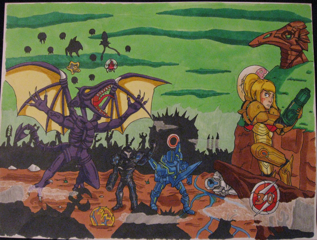
#dagdog62 #pyrrhanikos #rwbyfanart #jnpr #rwbyroosterteeth
Published: 2016-09-30 02:26:54 +0000 UTC; Views: 617; Favourites: 38; Downloads: 1
Redirect to original
Description
I love Pyrrha. She's very capable, composed, and wise. But she has no shortage of vulnerabilities either. If I had to sum them up, this would be my answer.(On a less sad note, volume 4 is looking pretty fine)
Related content


Comments: 7

Okay so the first thing I notice with this is the overall flatness of the illustration. You have very few areas of contrast with light and dark. One of the most important things you need to learn as an artist is how to use value(light and dark), its difficult and can seem confusing at first but it's so very important to keep your art from looking flat. Second thing i see is the issues with anatomy. Every character has some anatomical hiccup and this is especially evident in the hands. Anatomy and especially hands are very difficult to draw but its very important if you ever want to see the ideas in your head become a reality on paper. Now I do realize this is a stylized representation and that these characters are anime esque, but that does not mean you have license to make bad anatomical choices. If you enjoy this art style, learning how to draw realistic anatomy is the best thing you can do. Anime is a distortion of realism, and if you can draw something in a realistic way, you will be much better at distorting it to meet your own style.
Another major issue I have, and probably the most dire problem I see with this illustration is the composition. A lot of things feel off and don't make for a very dynamic or interesting image. Composition is one of the most important fundamental skills you can learn. Even if this illustration had no issues with light or anatomy, having a bad composition will still sink it. A lot of issues contribute to this problem. The perspective is off on the pillar, and the scale of all the characters makes no sense. It looks like Pyrrha would dwarf all the characters if she got off the pillar and stood next to them. Another problem with the composition is the focal point. From what I see Pyrrha is the focal point of this piece, and I know this because she is right in the cent of the illustration. This is a very easy, mistake to make. i see a lot of artist put a character in the center because it's the most important thing. It's something you should avoid in the future because it can flatten your image and is just not that interesting. Now I'm not saying never do it, because it's not always an instant fail, its just not as dynamic as it could be and not the most interesting solution.
When you have a focal point, you have a lot of options to show it's importance to the illustration like using light and shadow, or scale. Usually when making a character your focal point, you should make it the largest thing on the illustration and have your darkest tone and lightest on or around that character. For help with studying composition, I recommend studying movie posters or box art, or album covers. The key with composition is to have your illustration be readable as quickly as possible. Because a movie poster has to grab your attention in fractions of seconds, they are usually expertly composed to do so. Piggybacking off of that, a good movie will treat every single shot as a well composed image so studding movie stills is another good way of learning composition.
A few other notes. The colors are not very vibrant and all the white helps make the image look flat. The trees really bother me, especially the ones directly above Pyrrha. They don't look like trees and are somehow connected and mirrored. Also, why is there a pillar in the middle of this road? I could understand a structure like that at the end of the road or on the side but it being in the middle makes no sense.
So in conclusion, what you are lacking is an understanding of the core fundamentals of drawing. I recommend doing some still life studies to help you with your ability to draw light. I also think drawing figures in different poses and drawing hands will help you dramatically. Pay attention to composition. It's not harped on as much as lighting, or anatomy or even color but it's just as important as those elements. I hope this helps you in some way in the future.
👍: 0 ⏩: 1

Thank you, that was very thoughtful  (Smile)")
👍: 0 ⏩: 1
It will be of great benefit. Just keep pushing yourself and eventually you'll improve without even noticing
👍: 0 ⏩: 0

Nah, those are just normal students at Beacon.
👍: 0 ⏩: 1

Nice work! I really like the mood of this artwork. I'm not familiar with those characters, but it reminds me of A Link to the Past with the pedestral and the statues in the middle of a majestic forest.
Maybe you could add a clear source of light, so you can put emphasis on your focal point, which seems to be the girl sitting in the middle.
Keep up the good work!!!
👍: 0 ⏩: 0