HOME | DD
 ChrisCold — Any Direction
Published: 2010-10-05 13:13:01 +0000 UTC; Views: 46104; Favourites: 1670; Downloads: 3917
Redirect to original
Description
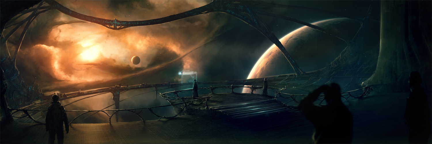
What you see here is a collaboration project between and myselfTook quite some time but it's finished now. He will probably upload a slightly different version so check it out as well here
Wallpapers available:
3840x1200
3360x1050
2880x900
if you need normal sized wallpapers crop them yourself xD
Related content


Comments: 171
 (Smile)")

great work from two of my favourite deviants!
👍: 0 ⏩: 1


Has a Mass Effect vibe to it. Like the Protheans looking out into the galaxy.
👍: 0 ⏩: 0

Hmm, I think I like the cooler colors in your version better than the warmer in his. Both are amazing, fantastic work, both of you.
👍: 0 ⏩: 1
Wonderful piece, grand scale. I like the organic look of the struts, and the nebula.
👍: 0 ⏩: 1

Shiny stuff mate. Only thing I would note is that the transition between both halves of the piece should IMO be smoother. By that I mean, if you cut it in half each half could be an artwork by itself.
👍: 0 ⏩: 1

I really dont know what you mean, the podium is right in the middle and the right side doesn't have any lights.
There is a clear diagonal path your eyes can follow from light-to-shadow.
It is really a wide piece, maybe that's kinda confusing. Although it's supposed to be a multi-display wallpaper anyway
")
👍: 0 ⏩: 1
What I mean is that in the cloud area just above the person standing in front of the monitor thingy, there's a visible border that conflicts with the path your eyes take. It cuts this piece in half (since it is located in the middle) and it makes it a little bit difficult for your eyes to look at the middle of the artwork. This is simply because this border functions as a sort of separator. That's why I stated it would be easier on your eyes if the transition from light to shadow would be made smoother and less harsh.
Don't get me wrong, it's a great piece.
👍: 0 ⏩: 1
a border above that person? cant see anything there except for the screen.
and the transition from light to shadow is not harsh at all, there are all kinds of values everywhere, you can desaturate and see it in gray if it's hard to tell in color.
here an example of contrast levels [link]
from the white sun to the dark far right corners you can spot many different values that dont switch right from white to black and back to white.
👍: 0 ⏩: 1
What I stated is the feeling I get from the middle of the piece, do with it what you will.
👍: 0 ⏩: 1
Well you said a visible border, not an imaginative
i thought you meant some kind of a texture glitch or so
👍: 0 ⏩: 0

You know, you really deserve to be on the front page more often, you've got more talent in one finger than half of the useless hacks that make it there...
WAIT- I'VE GOT AN IDEA...
👍: 0 ⏩: 1
Thanks,
i actually was several times on the front page a few months ago, but recently i dont get there haha
maybe it's because i'm not as active right now.
i blame DA's system
👍: 0 ⏩: 1
Yeah, I blame the system too...
That and the fact that I'm nowhere near "Feature" material yet...
But mostly the system...
👍: 0 ⏩: 0


man.. it's just amazing piece of work! I watch bouth of you and it's so awesome to see a result of your collaboration! I love your work guys!
👍: 0 ⏩: 1
")


Holy mother of.....
Great piece man, my fav of your recent works - a very slick colab!
👍: 0 ⏩: 1


 (Wink)")


great! only thing that bugs me, is that your description isn't flipped as well

👍: 0 ⏩: 1
You're just a weirdo like taenaron, that's why
👍: 0 ⏩: 0

Totally awesome! very nice collab
👍: 0 ⏩: 0
I did everything, taenaron cropped the wallpapers
👍: 0 ⏩: 2

Well then that is quite awesome indeed, nice work!
👍: 0 ⏩: 1


The color in this version gives it a better mood I think. Either way it's wicked awesome!
👍: 0 ⏩: 1


<= Prev | | Next =>