HOME | DD
 chriscopeland — Color Decisions

Published: 2013-04-24 09:47:07 +0000 UTC; Views: 8515; Favourites: 200; Downloads: 0
Redirect to original
Description
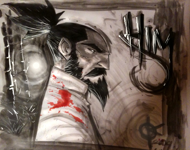
Between life and work and life and commissions and life and stuff, im also working on my own OGN. This was done a few weeks or so back and then i lost it, and had to re-do it, and here it is. Just sharing with you guys the stuff as i go along. So, doing some color comparisons, still adjusting for the final color scheme, just some simple adjusting and whatnot. Also, the Kanji down there actually translates more into "that guy", "HIM" is a little tricky in the language, Anyway, im Excited about my book y'all, its finally coming together. PEACE!Related content


Comments: 68

Damn! you are good!
but i think you already know that.
cheers!
👍: 0 ⏩: 0


Middle!
Pretty cool, man. Him has been a long time coming... but I totally know how it is.
👍: 0 ⏩: 0

")


I would say right but I'm liking the color palette in the middle as well
👍: 0 ⏩: 0

I'm excited for your book as well, look at that. The last one is my fav

👍: 0 ⏩: 0

pic 3 but the face color from picture 2. so he looks more alive, imo.
👍: 0 ⏩: 1

Yeah, im getting that a lot. THanks yo!
👍: 0 ⏩: 0


Looking good man! This is such a cool character! I wish luck in the making of the book and lots of success on all your projects!
👍: 0 ⏩: 1
Thank you, its been a long time coming, so im happy to accept all of the push in the form of encouragement.
👍: 0 ⏩: 0

My humble opinion about your color decision (assuming you're looking for them) is the last one (far right). His (or That Guy lol) skin color and the background makes the blood stick out more. I like that affect with the blood, it draws the eye and makes the blood seem important. It carries impact.
I can't wait for your OGN though!
👍: 0 ⏩: 1
Thank you, and good feedback is always welcome on my end of things.
👍: 0 ⏩: 0

I really like the warm palette of the middle one. But I like how you handled the highlights in the one on the right.
Whatever you choose, looks great and can't wait to see more!
👍: 0 ⏩: 1
THanks fammo, im sure it'll fall somewhere in the middle of those 2.
👍: 0 ⏩: 0

really like the middle do you think you will be doing a tutorial anytime on the coloring you did.
👍: 0 ⏩: 1
THank you, probably not as coloring is definitely not my strong suit, lol. I might post videos of me coloring something in the future.
👍: 0 ⏩: 0

middle for sure. left is too dark and the right is too pale.
👍: 0 ⏩: 1

I like the middle one. The extra highlight pass seems to cheapen it, somehow (although I do that all the time, haha).
👍: 0 ⏩: 1
THank yo! I cheapen a lot of things, lol.
👍: 0 ⏩: 0

looks awesome!! i like the one on the right myself but they all look neat!
👍: 0 ⏩: 1

I like the one on the far right. It really helps bring a good tone and mood to the character, and I like the use of three tones better then just two. It helps it pop more. Can't wait to see this new book ya got man!
👍: 0 ⏩: 1

I like far right one but I also kinda like the green jacket. your font?
👍: 0 ⏩: 1
THank you, i am considering a lot with a lot of different versions of these. im just showing these, but there are about 30 more.
👍: 0 ⏩: 1
Cool, will we eventually see them all?
👍: 0 ⏩: 0


I would choose the Second one if he is the HERO type and the last one if he is an EVIL type.
👍: 0 ⏩: 1
Hmm, good eye, the reality is that he will end up in each of these at some point in the story, lol.
👍: 0 ⏩: 1
Then stick with both then, that way it can appeal to the role he has at the moment. ^^
👍: 0 ⏩: 0

The one on the far right has a good mood to it. But I like tone on the first one
👍: 0 ⏩: 3


I like the color choices in the 3rd one, but I prefer the 2 grade cell shading in the second. Perhaps try the third one without the highlight.
👍: 0 ⏩: 1
Hmm, good though, i actually have like 30 more of these that i will be sharing over time at some point.
👍: 0 ⏩: 0
No, no i do not, lol. Its crazy man, i guess, my life is all of that stuff, lol. I love it, and it kills me at the same time, lol.
👍: 0 ⏩: 1

yes I think we all love this kind of killing life. I am starting to love my free time, beers, hang out, the light of sun.... But if I do it many often, I got nervous and I must go home and draw lol
👍: 0 ⏩: 1
| Next =>